

Design System Chronicles (Tenet UI)
Post #4 - Scalable and Accessible Dark Theme | Post #5 - Semantic tokens in action | Post #6 - Establishing a typography system

Colour inconsistency is one of those sneaky problems that creep into design systems and makes everything feel slightly off - like a song that’s just out of tune.
That’s why I have always been obsessed with semantic tokens. They take the guesswork out of the way and make sure everything stays visually consistent without me having to manually tweak 100 different colour styles.
I’ve talked before about strategies for a semantic colour system and how you could go about naming colour tokens, so I won’t repeat myself here. Instead, this article is a visual breakdown of how I’ve actually applied them in my components.
💡Update
Tenet UI (Figma Design System/UI kit) is available in the Figma community. The UI kit has a robust and lean semantic system (design tokens/variables) that supports light and dark modes and a comprehensive component library!
How I Apply Semantic Tokens to My Components
I’ll walk through some components and show how I’ve assigned colour tokens - background, text, icon, and border.
This documentation also includes images of real world examples to explain the rationale as to how a colour token was applied and why it was created. It would also have annotated visuals to demonstrate how these tokens come together in the UI kit.
Just a heads up before I move along. This token structure is something I always keep in mind and have consistently followed while creating them.

Background tokens

These are my background (bg) tokens.
I split my background tokens as “bg/base” and “bg/surface” for the grey colours. The bg/base is the semantic for anything that is the deepest surface, usually the page or the screen itself. Any component on top of the page/screen would warrant a bg/surface, indicating it is a “surface” on top of the page/screen.
📖 Read next:
- Designing colour palettes that work for every project
- Colours Revisited: Optimizing Your Design Workflow
bg/base tokens
When I first started assigning background tokens, I thought a single bg/base token would be enough. But then I ran into this problem: some components needed just a slight variation in the background so as to maintain depth and contrast without resorting to shadows. That’s why I introduced bg/base-weak and bg/base-strong. These are minor tweaks or subtle variations that make a world of difference.
So I ended up having 3 types of bg/base tokens:
base (default),
base-weak (one point weaker than default) and
base-strong (one or 2 points darker than default)
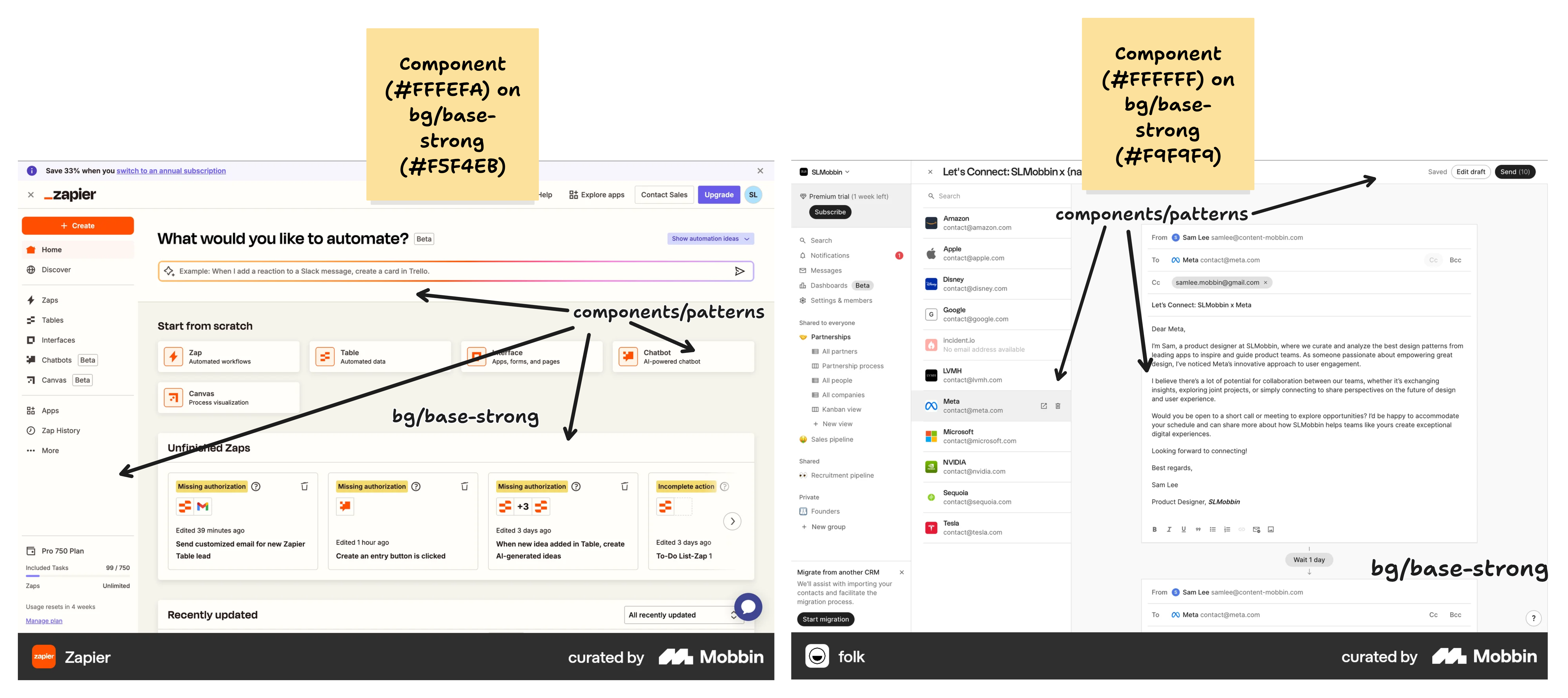
I’ll explain with a few real-world apps (from Mobbin).
bg/base
The screen or page could be slightly dull or darker (1 shade darker) than the component that sits on top of it. I define the colour token for this as bg/base. Take these examples.

You have a table component with the lightest colour #FFFFFF (primary) sitting on top of the page with colour #FDFDFD.
Similarly, here’s another example.

Notice, that for components (having the lighter colour) on top of a bg/base colour, I may or may not have the need to separate them with an elevation or a border.
bg/base-weak
Unlike bg/base, which differentiates the page from the components on top, bg/base-weak is used when we want a near-identical background - meaning, we rely on elevation or borders to separate elements.

Here’s another example with numerous components with the same colour as the base background.

bg/base-strong
This is when the base background or page is much darker (one or two points darker than bg/base) as compared to the components on top of it.
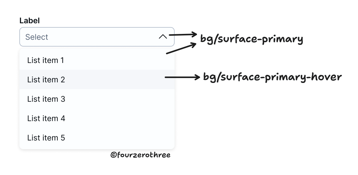
bg/surface tokens
The “bg/surface” tokens are for those components that sit on top of the page or screen.
For the surface tokens, there are 3 levels of hierarchy them being primary, secondary and tertiary (light to slightly dark, 2-3 points in the colour ramp).

There is also an “inverse-primary” surface token, for those components, that may have to be inverted (dark/black) in light mode.

For all three levels of hierarchy, there are state colours as well - hover and pressed.
bg tokens for brand and supporting colours
For broadly every token “group” in my list (bg, text, icon and border), I have tokens created for greys as well as brand and supporting colours.

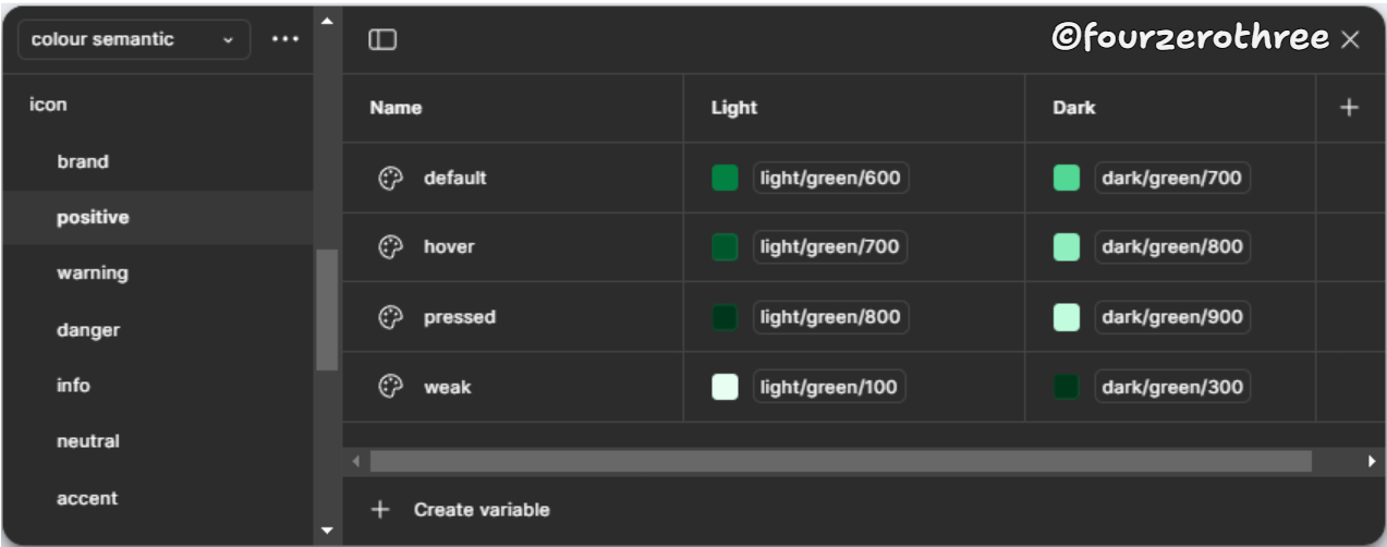
Across bg/brand and supporting colour tokens (bg/positive, bg/danger, bg/warning etc) the token names are very similar. The only difference being the “semantic” they define (brand, positive, negative, warning etc). On a broad level there are 3 types
default - one with default surface colour (usually dark), e.g.,
bg/brand/default.weak - to define surfaces that are light, e.g.,
bg/danger/weak.weakest - this was another token I had defined to be lighter than the “weak” token, e.g.,
bg/positive/weakest.
And, since these colours could be potentially applied to interactive elements each type would also have state colours - hover and pressed (refer image of variables above).
Button Brand

Button Danger

Alert

Text and Icon tokens
Like the “bg” tokens, “text” and “icon” would have tokens for greys, brand and supporting colours. Let’s start with greys.
Text-tokens

Icon-tokens

Hierarchy
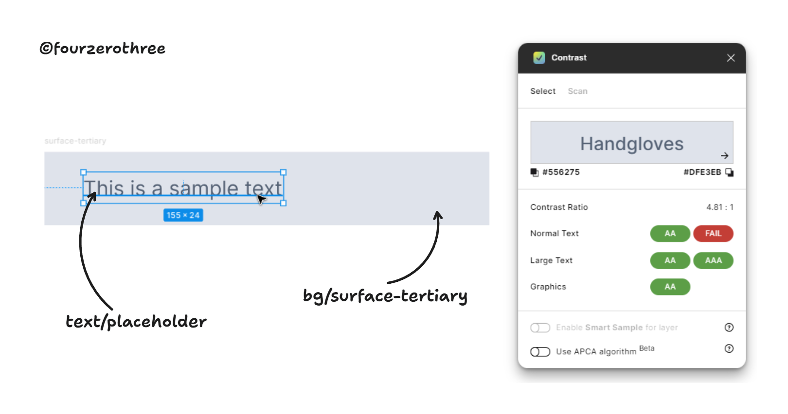
For both text and icon, I want a primary, secondary and tertiary text colour with varying shades of grey with primary being darkest and tertiary being lightest in this hierarchical spectrum. Add to this list, a token for placeholder, e.g. text/placeholder.


For the icon however, I don’t have a placeholder colour. I would use the icon/tertiary token if needed.
States
For states I may need a disabled text colour.

💡Important to note:
The placeholder (and the tertiary) text colour passes the contrast ratio test when paired with the darkest surface colour -
bg/surface-tertiary(I am not considering theinverse-primarytoken here as the darkest).
The disabled text is always paired with a
bg/disabledcolour and fails the contrast test. I let this pass because WCAG 2.1 says:
User Interface Components that are not available for user interaction (e.g., a disabled control in HTML) are not required to meet contrast requirements.

Link
I found a use case for creating “link” text tokens for the “link button” components (refer the text tokens image above).
text/link-default- link buttons (blue colour)text/link-hover- default link buttons (blue colour) in the hover statetext/link-neutral- neutral link buttons (grey colour)text/link-neutral-hover- neutral link buttons in hover statetext/link-danger- link buttons for negative actions (red colour)text/link-danger-hover- negative link buttons in hover state

Text/Icon tokens for Brand and Supporting colours
For both text and icons I have
default - for default text and icon in brand colours (dark colours against a light surface).
weak - for text and icons in brand colours that are light (light colours against a dark surface)
hover and pressed for the default text and icon colour (states).

Similar token names extend across brand and all supporting colours for both text and icons (except for the “semantic” - brand, positive, danger, warning etc).

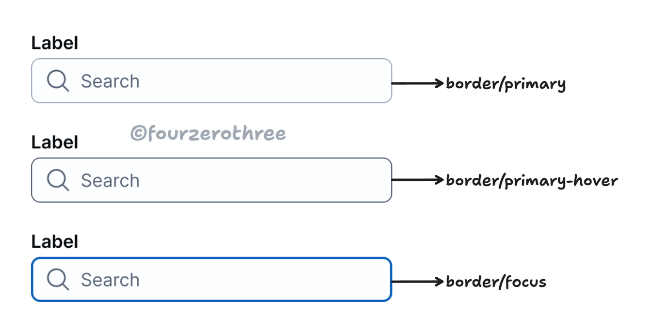
Border tokens
As with my surface, text and icon tokens border has tokens for
greys

brand and supporting colours. Similar names extend across the brand and supporting colours.

Hierarchy
Borders (greys) have a primary, secondary and tertiary colour token, with the colours getting lighter down the hierarchical spectrum.
States
Tokens defining grey borders have a hover state, while the supporting colours also have a pressed state. This is usually because of the secondary buttons having borders that may need a pressed state. There is also a border colour for “focus” state which would always be in the brand colour.

Closing Thoughts
Looking back, I’ve refined this approach dozens of times, and I’m still finding ways to improve. I think that’s the nature of design systems. There’s no single “right way”, only what works best for your product and team.
At the end of the day, make sure your colour tokens do the following.
They scale and adapt to new themes.
They make your design system flexible without making things overtly complex.
Most importantly, design tokens should be easy to understand and use for both designers and developers.