Plotting matrices to create consistent and scalable colour tokens
Design Systems - Design (colour) tokens
I remember learning all about colour, knowing how to create them in Figma, and feeling confident to move forward but getting stuck when I needed to make them for specific use cases. Where or how do you actually start damn it?
Even if you do start and somehow fumble your way in, you end up with inconsistent names that don’t scale as your Design System scales in complexity. Honestly, you could end up with 200-300 colour variables/tokens for a Design System and that’s a lot. You might as well set them up for success.
To solve this, you need a system from the beginning - a consistent structure for a token, a repeating pattern for your token names. I know this doesn’t sound helpful yet, but bear with me. We’ll slowly lift off.
Structure of a colour token
I use this structure fairly consistently. I talk about what constitutes the structure of a colour token here. Reading that would give you a primer, moving forward with this post.
Creating your first set of variables
When I was creating Tenet UI (personal project - design system), right off the bat I needed a first set of colour variables for the components I will create. I mean, I don’t want to “not” have variables to assign when I have a component ready. And here’s where you may get stuck.
What colour variables should you start with?
Do you create them as and when you create the components?
Do you set up a set of colour variables upfront that you may commonly end up using?
I recommend taking the second route.
I mean, it’s a hybrid approach. You create a set of variables you would likely use repeatedly and later create those you may have missed the first time around, as and when the need arises.
Breaking things down!
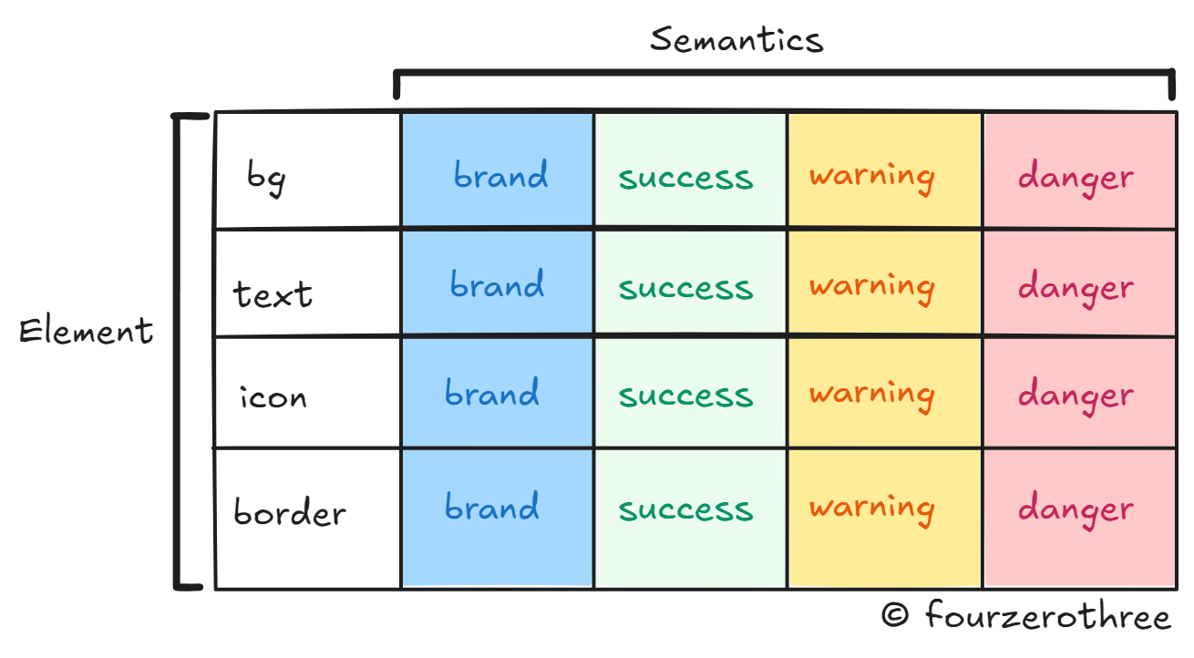
The idea here is to plot a matrix of sorts, which could help you create a system. This would help you maintain consistency across token names and make them scalable.
Referring to the “token structure” image above, we’ll begin with the element. Ask yourself, “What am I applying a colour to?” and you have your answer, namely
surface or background (I’ll stick to background)
text
icon
border
Each of these elements could be assigned colours from greys to supporting colours like
brand
success
warning or
danger
And… you have your semantics!
📖 Read next:
- Crafting a semantic colour system: Fixing the colour chaos, one semantic variable at a time
- Post #5 (Design System Chronicles) - Semantic tokens (colour) in action
Plot these two together and you have this matrix 👇
💡I’ll come to the greys later
This means, for example, your background of a component could have tokens like bg/brand, bg/success, bg/warning, bg/danger and so on.
In our token structure, hierarchy comes next. But let’s skip that for now and move on to states.
All our components have different states -
default
hover
focus
pressed and
disabled
Plot semantics and states together and create another matrix.
💡Note
I didn’t include the “disabled” state in the semantics-states matrix. The idea here is that “disabled” usually has the colour of a different hue (grey) and not of the semantic (brand, success, danger) itself.
This is opposed to other states like hover because, in essence, the hover state would have a colour that is one shade darker than the default state but has the same hue. Hence states - default, hover and pressed have a place in the sematics-states matrix.
💡For a disabled button, I assign bg/disabled.
As is evident from the image above, you combine both the matrix we plotted to get a more complete picture of the token.
This leaves us with hierarchy in our token structure.
Think about components without supporting colours or semantics. I am referring to components predominantly made of greys.
Components have elements bg, text, icon and border and each could have varying shades of greys. I like to use hierarchy here. This is how I go about it.
Elements of components, for light mode, go from light to dark or dark to light. This variation is represented as hierarchy - primary, secondary and tertiary.
Similarly, these tokens could in turn have states.
Here is an example dropdown component.
Like our first set of matrices, combine the element-hierarchy matrix and the hierarchy-states matrix.
Do the same for semantics (and hierarchy) as you did for elements as well. Examples,
bg/brand-weak (element/semantics-hierarchy)
bg/brand-weak-hover (element/semantics-hierarchy-state)
bg/brand-weak-pressed (element/semantics-hierarchy-state)
Instead of the primary or secondary notation to differentiate between light and dark, I used weak, in the above examples. You could also use hierarchy terms such as subtle and subtlest. Depends on how you want to name them.
Closing Notes
At the end of the day, you don’t need to have all of your colour tokens mapped out before you get going. That’s not possible nor necessary. But having a good set of tokens created upfront helps and the matrix plot is a nice exercise to get you going. But here are a few ways you could make the art of creating colour tokens more natural.
One is the obvious route. Create component sets with various states and assign colour tokens to them.
Take snapshots of screens/pages from sites like Mobbin and start mapping colour tokens to the components in the snapshot.
Most importantly whether you do the former or the latter always remember to complement your exercise by referring to and comparing your tokens with colour tokens/variables in available Design Systems and UI kits. Understand why Design Systems have a certain structure and a pattern by reading up their documentation.


