This was my color palette for a practice project when I just started learning Product Design.
And this was my color style guide.
Back then I thought I did a decent job. In fact, in the early days, I thought all I had to do was read up on colour theory and understand how to pick the right colours for a project. Nothing wrong with that, but tell you what. I later realized, that creating a robust and purposeful colour palette and having good naming conventions and rules around them so I don't have a problem applying the right color, mattered more.
At the beginning of any project, I like to take great care in trying to set up the foundations first (such as colours, typography, and spacing rules). Especially colours.
With this out of the way, I breathe a sigh of relief. This minimizes a lot of decision paralysis for me, both during the design of components and later the screens/pages. I just stick to them.
You see, colours are to be used purposefully and frugally. You need a system of sorts to do so. A system that helps you apply the right colours to elements in a component purposefully and consistently.
Optimizing the creation of a colour system
Let's take a moment to map what we may need to create such a system to optimize this workflow.
1) On a high level you have 3 or 4 types of colours.
Primary/Brand colour,
Accent colour (complementing your Brand colour),
Greys(including pure black and white) and
Supporting colours/Feedback colours (error, success, and warning).
2) You may need different tints and shades for the respective color groups. This gives you flexibility in assigning colors to your interface. This extended colour palette helps assign colours for different contexts like backgrounds, interactive components, borders, text, and other elements (I’ll delve into this subsequently).
💡Tip

I recommend creating tints and shades of your colors at the very start of the project. This will save a lot of time down the line.

Having this set right from the get-go forces you to use only the defined colours, ensuring consistency in color usage. Moreover, you have a nice palette you could hand off to engineers.
3) You need a naming convention for your colors. This is a "system" in itself, for which we could use Figma variables.
Creating Tints and Shades
After you have defined your colours, creating various tints and shades of each respective colour is the way to go. Tints are lighter variants of the primary color of your swatch, and shades are darker versions.
💡It is recommended to create between 10-12 tints/shades for each colour. To better understand this, read colour values in terms of “Hue, Saturation, and Brightness” (HSB) rather than conventional “Hex”.
I’ll let you read this wonderful article, Color in UI Design: A (Practical) Framework by Erik Kennedy for a deep dive into this.
Tint 👉 Primary hue + lower saturation + Higher brightness
Shade👉 Primary hue + Higher saturation + Lower brightness
📖 Read next:
- Crafting a semantic colour system: Fixing the colour chaos, one semantic variable at a time
- Plotting matrices to create consistent and scalable colour tokens
There are a few ways you could approach doing this.
You could use well-crafted custom colour palettes from websites or UI kits. The idea is to select colour swatches closest to your brand, greys, and supporting colours and copy them to your Figma file. Some good sources would be Tailwind CSS, Radix, and Untitled UI.
Use tools/plugins to generate your tints and shades. Plug the hex code of the color of your choice (in the plugin) and generate an extended palette. Some good plugins would be Supa Palette, Foundation colour generator, Colorbox, and Material theme builder.
Also, you could manually tweak the "Hue" value of any existing color palette (from websites/UI kits) to a value of your choice, while leaving the "Saturation" and "Brightness" values as is.
Lastly, of course, is for you to create the entire swatch manually, by carefully adjusting the "Saturation" and "Brightness" values while keeping the same "Hue" value.
For a deeper dive into creating tints and shades, I highly recommend going through The Ultimate Guide to Creating Color Palette in Figma by Jordan Hughes creator of UntitledUI and this video on How I make UI color palettes by UX Tools.
Now, with this done, you have colors in raw values.
Colour tokens (Naming conventions)
Design tokens are a method for managing design properties and values across a design system. Each token stores a piece of information—such as colour, sizing, spacing, font, animations, and so on. To make them easier to refer to, each token also gets a name.
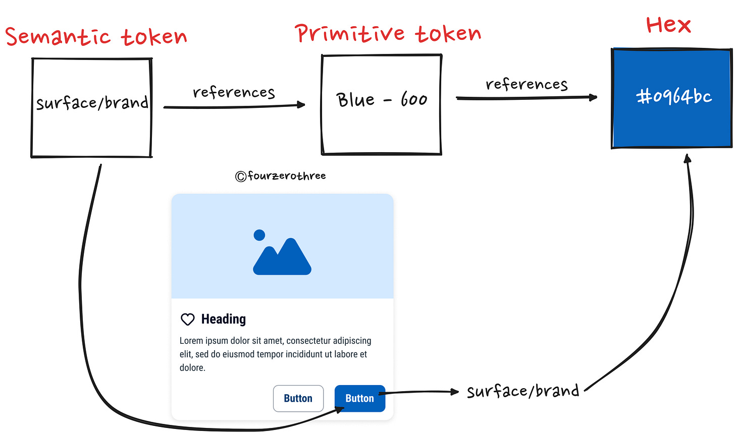
I am a big fan of creating colour tokens using Figma variables irrespective of how big or small a project might be. The biggest takeaway here is that colour tokens are named after "how" you might want to use a colour as opposed to "what" colour it is.
For example, the token surface/brand tells us how the colour is to be used. "Surface" tells us the colour is to be used on a background colour. "Brand" tells us it is the brand colour that is to be used.
Compare this to blue-600 which only tells us it is a particular shade (600) of blue colour.
Primitive and Sematic tokens
Referencing the example above, note that colour tokens can be broadly classified as
Primitive tokens (example - blue-600)
Sematic tokens (example - surface/brand)
The Primitive token holds the raw hex value of the colour, while the value of the Primitive is mapped to a Semantic token
This greatly helps maintain consistency when applying colours to different elements. I know what colour to apply where without having a decision paralysis (should I apply blue-600, 500 or 800?).
Honestly, knowing how to create a robust system of colour tokens is a handy skill to have especially since naming design tokens could become complicated when your design system starts to scale. The key here is to create a predictable, easy-to-use and easy-to-create naming convention that scales.
💡To be honest…
Naming conventions for design tokens can be difficult and may take time to set up. It’s important hence, to understand the structure of the name of a colour token.
What constitutes the structure of colour tokens?
Its efficient practice to break down the structure of a token into many different parts.
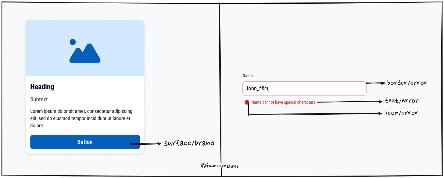
1) Elements
In the beginning, its helpful to map what it is you would usually apply colours to.
As you can see from the image of the card component above, colours can be mapped to being applied to 4 elements in any component.
Surface (or backgrounds)
Text
Icon
Border - stroke colours for component borders and dividers
Sometimes, the text and icon elements are clubbed as “Foreground” or “Content” referring to any foreground or content in a component.2) Semantics
Secondly, think about the semantics of the colour concerned. Is it a brand colour? Are they supporting colours like Success, Warning or Danger? Map them. You might want a surface/background with the brand colour, and maybe a colour for an error or success text.
3) Hierarchy
What about the hierarchy of the concerned element you might be applying the colour to? For example,
You might want 2 types of surface/background colours, a primary and a secondary colour.
Maybe you want strong (dark) text colour against a light surface colour and a weak (light) text colour against a dark surface colour.
4) States
Finally, we have different states the component could assume.
Hover
Pressed
Focus
Disabled
Here are example design tokens I created for a screen on the Coursera mobile app as part of my practice.
Learn and practice creating Design tokens
Go through well made UI kits and Design systems to get a hang of how design tokens have been named. Atlassian, Carbon, Lightning Design System, Twilio, Untitled UI, Once UI, UI Prep are a few great examples you could look into.
You could resort to taking screenshots from an app of your choice, reverse engineer the colour palette and create your own colour tokens. This is great practice.
Closing Notes
While I could and have a lot more ground to cover on colour, I’ll stop here. I honestly think, digesting this framework to define and create a colour palette and design tokens would optimize your UI design workflow. It certainly has for me. However small or big a project is, I recommend resorting to creating colour tokens using Figma variables. Now, some may think its an overkill to use tokens for all projects. But think about it, color tokens, are essential components for creating consistent, scalable, and maintainable systems for any project.
Key here is to actually practice using this framework. Though it might look quite straightforward on paper, executing it has its own challenges. A major challenge is the time it takes to create a robust palette especially if you are also going to create tokens using variables. But its worth the effort. All the work upfront, saves you a bunch of time down the line. I’ll sign off by referencing a bunch of articles I found useful. Also note that, these articles apart, I have learnt a ton by reading up on the documentation of various design systems, few being Atlassian, Goldman Sachs, Carbon and the like.


