
Crafting a semantic colour system: Fixing the colour chaos, one semantic variable at a time
Naming and Building Semantic Tokens for Modern Design Systems

Crafting semantic colour variables/tokens for a project or design system is no joke. Names need to be clear enough to guide designers but flexible enough to grow with the system. To be fair, inconsistent naming and designers second-guessing every choice is going to be inevitable. It always does feel like a maze. Creating a semantic color system is always a continuous iterative approach.
That said, let’s go through an approach to crafting a semantic color system.
🎥 Watch the Video
The heck are semantic colour variables, really?
Alright, so before we dive into naming strategies or any Figma wizardry, let’s get one thing straight: what exactly are semantic color variables? I mean, I know you may have been put through this in numerous other articles and at the risk of sounding like a broken record let me get into what they are. Afterall, a quick overview would ensure we are on the same page.
The Hex and the Primitive

Take these 2 examples,
The first one (on the left) is an open state variant of a drop down. The menu item’s hover state has a colour
#F5F7FA.The second example is an Alert component (success variant) with it’s background/surface colour being
#E6FF2.
These colours are raw hex codes.
Ideally I want to define them with variables/tokens.
Design tokens are a method for managing design properties and values across a design system. Each token stores a piece of information—such as colour, sizing, spacing, font, animations, and so on. To make them easier to refer to, each token also gets a name.
Design tokens are a methodology for expressing design decisions in a platform-agnostic way so that they can be shared across different disciplines, tools, and technologies. They help establish a common vocabulary across organisations.
While defining my colour variables in Figma, I define 2 types,
a) Primitives and
b) Semantics (you could also define component specific tokens, which I don’t want to get into, for this post).
The primitives are mapped to hold the raw hex values.

Note in this example
grey/200 is the primitive that holds the value
#F5F7FAandgreen/100 is the primitive mapped to value
#E6FF2
Primitives are straightforward. They are basically named after the colour and spectrum they are in the colour ramp,
green-100
green-200
green-300
and so on.

The problem I have with hex values or primitive variables is that they are not telling me how I might apply it to an element or component. I could use grey/200 anywhere!
📖 Read next:
- Plotting matrices to create consistent and scalable colour tokens
- Post #5 (Design System Chronicles) - Semantic tokens (colour) in action
Semantic variables
As for the semantic variables, they are mapped to the primitives I defined initially.

Rather than just slapping a label against a colour like grey/200, the semantic variable bg/surface-primary-hover tells me how the colour is to be used.
"bg" tells me it's a background colour, “surface-primary” tells me it is used on a surface of a component and that it's the primary or lightest shade (in my case). The term “hover” tells me it's a hover state.
Not only does this make it easy for me to apply colours, it also helps maintain consistency when applying colours to different elements. I know what colour to apply and where, without having a decision paralysis (should I apply grey-200, 300 or 400?). I have a shared design language with other designers.
Strategies for creating semantic variables (that could work)
Taxonomy/Structure
We use semantic variables to have a shared language to make life easier. On the flip side, however, we have to come up with names that are
easy to understand,
consistent and
can scale
which is quite the challenge.
I have a taxonomy that I stick to. But this can vary depending on your team or company.
Now, honestly coming up with a naming strategy isn’t always linear, sequential or straightforward. There is this continuous iteration going on in parallel. I am not happy with a name? I go back and change it. And that's fine.
💡For a primer into semantic variables, here are 2 posts I have written on colour variables and tokens previously,
This is the taxonomy structure that I stick to while creating semantic variables for colours. I shall refer to this structure in the rest of this post.

This Schema talk, “Design Tokens on Asana's Design Systems Team” in 2021 by the Asana design team, goes into how they structured and named their tokens.
This is similar to the taxonomy in the first image. This is how it would map out 👇

I have come across a few other ways designers structure tokens. But I find this taxonomy most intuitive. This taxonomy is also more or less closely aligned with the Simple Design System created by Luis Ouriach in Figma. I take a lot of inspiration from his work as well.
Semantic colour system - Strategies
There’s no perfect method. Every design system, project, or even individual component has its quirks, and you have to embrace the chaos a little to get it right. My process? It’s scrappy.
Before diving headfirst into naming, I pull up or create a few components. Why? I try to check if the naming system makes sense for these. More often than not, it would then (hopefully), work for the rest.
I follow the method I describe here and come up with a “rough” first set of semantic variables. I create a first set of variables I would likely use repeatedly and later create those I may want, as and when the need arises. The first set is not perfect though. I keep iterating.

I use this first set (of variables) to assign to the components I created. I recommend doing this for 2 reasons
Firstly you get to experiment, assign colours and get a visual feel.
Secondly, I also check for colour contrast ratios. If a colour combination fails or nearly fails the test, I could quickly switch the primitives (mapped to the semantic variable) accordingly to make the combination pass contrast ratios.

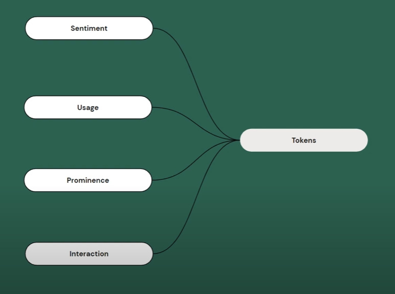
When creating variables the key is to understand that all elements (bg, text, icon, border) in our component sets could have (refer the image “structure of colour token/variable”)
semantics
hierarchy and
states
The element and semantic part in a token is easy.

Its “bg” for element and “positive, warning, danger, brand” for semantics (refer the image - Structure of design token/variable).
Notice the “default” in the token name. This is for the hierarchy. I would need “positive” or “danger” or any “semantic” colour to have a dark and a light shade. I prefer the “weak” notation for the hierarchy.

Also, maybe you need an even lighter shade? I don’t know, maybe? This is where you need to trust your eyes and decide for yourself.

Of course, the image may not seem to show you a stark difference between weak and weakest, but I prepare for the worst and create another variable here. So the default is the dark shade and the weak and weakest give me the light shades. You see the pattern here? Dark and light shades (hierarchy) for all my “semantic” colours assigned to “backgrounds”
element-semantic-hierarchy
bg/brand/default
bg/brand/weak
bg/brand/weakest
And if you use these colours for components like buttons, you may need a hover and a pressed state as well. Which translates as follows.
element-semantic-hierarchy-state
bg/brand/hover & bg/brand/pressed
bg/brand/weak-hover & bg/brand/weak-pressed
bg/brand/weakest-hover & bg/brand/weakest-pressed
This way, this notation could extend across all my semantic colours assigned to backgrounds.

💡Note
Rather than bg/brand/default, I could do away with “default” and just have bg/brand. This works fine too. Similarly, notice the name bg/brand/hover. I named it this way rather than bg/brand/default-hover. It works either way.
If you think this way, you could plot a mental map, a matrix of sorts to tabulate the combinations of variables you may need.
Extend the same strategy to “text” and “icon” (element). I would require a dark text/icon against a light background and a light text/icon against a dark background.
text/brand/default & text/brand/weak
icon/brand/default & icon/brand/weak
Consider states as well and you have,
text/brand/hover, text/brand/pressed
text/brand/weak-hover, text/brand/weak-pressed
icon/brand/hover, icon/brand/pressed
icon/brand/weak-hover, icon/brand/weak-pressed
Mapping variables with Neutrals
Mapping the variables with the neutral colours is where things get tricky, especially backgrounds. Rather than have a common name for “bg” across all my neutral colours, I want to differentiate between pages or screens (housing the components) and the components. What do I mean?
For the page or screen background, which translates to the deepest surface, I would have a variable. And for components sitting on top of it, colours would have a different name. Let’s take this example. This is a recreated design of one of my blog pages.

💡Shameless plug - I created this with a UI kit/Design system I am building called Tenet UI.
Notice the page itself has a colour bg/base, whereas the components - Header, Tabs and Card that sit on the page have the colour bg/surface-primary. Essentially I am assigning those elements with a higher level of prominence as “bg-surface”, whereas the lowest level of prominence in terms of depth would be the page itself which has “bg/base”.
This gives me a little more granular control when I flip to dark mode. I can make the components look a little elevated, with the same tokens.

Here are some names for (background) tokens defining neutral colours.
bg/base
bg/base-strong
bg/surface-primary
bg/surface-primary-hover
bg/surface-secondary
bg/surface-secondary-hover
bg/tertiary
bg/disabled
A quick rundown of sorts
There are 4 elements for which you assign colours - bg, text, icon and border.
Each of the 4 elements could have neutral (grey) and semantic (brand, positive, danger, info and warning) colours.
Hierarchy for neutrals defining backgrounds is from light to dark. Primary would be lightest and Tertiary would be darkest. But this would just be jumps of 1-2 shades (100,200,300 and so on). Eg - bg/surface-primary (grey/100), bg/surface-secondary (grey/200), bg/surface-tertiary (grey/300) and so on.
However, hierarchy for “text, icon and border” neutrals would be from dark to light. Primary would be darkest and tertiary would be lightest. Trust your eyes for this. Jumps here, would also be just 1-2 shades. Eg - text/primary (grey/1000), text/secondary (grey/800), text/tertiary (grey/600) and so on.
For bg/semantics you could have extremes of hierarchy. A dark shade and a very light shade. Hence it may be better to use something like bg/brand/default (which could be brand/600 or brand/700) and bg/brand/weak (could be brand/200 or brand/100). Because the jumps in colour are more than a few steps, I prefer using weak and strong, rather than primary or secondary.