
Designing colour palettes that work for every project
A great design system starts with great colors

I am obsessed with creating a cohesive colour palette for my projects. The obsession started because I didn’t know how to.
Establishing a colour ramp at the very start of your design process is a game changer. It’s no longer about “eye-picking” colours as you go but building a deliberate, cohesive system.
📽️Watch the video version
The heck’s a colour palette/ramp? Why create one?
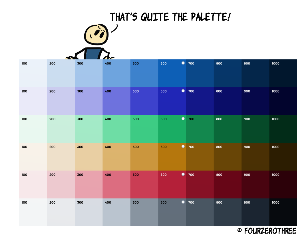
A colour ramp is a spectrum of tints (lighter variations) and shades (darker variations) derived from a single base colour. It's like a visual representation of how any base colour (could be brand, accent, greys and supporting colours) transitions from light to dark. But why the heck do you need a ramp? And why at the very beginning of a project? You may ask.
If you are creating a design system, it helps establish your “primitives”.
Having this set right from the get-go forces you to use only the defined colours, ensuring consistency in colour usage. You avoid “winging it” every time you need a new shade.
You have a nice palette you could hand off to engineers.
Need a new state colour? It’s already there in your ramp. An extended colour palette helps assign colours for different elements like backgrounds, borders, text, icons, interactive states and other assets.
It will save you a lot of time going forward with any project.
While there are a few ways you could achieve this, let's discuss some boring stuff first. The basics help us get good results.
The HSB jargon
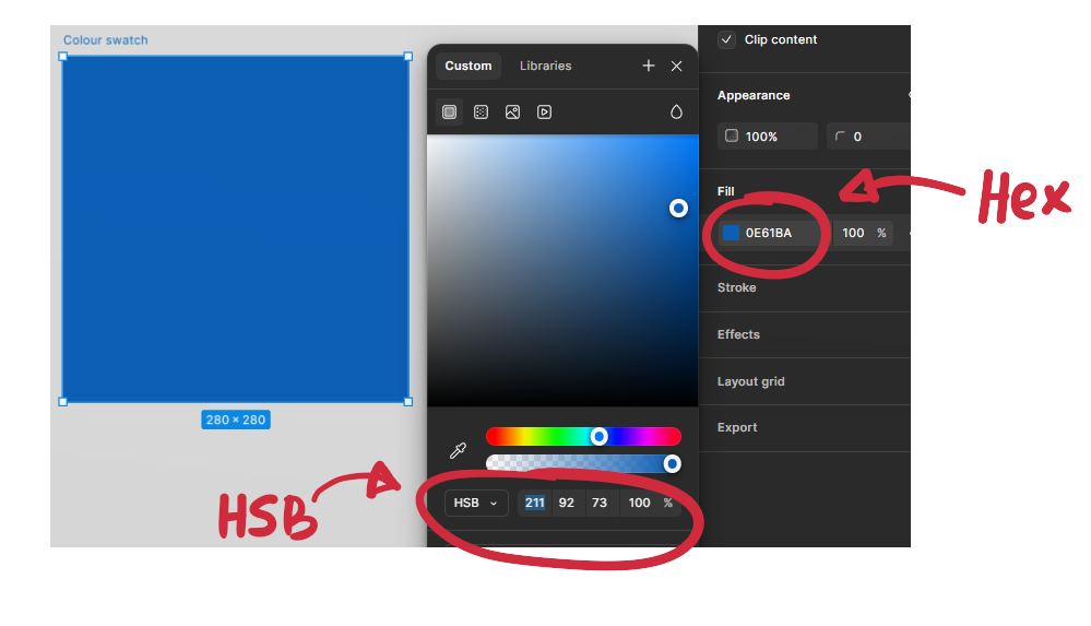
Reading colours as HSL or HSB values rather than Hex greatly helps. I’ll go with HSB for this post as this is how I operate with colours.
For the sake of brevity, I’ll let you read this wonderful article, Color in UI Design: A (Practical) Framework by Erik Kennedy for a deep dive into this. And let me tell you, this article is a must read. It's a great article that just opened new doors of understanding for me with regards to colours.
I’ll however give you a TL DR version of it. Our intention is to create light and dark versions of a base colour. So, if there is anything you could take away with regards to the HSB jargon it's this.
Create lighter variations or tints (of the base colour) by increasing brightness and decreasing saturation 👉 (base) hue + higher brightness + lower saturation
Create darker variations or shades by lowering brightness and increasing saturation 👉 (base) hue + lower brightness + higher saturation
As for the hue, it is the colour itself, a number between 0 - 360, telling you where you are on the colour wheel.
📖 Read next:
- Colours Revisited: Optimizing Your Design Workflow
- Post #4 (Design System Chronicles) - Designing a Scalable and Accessible Dark Theme
While creating the palette, it's okay if the hue is the same number across the spectrum. We could just tinker with the saturation and brightness to create different tints and shades.
However, if you want to get granular with the hue as well, here’s what Erik Kennedy writes in his post,
The trick is to just make the movement of the hue match up with the movement of the saturation and brightness. If you want a darker variation, move the hue towards red (0°), green (120°), or blue (240°), whichever is closest — and vice versa (with cyan, magenta, and yellow) for lighter variations.
Creating the ramp
Step 1: Establish your colours for the project.
You may have 3 or 4 types of colours.
Primary (Brand) Colours: The centerpiece of your palette, used for major UI elements.
Accent Colours: Complementary colors that support the primary color.
Greys: Neutrals for backgrounds, borders, and text.
Feedback Colours: Green for success, red for errors, yellow for warnings.
It is recommended to create between 10-12 tints/shades for each colour. Let’s stick to 10.
Step 2: Establish a base colour
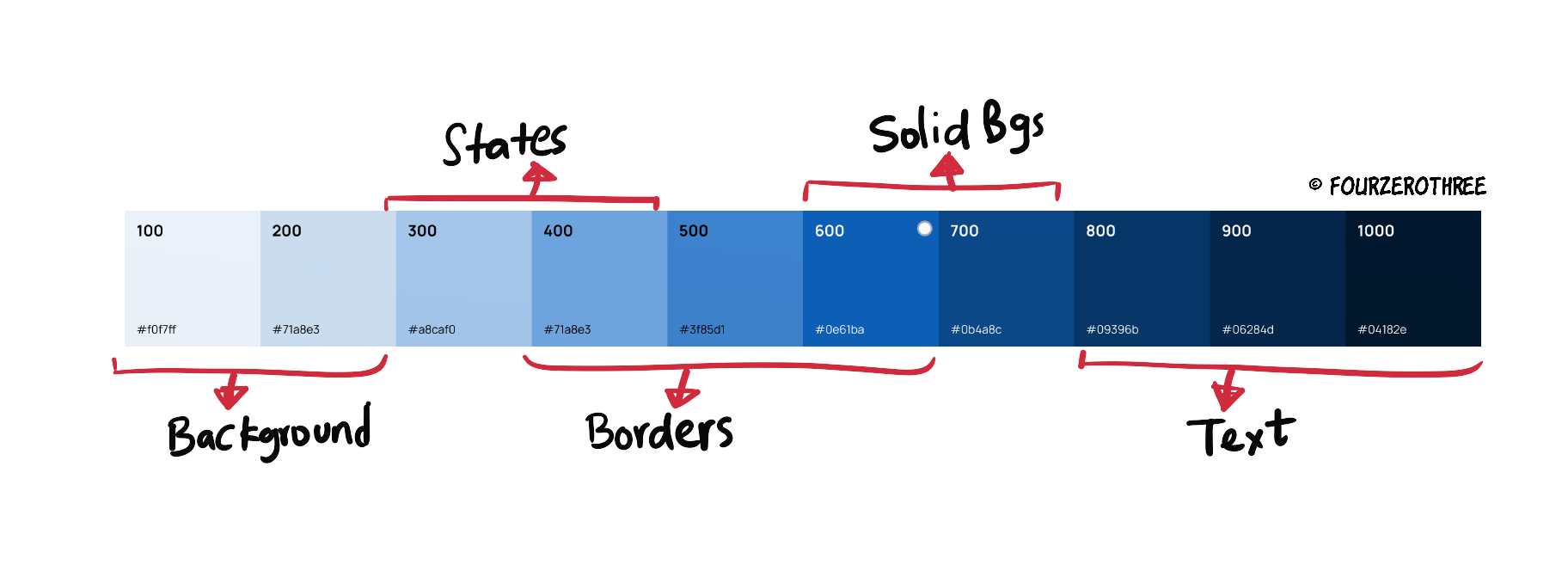
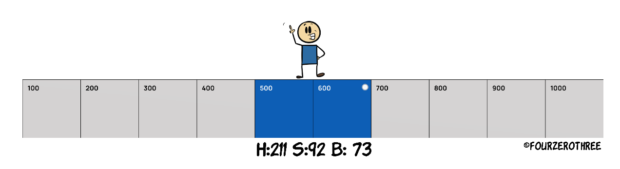
Each category would have one base colour from which you would create your shades. Most probably that would be “500” in your palette (out of 10 colours from 100-1000). This depends though.
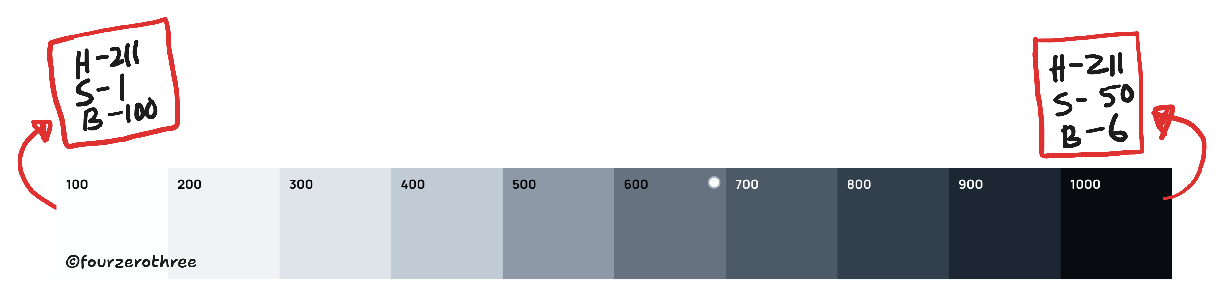
For this exercise, the colour #0E61BA is the base brand colour. I’ll take note of the HSB values - H:211, S:92, B:73.
This (base colour) would be in the middle of the spectrum
(500 or 600).
You would want the darkest colour
(1000)in the spectrum to have saturation (s) 95-100 and brightness (B) 15-30.
The lightest colour
(100)would have S (5-10) and B (95-100).
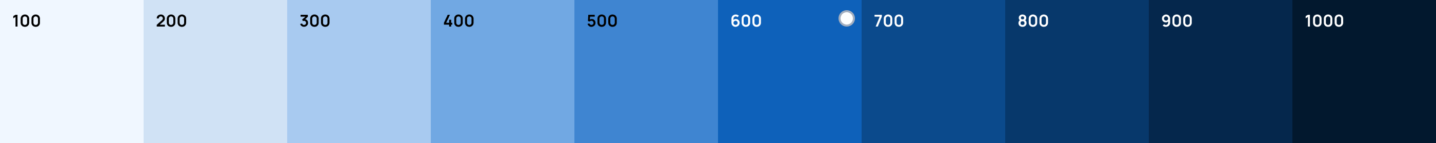
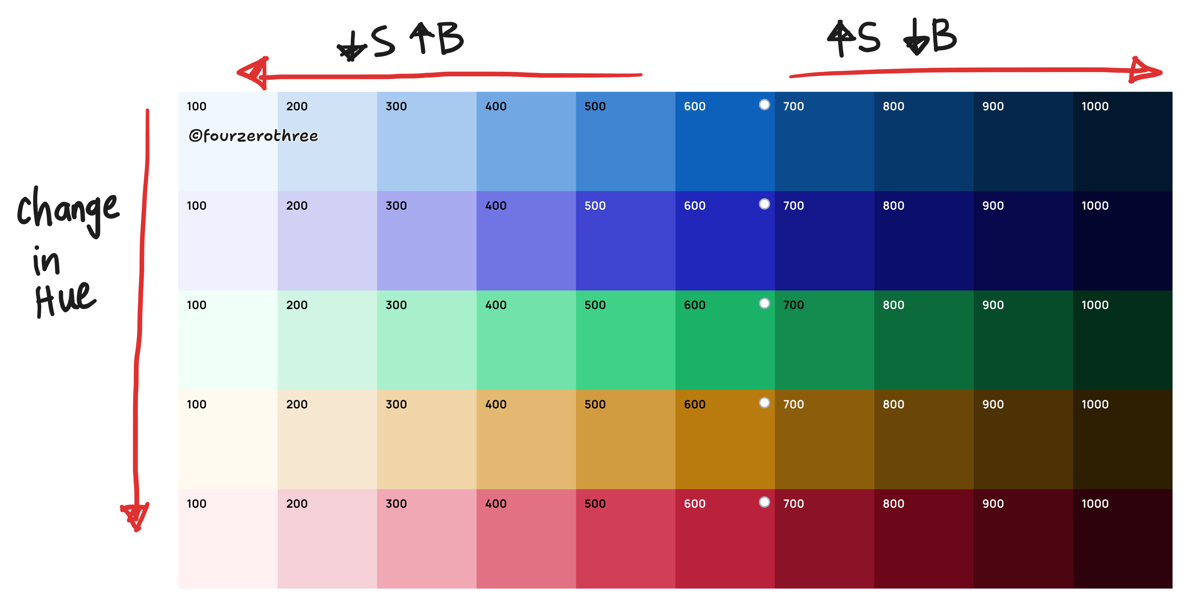
With these 3 colours done, trust your eye and work your way between these points to create the intermediate tints and shades (remember the HSB jargon we discussed). Here’s our brand blue palette. The base colour stands at 600.
Step 3: Creating the rest of the colours
To make all your colours in the palette cohesive, see to it that your other hues (accent and supporting colours) have more or less the same saturation and brightness.
Keep them within 5-10 points of each other.
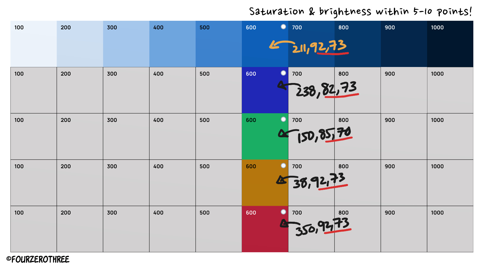
Repeat the process.
And like that you have a cohesive colour palette. Trust your eye for this.
Creating Greys
Creating greys can be tricky. It’s essentially the same as creating the other colours, but we might need to play around a little to get things right.
You would want greys to have the hue of the brand colour so the greys are a little cohesive with the brand, rather than being too neutral.
With the same brand hue, the lightest grey
(100)would have B(99-100) and S (0-3).Darkest
(1000)would have B (5-15) and S(40-60).Note that the saturation significantly drops as compared to our other colours. Having too much saturation would make the darkest grey looking too close to the blue spectrum (since we are maintaining the hue of our brand). With this done, you could work your way from the lightest to darkest.
Other ways of creating a colour palette
Tools/Plugins
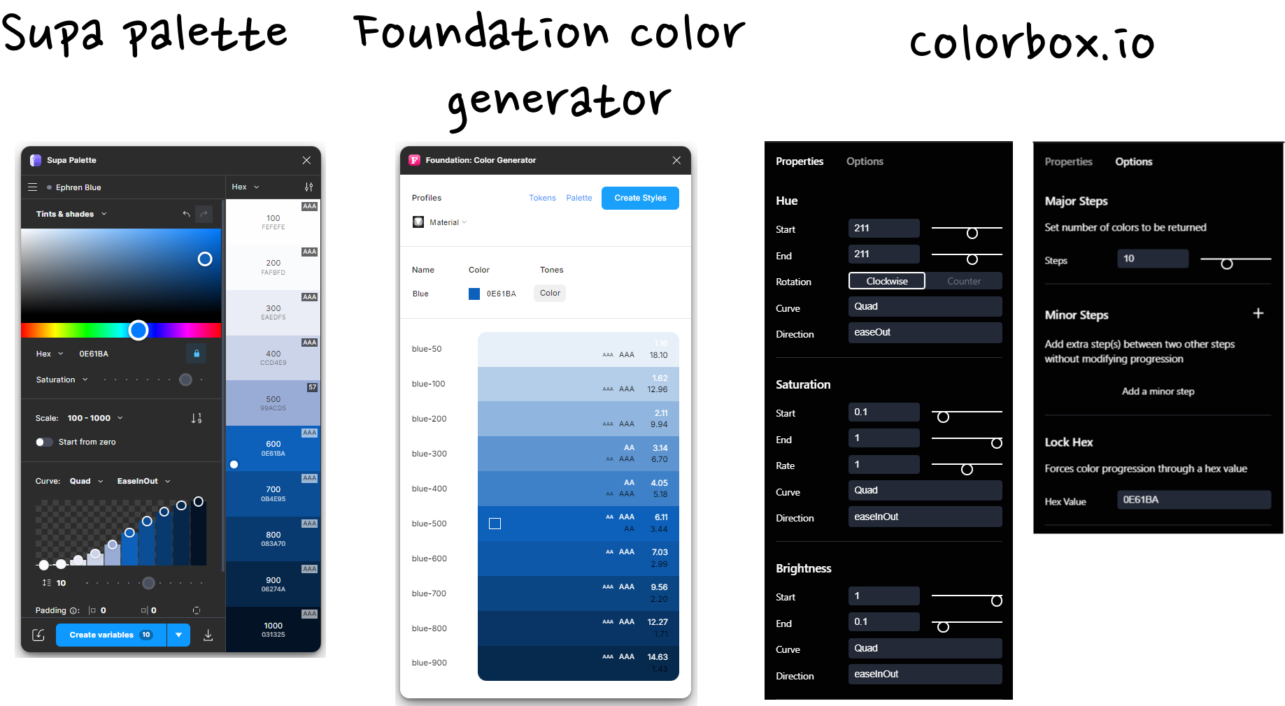
An alternative would be to use tools/plugins to generate your tints and shades. Plug the hex code of the colour of your choice (in the plugin) and generate an extended palette.
I usually use either of 2 plugins Foundation Color Generator and Supa Palette for quickly having a palette generated. I also love using the tool Colorbox (colorbox.io) for this exercise. I’ve got great results and this has been my go-to tool for colours recently.
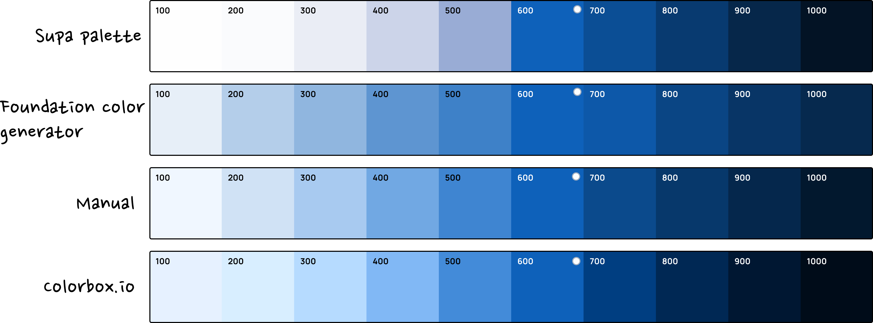
Here are the results of manually creating a ramp and using the plugins and tools I mentioned. I was not very happy with the results of Supa Palette for this exercise.
There are a lot more plugins and tools you could use, some being really good. Here is a post that lists a few.
Ready-made colour palettes
You could use well-crafted custom colour palettes from websites or UI kits. The idea is to select colour swatches closest to your brand, greys, and supporting colours and copy them to your Figma file. Some good sources would be Tailwind CSS, Radix, and Untitled UI.
Tools/Ready-made palettes + Manual tweaking
A hybrid approach is easy and fast as well. Use existing palettes or generate one with plugins and then manipulate values to your liking.
In fact a good way of generating a neutral palette (I find creating neutral palettes difficult) is to get a nice ready-made palette from Tailwind CSS and then tweaking the hue value to match the brand in your project. It would be a lot easier.
Closing thoughts
Generating a colour ramp is a tough task honestly and requires a lot of tweaking. A good ramp brings cohesion, accessibility, and flexibility to your design. And don’t stress if it’s not perfect the first time. Keep tweaking, experimenting, and learning.
A great design system starts with great colors.