
Post #4 (Design System Chronicles) - Designing a Scalable and Accessible Dark Theme

Design System Chronicles (Tenet UI)
Post #3 - Organizing variables | Post #4 - Scalable and Accessible Dark Theme | Post #5 Semantic tokens (colour) in action
Dark themes are a staple in modern UI design, offering users a visually soothing alternative to light interfaces. Creating a dark theme is always a challenge, an interesting one at that, because it's not about just inverting colours. It’s a meticulous process of balancing accessibility, aesthetics, and usability.
The real challenge was in making dark themes feel natural and consistent without compromising accessibility. With Tenet UI I aimed to create a dark theme that is:
Readable: Text and visuals must meet WCAG standards.
Elegant: Colors should feel harmonious and intentional.
Scalable: The system must adapt seamlessly across components and use cases.
Colour palette
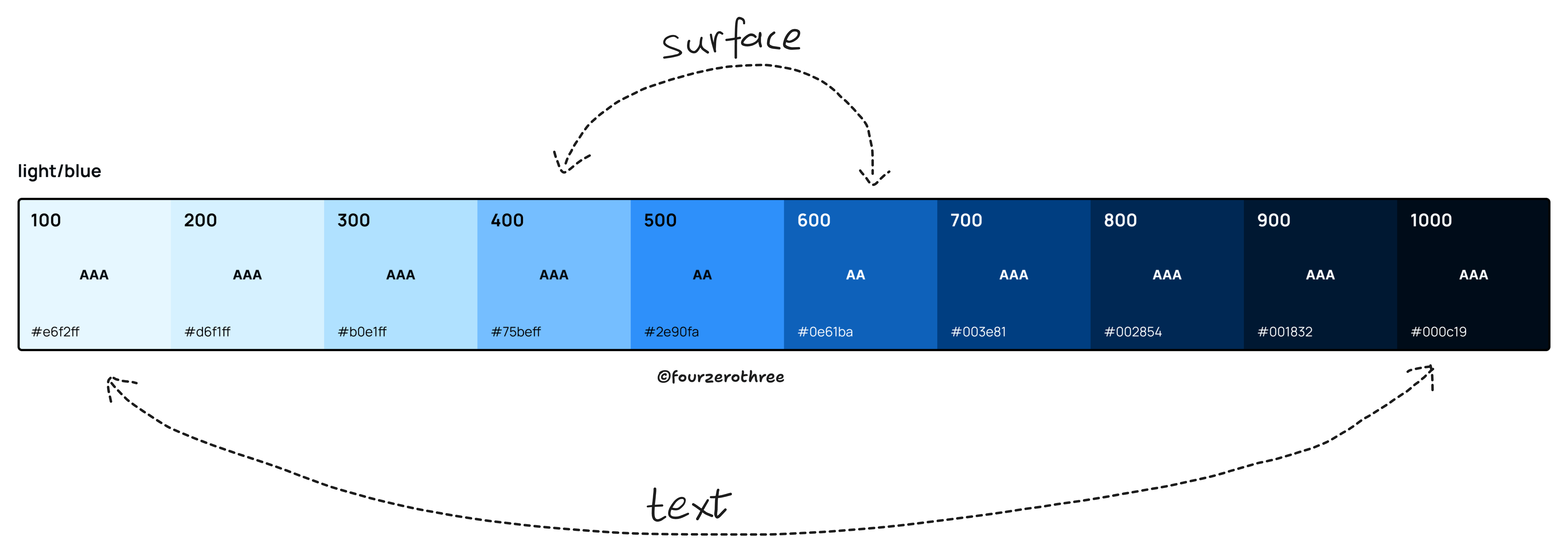
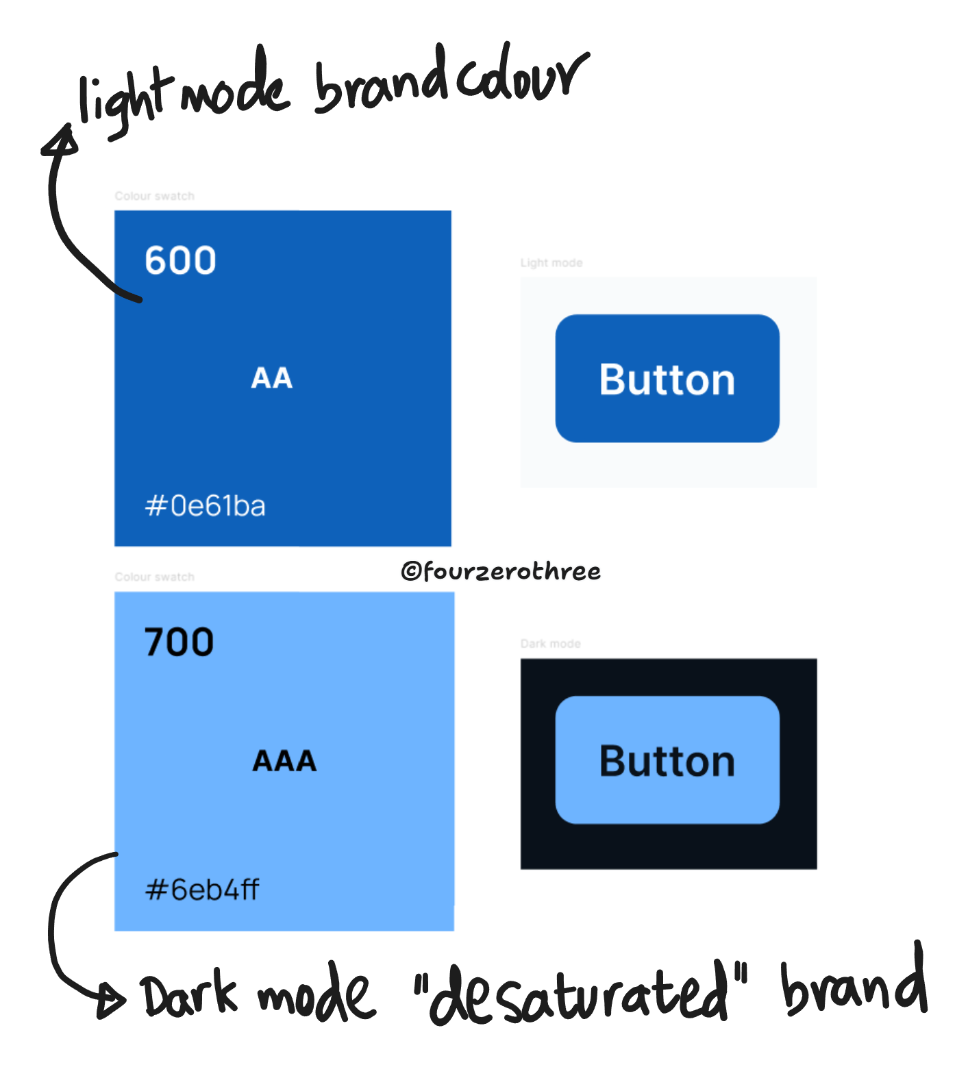
It’s tempting to use the same palette generated for light mode, for dark mode as well. If I did this, the light mode and dark mode colours will be on the opposite end of the spectrum of the same palette. Taking my brand colour palette for example, I would maybe use 600 as my brand colour for component surfaces like buttons, while using 400 for the same in dark mode. For text, light mode’s 1000 corresponds to 100 in dark mode.
While this seems simple at the outset, it could get quite complex as the system scales. Let’s take the neutral palette for example.
The number of colours I have to delegate using greys are quite a few in number. And given I have colours for backgrounds, icons, text and borders, this could quickly get complicated and it becomes very difficult to stay consistent. Also take into account the accessibility and sufficient contrast to be maintained, this would become a nightmare.
I opted to create an equivalent dark mode palette for every colour swatch I had. Though I may have a whole bunch of extra colours, the mapping becomes a lot more simpler and straightforward. Light mode 1000 would correspond to dark mode 1000 and so on. The mapping when creating a dark mode palette becomes almost 1:1. Every “saturated and dark” light mode colour would have a corresponding “desaturated and light” dark mode colour and vice versa. This approach saved significant time and reduced cognitive load.
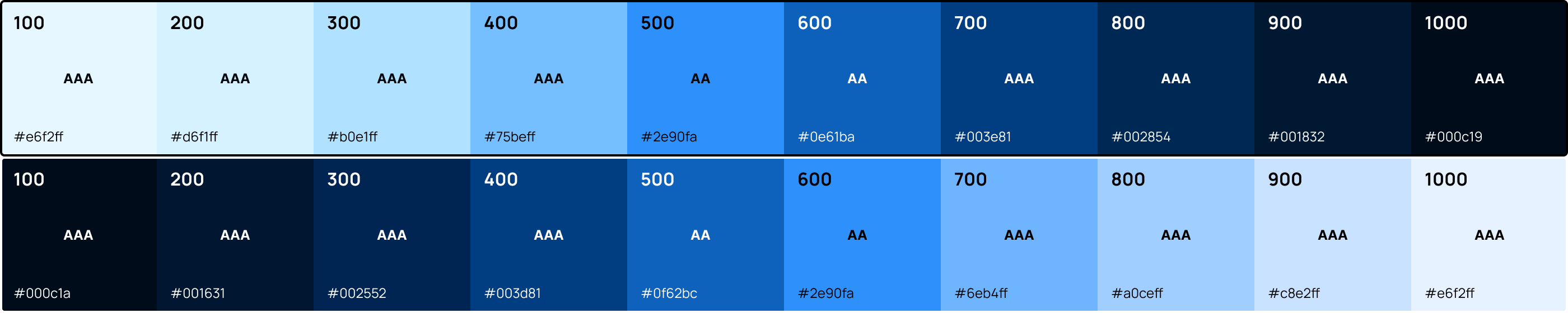
I am not merely flipping the light mode colours. They are slightly different. I delegated the hard work of creating a dark mode palette for each light mode counterpart with colorbox.io.
However, note that I say the mapping is “almost” 1:1, because the mapping sometimes deviates 1 or 2 points. For example, for surfaces like buttons, blue 600 from my light mode palette corresponds to blue 700 in my dark mode palette. For components like alerts, blue 200 from the light mode palette corresponds to blue 400 in my dark mode palette.
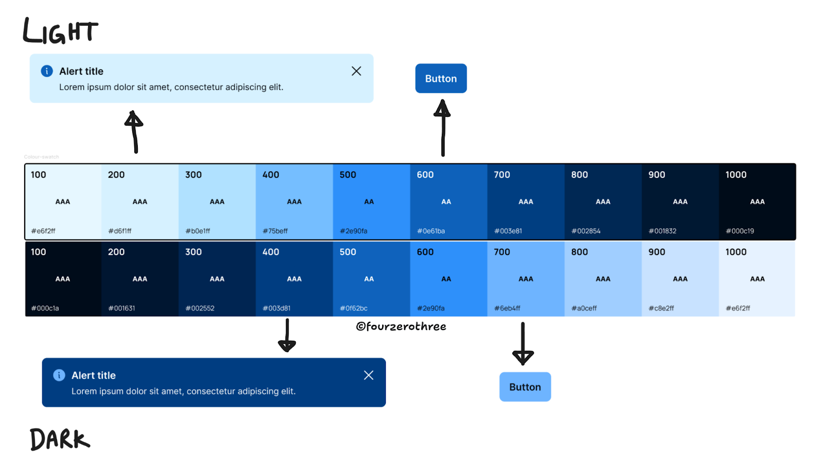
It was a lot easier this way. I initially got my light mode colours right, did a 1:1 mapping of my dark mode colours. Having done this, I flipped a component to dark mode and then constantly iterated to get the mapping right.
📖 Read next:
- Post #5 (Design System Chronicles) - Semantic tokens (colour) in action
- Crafting a semantic colour system: Fixing the colour chaos, one semantic variable at a time
Contrast and Accessibility
One of the most critical aspects of dark mode is achieving the right contrast so text on top of a surface is accessible. In order to get this right, I had to understand and work out a few things with regards to dark mode.
Understanding Elevation
When light comes from the sky, it illuminates the tops of things and casts shadows below them. The tops of stuff are lighter, the bottoms are darker….Higher surfaces are brighter – because they catch more of the sun’s rays.
- 7 Rules for Creating Gorgeous UI by Eric Kennedy
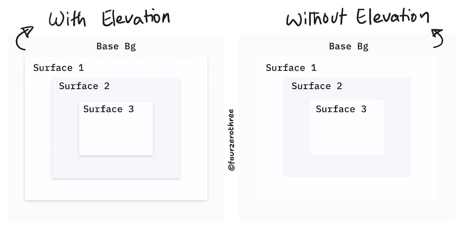
Lighter colours on top of subtle darker colours always look right. Creating layers for light mode is straightforward.
This is one layer on top of another.
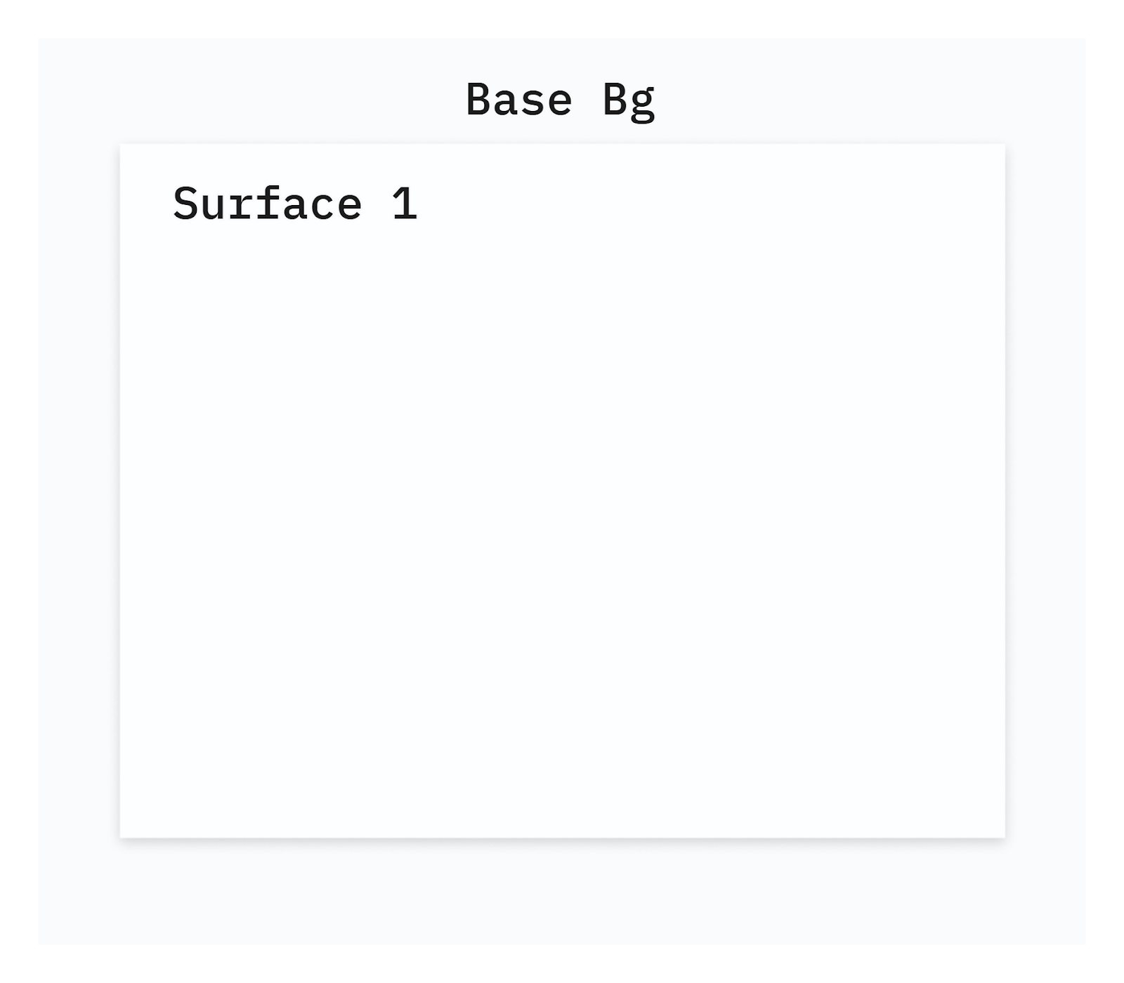
In fact, layering for light mode is flexible, depending on how you may want to design layers.
I may want to stack light layers (of the same colour) on top of each other, with the help of elevation.
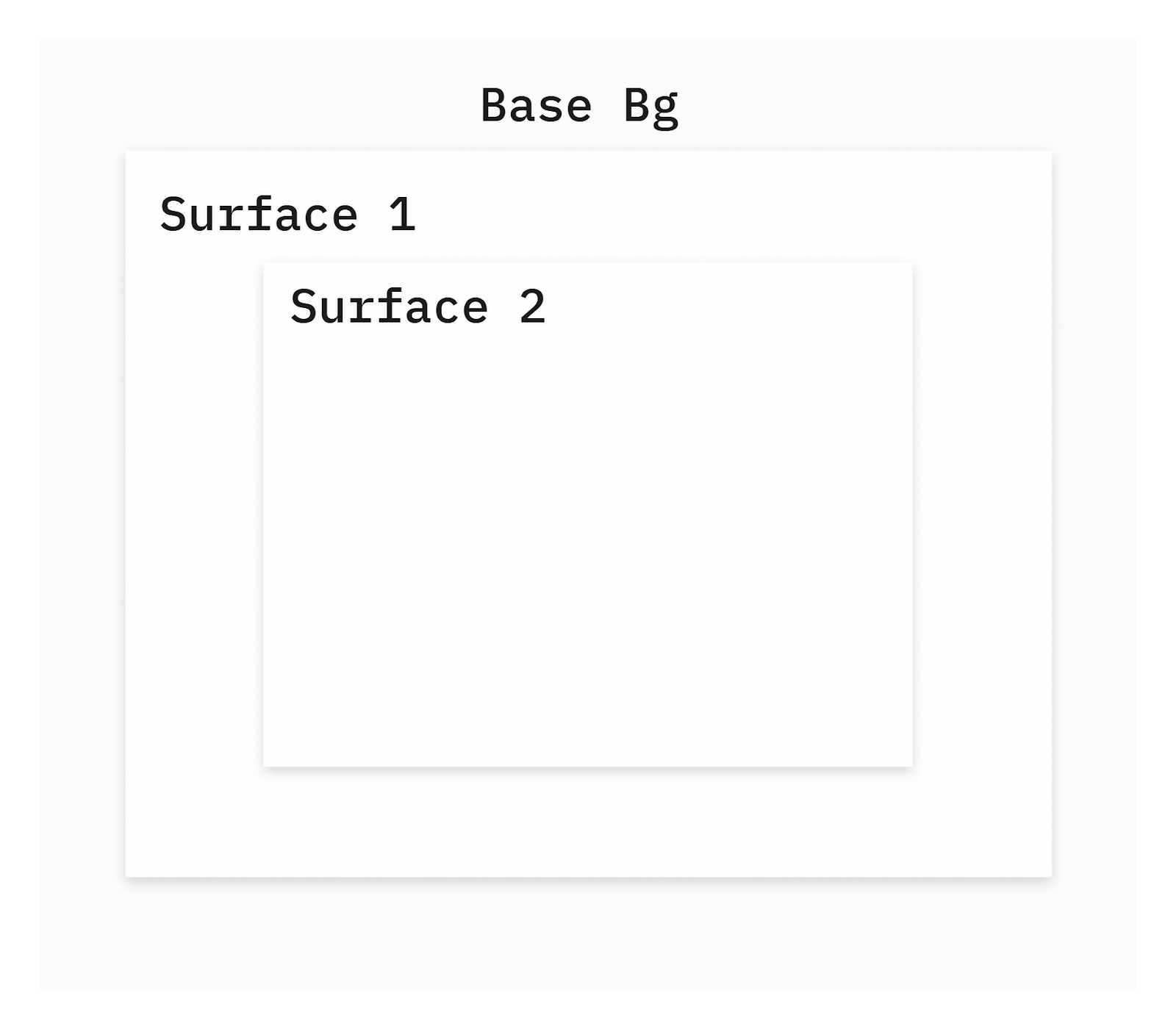
Maybe I want to stack layers with alternating light and darker colours. Now, since I am alternating between light and dark, I may or may not use elevation.
Of course, the principle is that higher surfaces are lighter, but depending on the UI, maybe I have some flexibility in light mode.
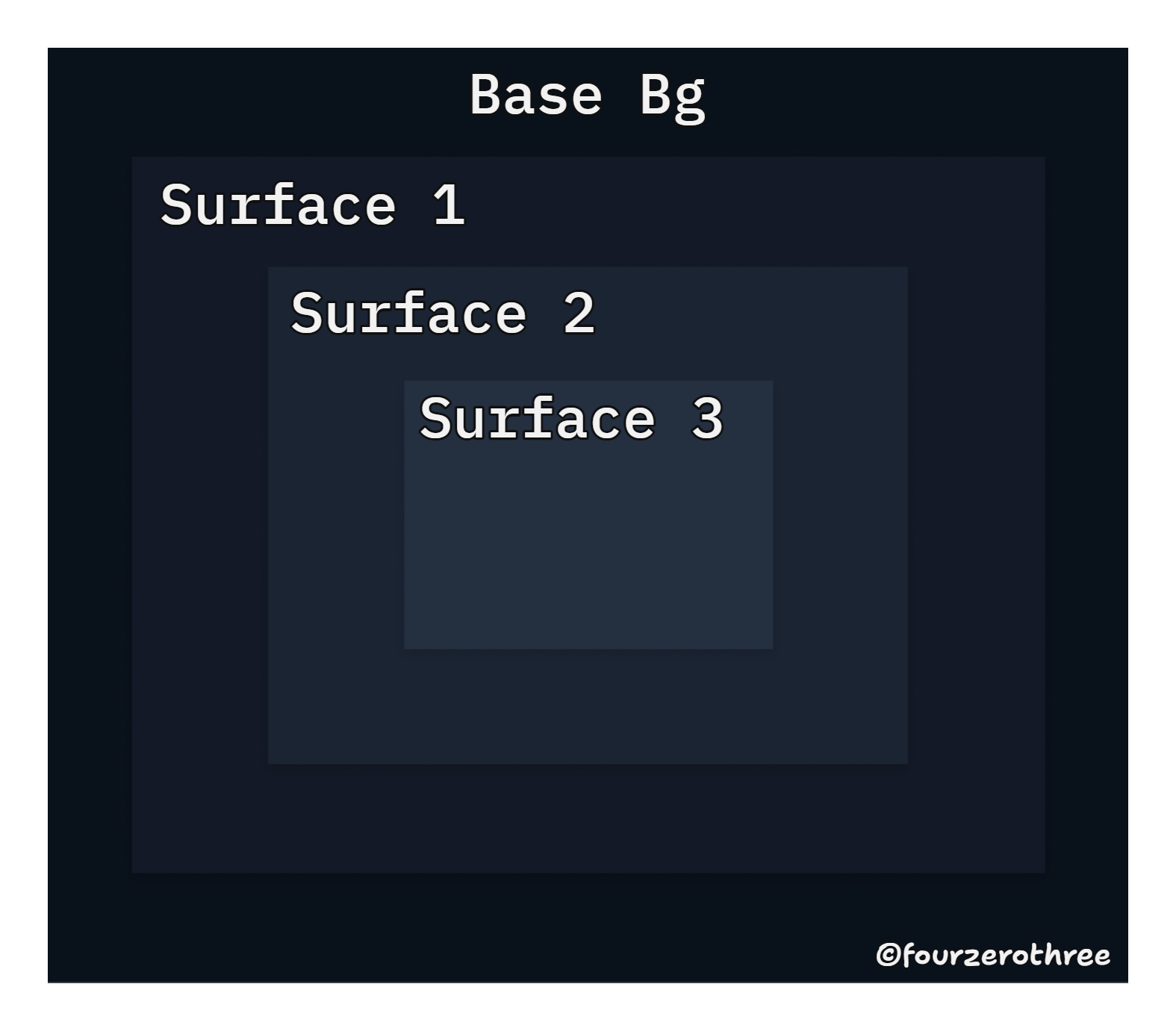
For dark mode however, elevation can be shown only when the surface on top is lighter than the underlying surface. Hence the layering model differs for dark mode. It's always a lighter surface on top of a darker surface.
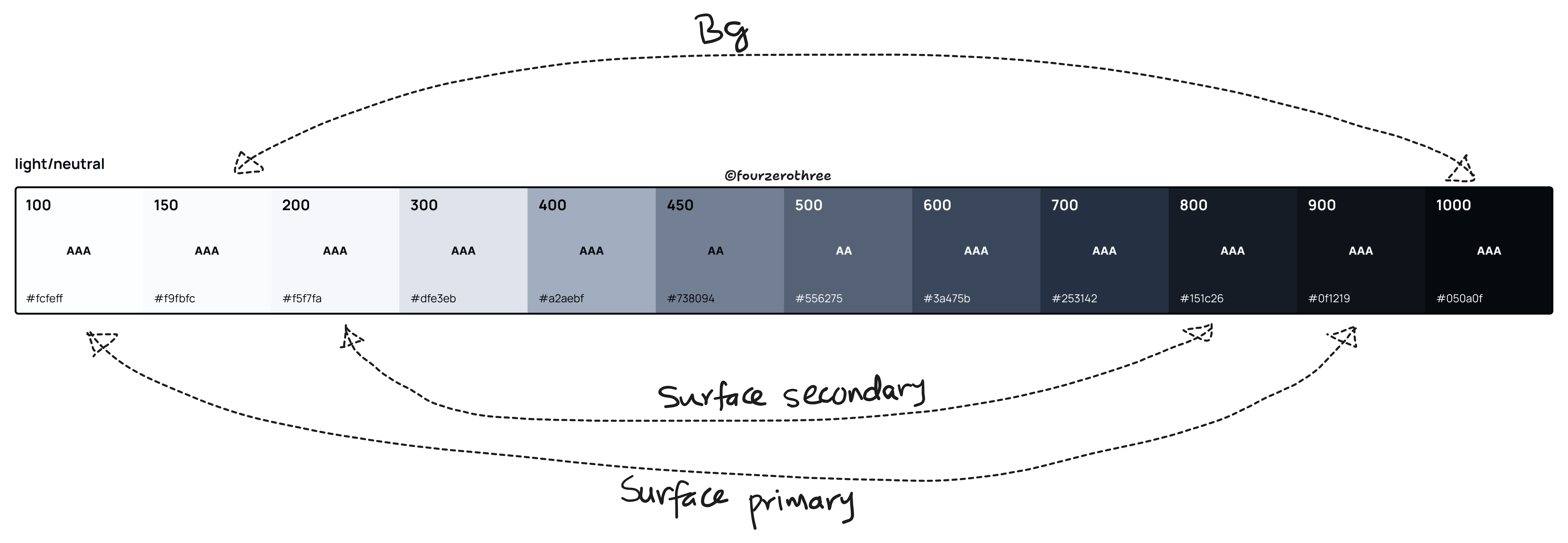
Base Background
For the base (the deepest surface) background, Google Material opts for a dark grey - #121212, rather than a pure black #000000, for a few reasons
Placing bright imagery or complex animations on pure black (#000000) creates excessive contrast and leads to eye strain. Rather than reducing contrast for the items in the foreground, increasing the lightness of the background was a better solution.
Also, dark grey surfaces can express elevation and depth better, as it is easier to see a shadow on top of a grey colour.
Google also gives us a solution if we want our dark grey background to be cohesive with our brand colour.
We could reduce the transparency of our “desaturated” brand and overlay it on #121212 and use the resulting colour from the overlap as the base background(bg) colour.
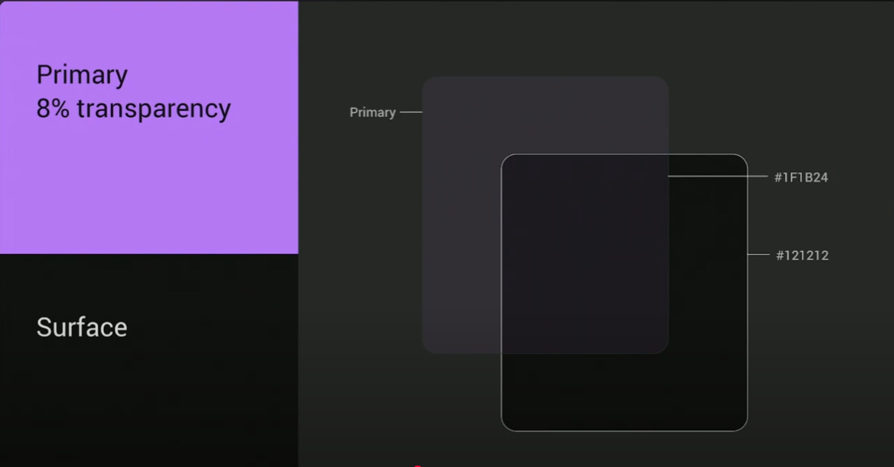
This guideline was very helpful. In Tenet UI, my “desaturated” brand equivalent for dark mode was blue 700 - #6EB4FF (my brand colour in light mode was blue 600 - #0e61ba).
Using Google’s guidelines, I tried creating a base background.
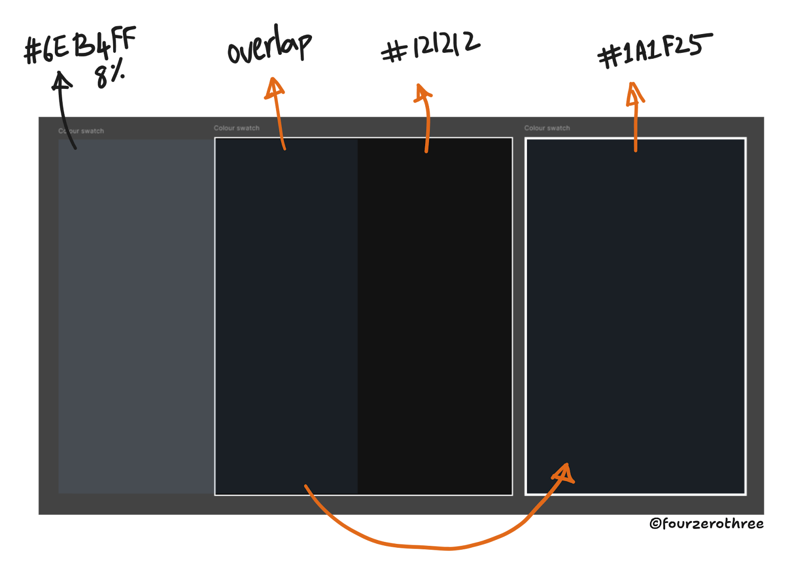
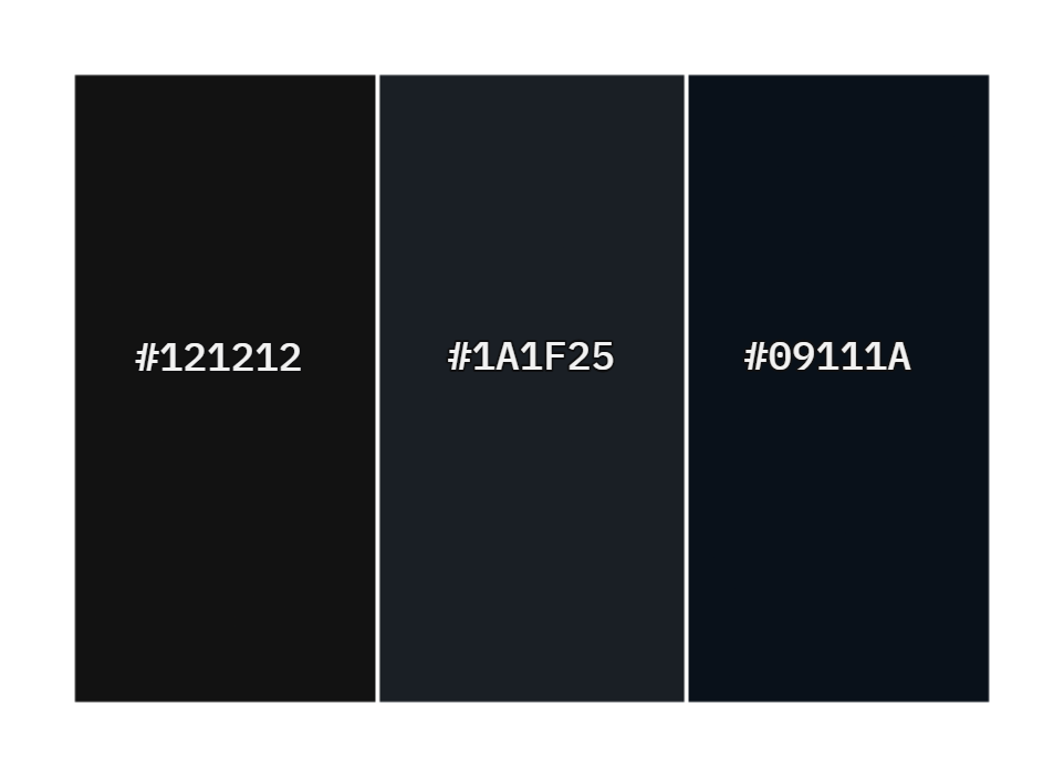
However, the resulting colour from the overlap - #1A1F25 was a little desaturated and slightly brighter than I wanted. Rather than tweaking it, I opted to use the darkest grey in the (dark mode) palette that I had already generated, which was #09111A. This was more saturated and less brighter than #1A1F25, just enough to my liking.
Accessibility
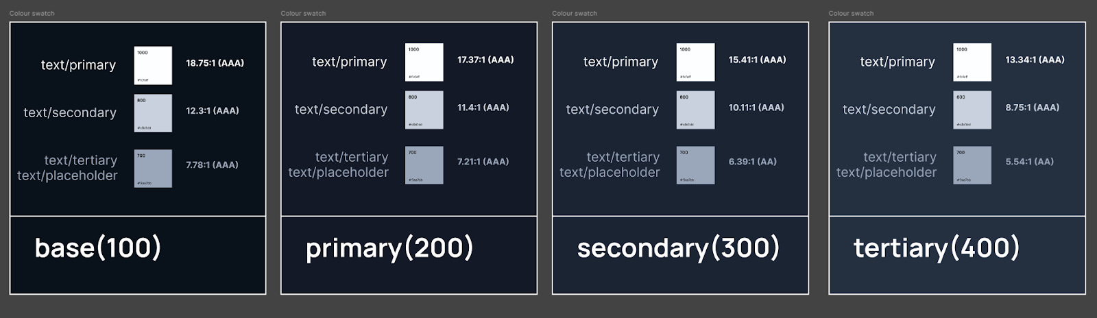
According to Material Design’s guidelines, dark surfaces paired with 100% white text should maintain a contrast ratio of at least 15.8:1. This is because elevated surfaces in dark mode become lighter and the lighter (elevated) surfaces should accommodate for sufficient contrast for the white text on the surface. I wanted to ensure that #09111A paired with pure white #FFFFFF was 15.8:1 or higher. It was 18.75:1. This ensured other lighter shades of dark grey that I could potentially use as layers were dark enough so text on top of it could pass contrast checks.
I want it to pass contrast checks for my primary, secondary and tertiary text on top of the base background, primary, secondary and tertiary surfaces. It might feel like overkill, but achieving this made scaling seamless, without having to worry about accessibility.
This was not perfect from the get go. I had to constantly tweak the colour palette I had created to ensure I had accessible colours.
Brand and Supporting colours
For the brand and supporting colours (Success, Warning, Danger, Warning) default light-mode colours (saturated and dark) would have a desaturated and light dark-mode counterparts and weak light-mode colours (desaturated and light) would have saturated and dark dark-mode counterparts. This would apply to background and foreground colours.
Also note that any foreground (text and icons) on the surface would be inverted. White foreground on a default light mode component, would invert (black) in dark mode and vice-versa.
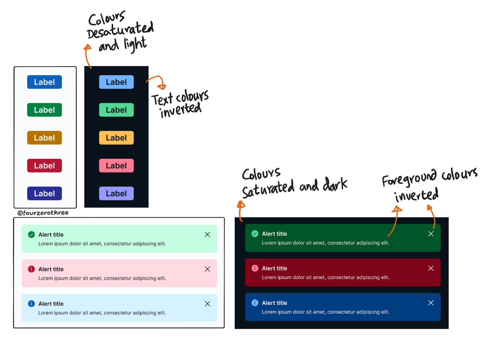
Of course, I had to make sure that the foreground on the brand and supporting colours were accessible as well.
Recreating a screen from my blog
I used Tenet UI to recreate this screen from my blog and flipped it to dark mode.
Using Tenet UI to build a Dental E-learning application
As part of a personal project, I designed a Dental E-learning application (this is also an online education platform that I actually run [web-app]). I used Tenet UI to quickly set up colour variables and most components for this project. Here’s a prototype, where I flip between light and dark mode.
Quick notes
Colour palette: I opted to create an equivalent dark mode palette for every colour swatch I had. This made the mapping of dark mode colours to corresponding light mode colours simpler and straightforward.
Creating the palette: I delegated the hard work of creating a dark mode palette for each light mode counterpart with colorbox.io.
Stacking layers: Elevation in dark-mode can be shown only when the surface on top is lighter than the underlying surface.
Start with Backgrounds: I used dark grey (#09111A) instead of pure black for a more versatile and comfortable base background. My base background had a tinge of the brand colour, so components in dark mode would look cohesive.
Ensuring accessibility: I wanted to ensure that my base background - #09111A when paired with pure white #FFFFFF was 15.8:1 or higher. This ensured other lighter shades of dark grey that I could potentially use as layers were dark enough so text on top of it could pass contrast checks.
Desaturating colors: Desaturated or muted alternatives was the way to go for default brand and semantic (supporting) colours.
Testing early and often: I used contrast checkers and gathered feedback throughout the process of creating the dark theme.
Closing Thoughts
Designing a dark theme for Tenet UI taught me the value of meticulous planning, iterative testing, patience and attention to detail. Beyond technical challenges, this process reinforced the importance of accessibility and brand coherence when creating design systems.
For tackling dark mode, my advice is simple: start small, test obsessively, and never shy away from tweaking. Your first attempt won’t be perfect (mine certainly wasn’t), but every iteration will bring you closer to something truly polished.