
Post #2 (Design System Chronicles)- Setting up colours for Tenet UI with colorbox.io

Design System Chronicles (Tenet UI)
Post #1 - Why Tenet UI | Post #2 - Setting up colours | Post #3 - Organizing variables

I have written a lot many posts on setting up colours, right from building a colour palette to creating colour tokens. Most of these stemmed from my experiments in creating a color system for Tenet UI.
For my UI kit I resorted to taking a hybrid route of creating the palette using colorbox.io and then manually tweaking the colour values as needed afterward. One key reason I chose colorbox.io was its ability to create cohesive and harmonious color palettes without me having to do the heavy lifting.
Starting with the Brand Color
I started with generating the brand colour. I chose #2E90F4 (blue) as a base colour from which I could generate my brand palette.
Here’s the process of how I generated colours with colorbox.
I hit the “new colour” icon to generate a colour palette. This would generate a random colour palette.
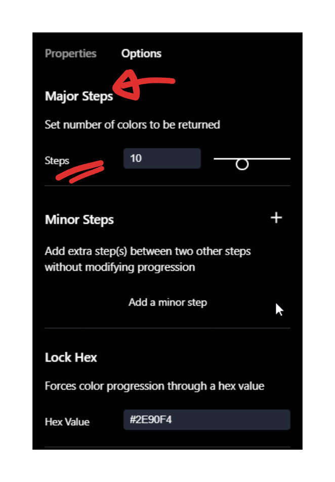
The panel to the right, has two tabs - “Properties” and “Options”. I hit the Options tab and “locked” my hex value -
#2E90F4.

Locking the hex value, ensures that the generated palette in colorbox has my base colour (in my case #2E90F4). It forces the colours in the palette to progress through the hex value of my choice.
📖 Read next:
- Post #3 (Design System Chronicles)- Organizing colour variables in Figma
- Post #4 (Design System Chronicles) - Designing a Scalable and Accessible Dark Theme
I removed the “Minor Steps”. Minor steps in the palette are when I might need an extra small step in my palette, like for example, when I may need a “450” in between my colours 400 and 500.

I want 10 steps in my palette - 100 - 1000. I made sure that “Major Steps” was set to 10.
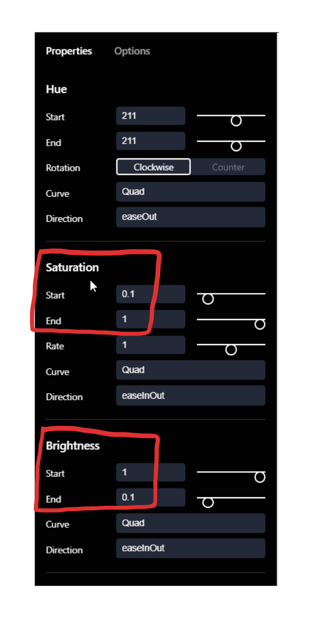
Now, I moved on to the “Properties” tab and the first thing I did here was to set my hue values. Switching to HSB in Figma, I found the hue value of
#2E90F4to be “211”.

Next up, is setting the Saturation and Brightness for generating the colour palette (I have spoken about this in detail here).
TL;DR
Create lighter variations or tints (of the base colour) by increasing brightness and decreasing saturation 👉 (base) hue + higher brightness + lower saturation
Create darker variations or shades by lowering brightness and increasing saturation 👉 (base) hue + lower brightness + higher saturation
If you refer the image above, you have a range for Saturation and Brightness you could set. I set my Saturation to have a range of 0.1 to 1 (10% to 100%). This means my tints (lighter variants) would have lower saturation and as the colour gets darker, the saturation increases. On a similar vein, Brightness is the opposite of Saturation. It increases as we move to the tints and decrease as we progress to shades (darker variants).
Notice you also have something called “Curve” and “Direction” in the above image. Now, quite honestly, I didn’t dive deep into what this really meant. I understand that they are approaches we could take in manipulating colours. I did 2 things:
I searched for other articles on how colours can be generated using colorbox to check how others have used Curve and Direction.
I experimented with various options for Curve and Direction and trusted my eye.
Eventually, the following worked for me:
Saturation/Brightness: Curve - Quad, Direction - easeInOut.
Hue: Curve - Quad, Direction - easeOut.

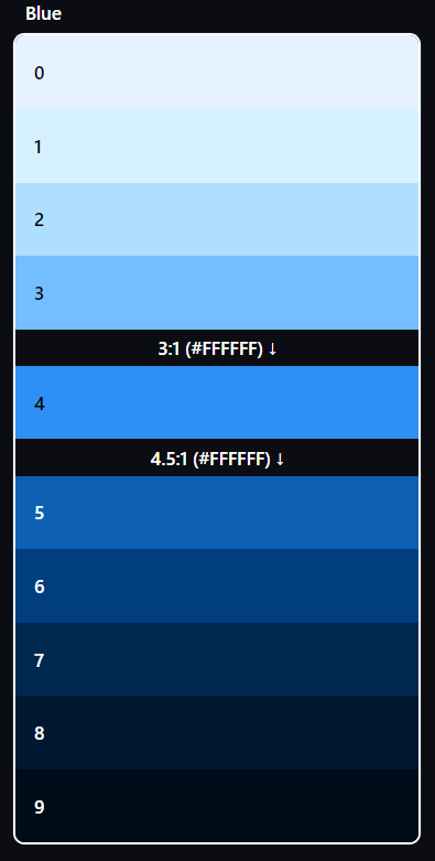
This was my final brand colour palette.
Dark Mode
Colourbox makes it easy to generate dark mode colours. For each palette I generated, I could switch to “Options” in the right panel and toggle the “Auto Dark Mode” setting. This ensured a smooth transition to a dark mode palette.

Building the rest of the colour palette
The best part about using colorbox.io is that I could then use the same settings for the other colours I want in my palette, except for:
Hue - This, I need to change depending on the colour I want to generate (red, green, yellow, grey, accent colour of choice)
“Lock Hex” value - This again, changes depending on the colour I want to generate.
This way I ensured I had a cohesive colour palette.

💡My Greys had different settings as far as the Saturation and Brightness (settings in colorbox) was concerned, to achieve the right tonal balance. Greys needed a lot of experimentation (both pre and post generation in colorbox). Having the same settings that I spoke about previously somehow didn’t work for greys.Manual tweaking in Figma
After importing this palette to Figma, I created a few easy to create components (like buttons and input fields) and assigned them the colours from my palette to get a visual feel of how it worked. Also I checked for contrast ratios at this point (I did this again after I created my first set of semantic tokens, which I’ll write about in another post).
I took some time to experiment and depending on my results did some manual changes to the palette I had generated from colorbox (you could read how to manually create a colour palette here). But I had to be careful. I want my colours to be cohesive after all.
For me colours are a prolonged (if not continuous) iterating experiment. In fact I often revisited colours even after I made some progress with the UI kit.
The final set of colours

Closing thoughts
I have experimented with different ways of creating colour palettes, both manual and automated. I’ve always felt a hybrid approach has served me well. At least that’s what I did for Tenet UI.