Designing a learning platform for busy dental students - a mobile design exploration
HackDentistry Mobile (Concept Work/Design exploration)
An exploratory mobile design I created as a counterpart to the real HackDentistry platform. While the actual product was web-first, I used this exercise to practice mobile design, prototyping, design system foundations, and theming (light/dark modes). This was not a shipped product, but a design exploration.
HackDentistry
This design project stems from my real-world experience as the founder of HackDentistry, a dental e-learning platform that I built (and still run) with a friend and fellow dentist.
The Goal
The goal with the mobile app is simple - to give students the power to learn and revise whenever they had time, in a way that fit into their schedules. Whether a student needs to brush up on Oral Pathology and Medicine between classes or take a practice quiz before an exam, HackDentistry would provide the tools they needed - right in their pocket.
📖 Read next:
- Architecting a “Remote Execution Platform” with AI-augmented UX workflows - a case study
- Creating Tenet UI (design system) for Cohesive, Consistent and Scalable Design - a case study
Getting my Hands Dirty
User-Focused Navigation
HackDentistry was to be about simplicity and focus. I wanted to especially avoid an overwhelming navigation. I focused on getting students into their courses quickly. Course selection is direct the moment users log in, allowing users to find relevant content.
This way the enrollment process is seamless, enabling users to start learning immediately after logging in. Students can dive directly into video tutorials or practice quizzes.
Key UI Decisions
Overall, I wanted a clean, minimalist design that ensured students or dentists could access information quickly and intuitively.
Course cards in the home screen in a clean list view represent individual learning modules. Each card, apart from the course title and module type (e.g., video or quiz), has a progress indicator, giving users real-time feedback, motivating them to track their learning journey and stay engaged by visually seeing their progress toward course completion.
Course Chapter and Lessons: Clean, list-based layout for chapters and lessons once a course is selected. The course content is organized into videos and well-structured notes with a clear visual hierarchy.
Notes: The article view for dental concepts adopts a clean, text-focused layout, breaking down the content into sections (e.g., Etiology, Clinical Features, Histopathology, Treatment) with bold subheadings that help students scan through information quickly.
Articles include references at the end for further reading or links to books and research papers, ensuring academic rigour.
Practice Quizzes: Quiz layout is a simple, touch-friendly design, making it easy to interact with while also providing immediate feedback to users for retention.
Dark Mode
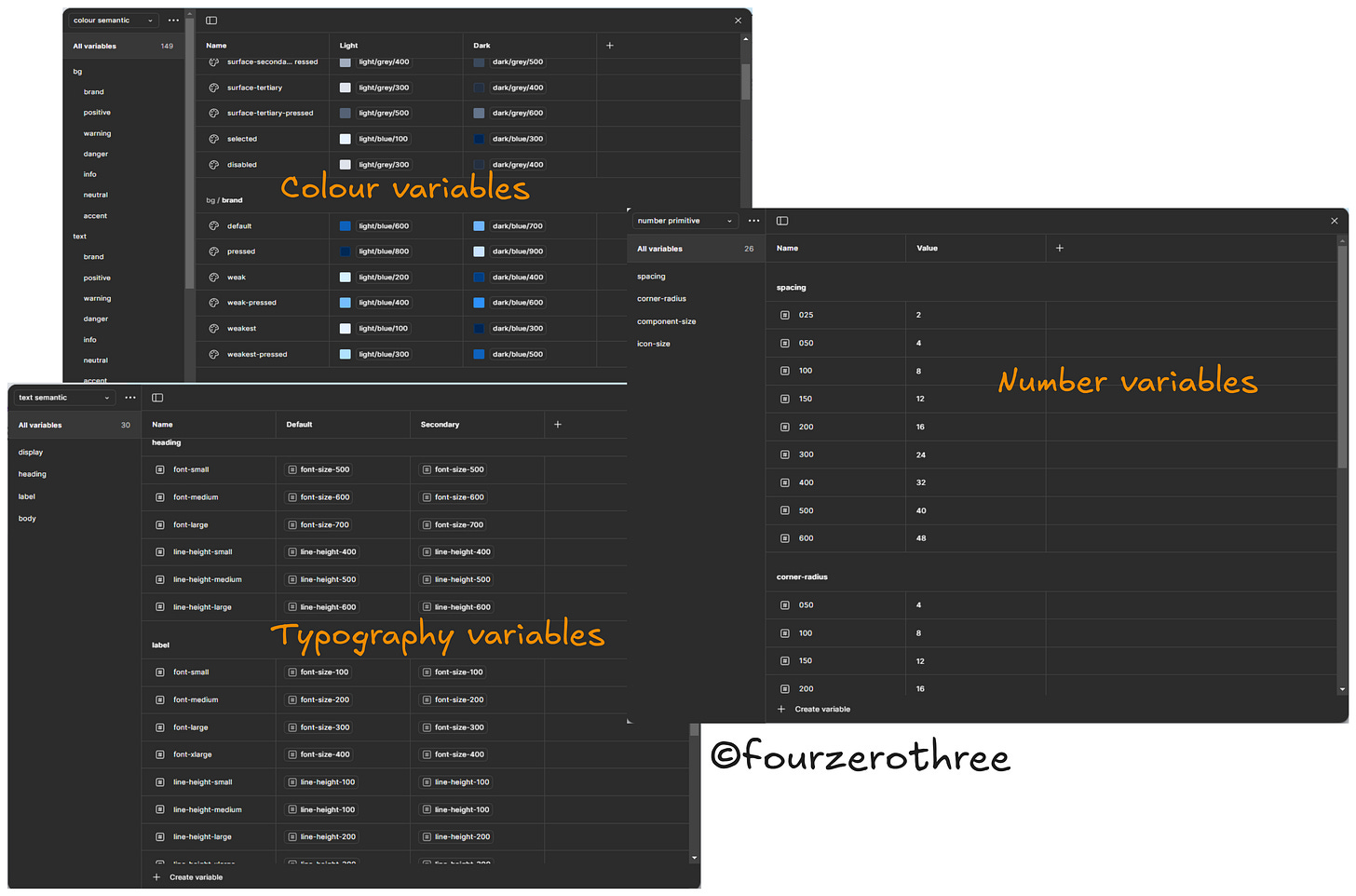
Tenet UI, a personal project of mine, is a UI kit and Design system. I had the opportunity to use it as a Design System Library for HackDentistry. Tenet UI has a robust set of design tokens (colour, typography and numbers) which helped me easily switch between light and dark modes.
Some Design Artifacts
Information Architecture
Wireframes
Wireflows
Leveraging Tenet UI-Design System for Speed and Consistency
With Tenet UI, a design system I developed as a personal project, I was able to bring structure and consistency to HackDentistry’s UI. Apart from the need for some custom components specific for HackDentistry, the components and design tokens readily available in Tenet UI helped me drastically cut down design time and build screens rapidly.
Closing thoughts
After a few rounds of refining the UI and prototyping, I was happy with the outcome of the mobile design. Following a modular design with the help of Tenet UI-Design system ensured designs were consistent and cohesive.
The aim was to have a minimalist design that was clean and simple with an easy navigation and readily accessible content.
Less clutter, more focus.


