
Building for efficiency and usability: A Case Study on Component Design
Design systems - Component design

Prologue
I love design systems and I love building components for design systems. Like every design system designer in the wild, I want to create efficient components.
It's imperative to understand that the answer to building efficient components and eventually an efficient Design system (well-built components are one part of the solution to an efficient Design system) is manifold.
Obviously, I didn’t always embrace this, and my approach to building efficient components only meant building flexible components, which was rather naive, to be honest. My idea of a flexible component meant packing a component with enough variations to reduce the number of variants in the Design System.
We can usually get consumed in the world of creating components, and we forget the amount of complexity we pack into it. Maybe the components in the design system would boost the efficiency of consumers (other designers) using it? Maybe not.
The inherent problem is a tendency to create components optimized for the creators of the component itself and not necessarily the designers consuming it.
The consumers/users of a system will always far outweigh the people managing it.
That brings me to the question, “What is an approach I could take when building components?“
💡Update
Tenet UI (Figma Design System/UI kit) is available in the Figma community. The UI kit has a robust and lean semantic system (design tokens/variables) that supports light and dark modes and a comprehensive component library!
Component research for Tenet UI
Tenet UI (a personal project of mine) would be a general-purpose UI kit (and possibly a Design System?). The idea then, is to make it as “complete” as possible, covering as many use cases as possible. I made a list of components to build and lavishly used “component.gallery” for my research. Created by Brad Frost, it's a collection of interface components from real-world design systems.

Existing design systems help me understand a myriad of things some of them (in the context of components) being
possible variants and variations of a component.
Which in turn, could help me figure out how the component API (the way each component can be controlled and configured) or component props can be designed.
How the component could be structured.
Best practices.
You get the point.
Some interface problems have already been solved: there’s no need to reinvent the wheel every time you start a new project when the hard work has already been done by someone else.
📖 Read next:
- Crafting Components with Subcomponents and Nested Instances
- Post #9 (Design System Chronicles) - Component Thinking: A recap of my component design workflow
Building components
Flexibility
I want my components to be flexible. I want to produce many variations of a component without having to create many variants. In essence, they should be flexible enough to accommodate changes and variations without requiring significant overhauls.
I also want them to be composable. This means I want to design components in a way that allows them to be reused, combined or nested within other components.
Now creating flexible components means introducing some amount of complexity to it. Hence flexibility is beautifully contradicting, being easy to incorporate whilst being challenging at the same time.
It's easy to incorporate complexity into a component in Figma. Figma allows me to create various combinations of properties quickly. Whilst it seems to be easy, it is difficult to produce meaningful combinations of properties, such that the components are intuitive to use.
Designing Component API/Component props
Designing component API is very closely intertwined with the flexibility of a component.
Component API or property (props) is designed so a component can be controlled and configured. I used the snapshots of a component from the research phase to create rough wireframes of the different variations that could possibly exist.

This allows me to determine what props to design depending on the variations I want to create. But the challenge here is to also make component props easy to understand and consume for designers.
Challenge
How can I design flexible and composable components that let me make changes in layout and content without creating unnecessary complexity, while also being fairly easy to consume?
(Note: The keyword to note here is “unnecessary complexity”. Some amount of reasonable complexity would be needed to create flexible components)
Pondering on this problem, I could further break this down to know what I want to achieve.
I have to strike the right balance between flexible and constrained components, ensuring that the components remain intuitive and usable by consumers while still being adaptable to multiple use cases.
Designing a well-thought-out, code-aligned component API (props) is essential to overcoming this challenge, which is a challenge in itself. I need to carefully determine which properties are necessary and configure them in a way that allows for easy consumption.
Solving the Challenge
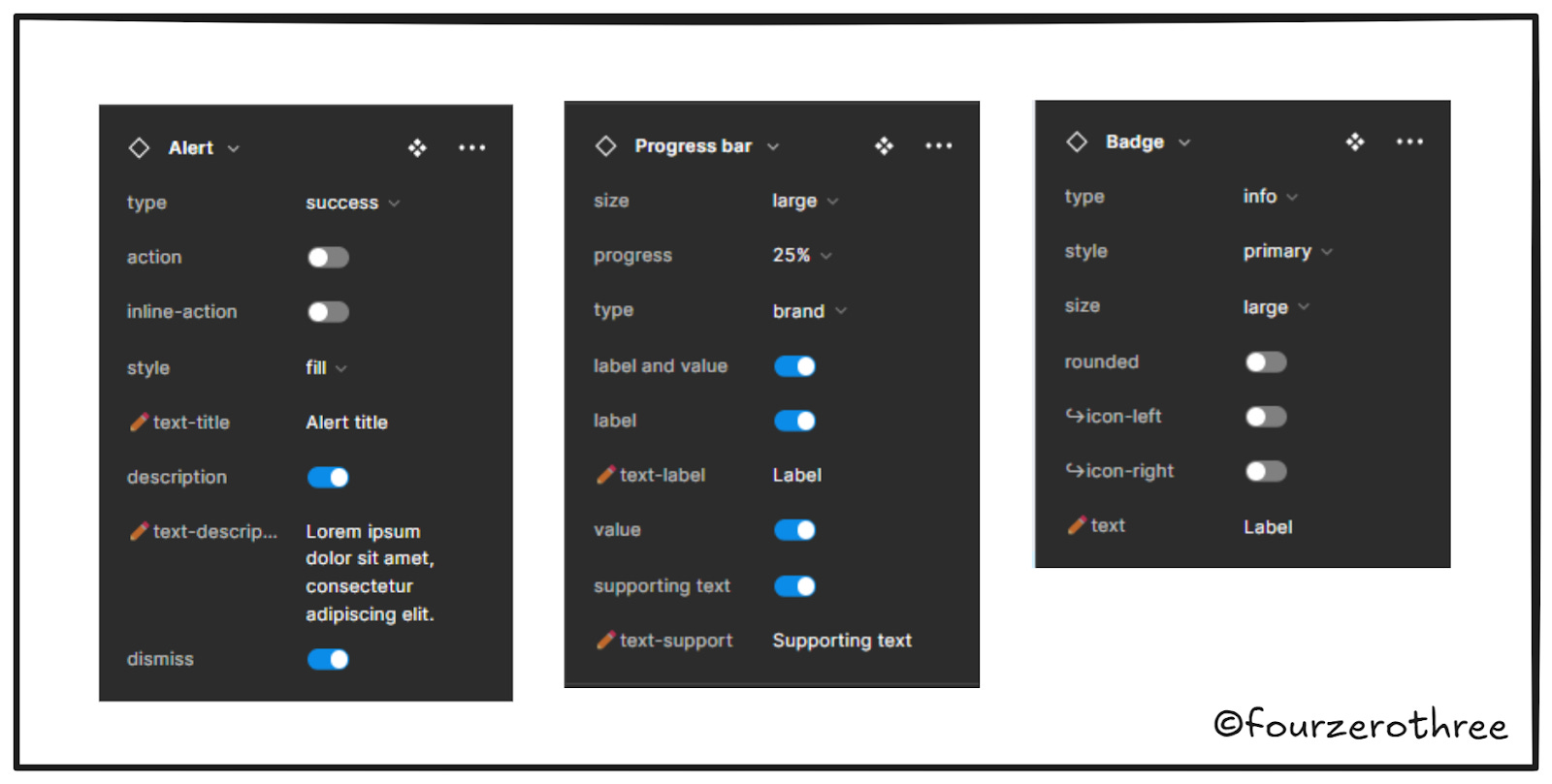
Constrained components
Inherently, all components are to an extent flexible. However, when building Tenet UI, I made it a point to separate distinctive variants as separate components if it made sense.
The best example here is the button component. This was in fact, touched upon in the Config 2024 talk - Design Systems Best Practices as well.
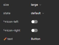
Consider this button component set.
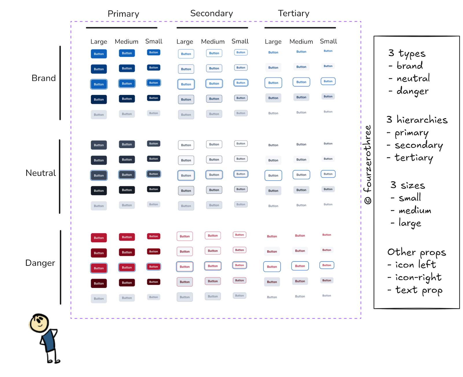
I could pull out one button from the assets panel and whip out 135 variants. Imagine the variations considering the “icon-left” and “icon-right” props. This is very flexible!
There are 2 problems here
This component set is too complex
The discoverability of a button type is a problem.
So it’s best I constrain this button component set. I do this by creating distinctive variants of buttons as separate component sets. Consider this 👇
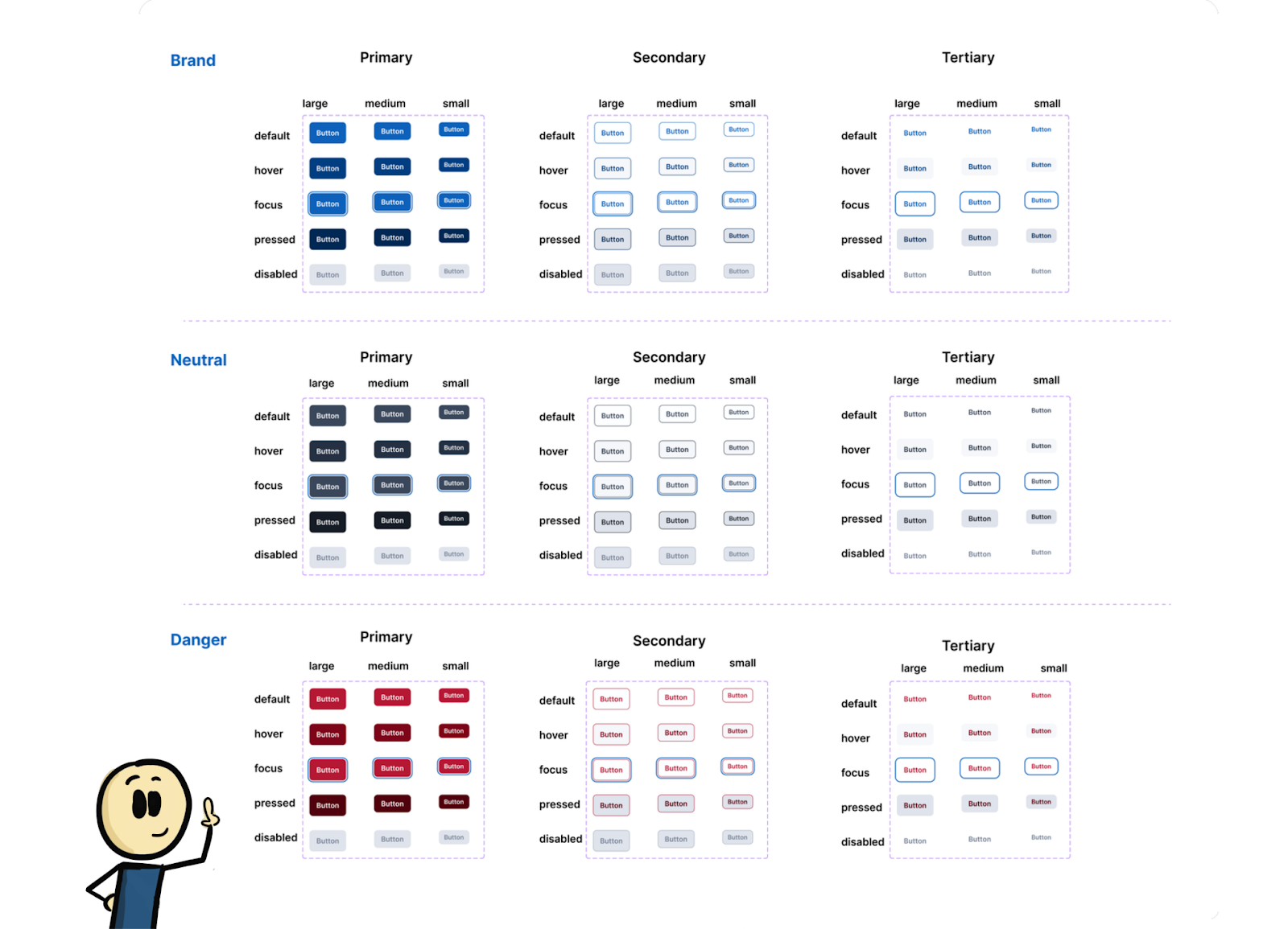
How does this help?
Easy discoverability of different button types. I open the assets panel and I have all my button types neatly stacked.
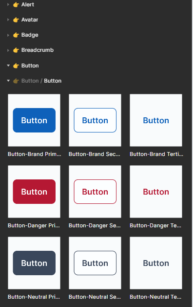
Using these buttons is way less of a cognitive load. I get to choose any button and this is my props panel for every button set.
Constraining the button component set this way reduces the complexity of a component set. Doing so also helped make the components more discoverable.
Let’s touch base with another example. The input-text is a simple component which could be made unnecessarily complex.
It’s an easy decision to make a component like input-text and just decide to use it across a multitude of use cases.
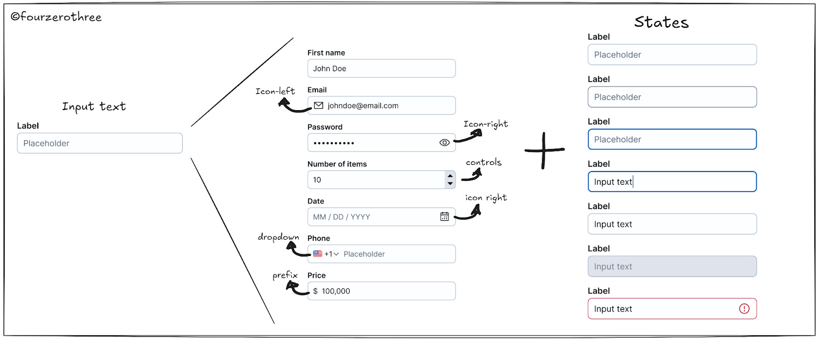
Imagine the variations/variants. And to make things worse you have states to consider for every variant.
Just like the button set example, I decided to split the input field components into
Input text
Input number &
Input date
In this example, note that making specific component sets (constrained) leads to an increase in the number of components. This is against the goal of making them flexible so you have less. In the end, the overarching principle for building a component is around how intuitive they are for consumption, even if it means I have more components to maintain.
Flexible components
While reducing complexity is critical, ensuring flexibility for different use cases is important. I want my component to have different combinations of layouts, so I don’t have to repeat designing different variants. The obvious choice is to add the required properties, or design component API such that it’s possible. But by doing this, I increase the chances of creating what Luis Ouriach calls a “prop soup”.
Honestly, it’s hard not to end up in a prop soup. Oftentimes it’s a necessary evil. Nathan Curtis offered a solution called “Subcomponents” for situations that could end up with a prop soup.
I did the same for my components.
What if you could offer smaller yet useful parts that solve for nearly everything they need, sustain consistency, and accelerate their delivery? Beyond simple nested yet generic components like a Button or Icon or Image, subcomponents are more specific — and juiced up — to build solutions of a specific class or context.
Subcomponent: an independently composible UI component with a well-defined API intended for use only within a specific parent component or context.
Dissecting Nathan Curtis’s definition -
I build smaller components (independently composable UI component) with their own properties (well-defined API) that can be managed independently.
I can use these subcomponents along with others to build more complex components.
Apart from subcomponents I also resorted to using “Slots” wherever needed. A slot (which I learnt from this video by Luis Ouriach) is a placeholder component that could be swapped for any other component. By nesting a slot inside a main component, I could swap it for another component or subcomponent and create many variations of layouts of the main component.
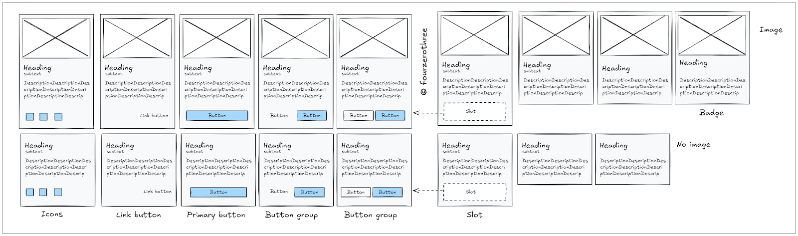
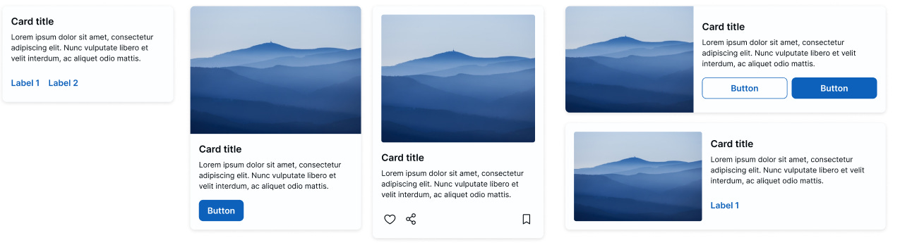
I know this sounds like a mouthful. Here’s an example of how I used subcomponents and slots to help achieve flexible cards.
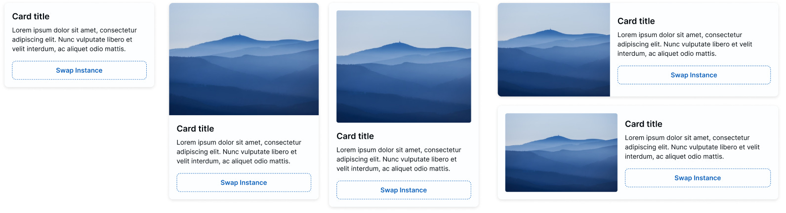
When creating the card component (Is a card better regarded as a pattern? Maybe?), I found one portion of the component for most use cases had a common structure. For the basic card, it was the “content” and for the image card it was the “image” and “content”.
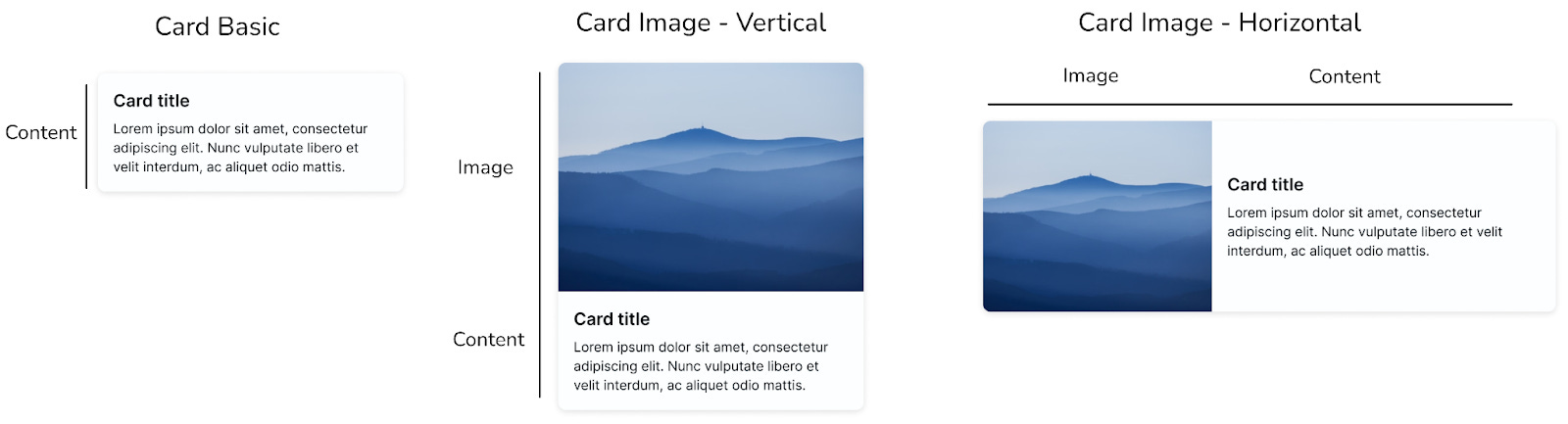
Most variations for the card were in the layout that appeared at the bottom.
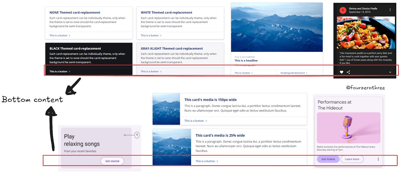
Layouts at the bottom were single primary buttons, button groups, link buttons or icon groups.
These would be my subcomponents.
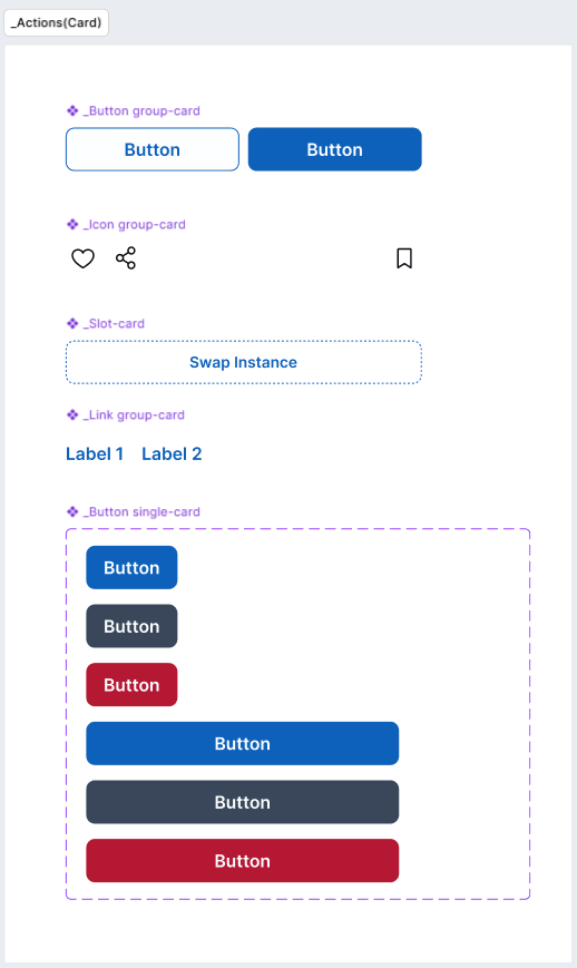
Note that my slot component is a part of this group of subcomponents.
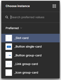
I inserted the slot component into all my card variants and applied the instance swap to the slot component.
When applying the instance swap, I set the preferred values to map to all the subcomponents I created.
I could now manipulate the slot component to get many different card layouts. Using the subcomponents and slots makes the component very flexible while at the same time reducing the need to create several properties or variants to achieve the same.
I could give more of these examples but I think it would best serve if they were individual posts/articles.
Designing component API/properties that are easy to consume
As I said, designing component properties is closely linked to how I want my components structured. Essentially good prop design is taken care of when I decide how to design my component.
But can I make them such that they are less of a mental load?
Names in lowercase
The first approach I took was to name all props in lowercase. This was a conscious decision. By doing so the property panel looks clean and consistent. It's easier on the eyes. Also, it was less of a cognitive load when naming them (I didn’t have to worry about the case format).
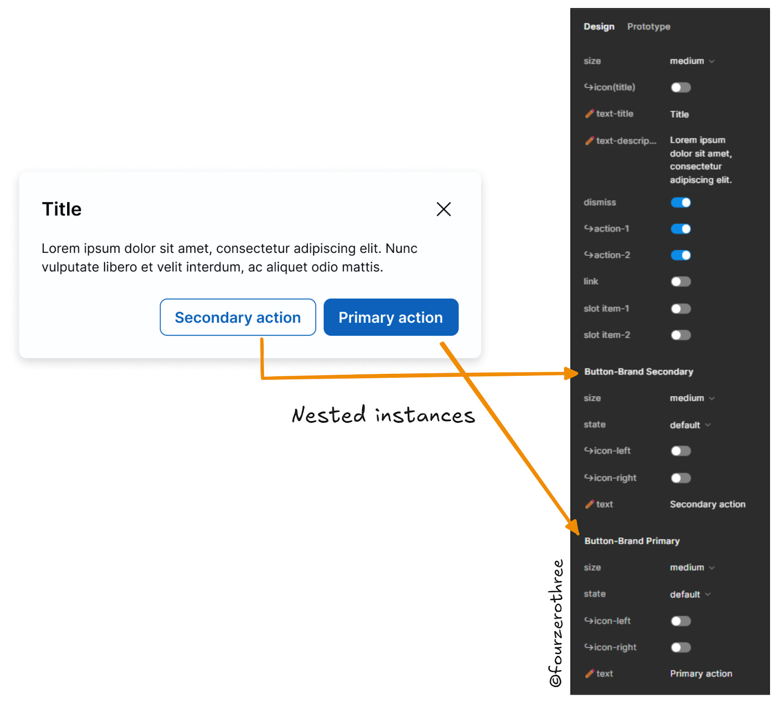
Nested instances
A regular part of creating components is to nest smaller components or subcomponents inside one to help make it flexible. I then expose the nested components in the property panel so I can manipulate it.
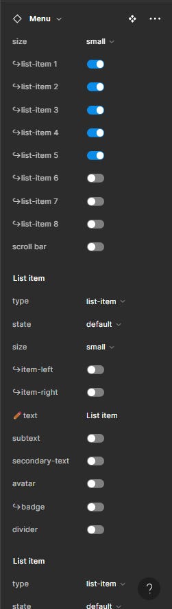
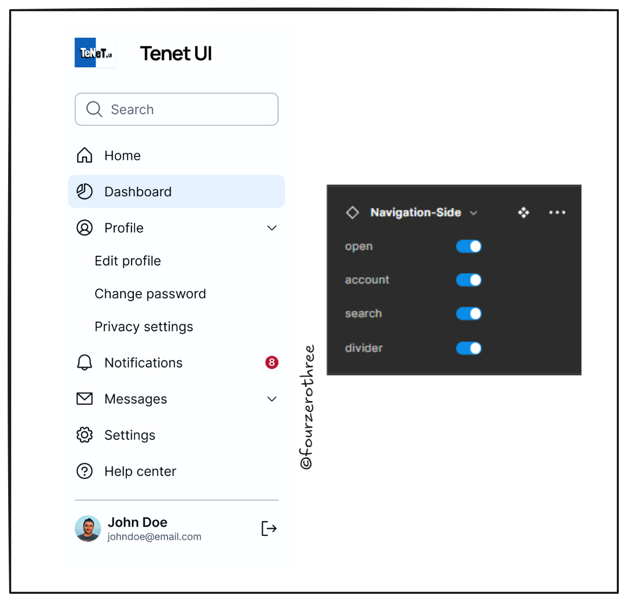
There are times when exposing them becomes messy and overbearing, especially for complex components. I’ll take the example of the Side Navigation and the Menu component.
Here’s the Side Navigation component.
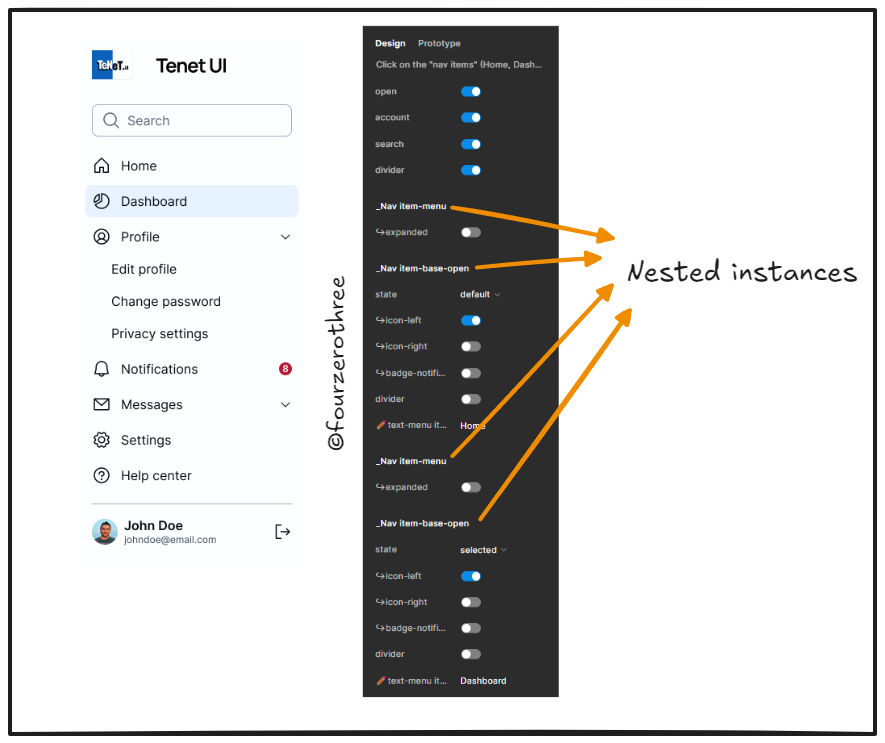
Ah! Too many exposed nested instances to handle.
And here’s an example of the Menu component. Again, too many nested instances to expose.
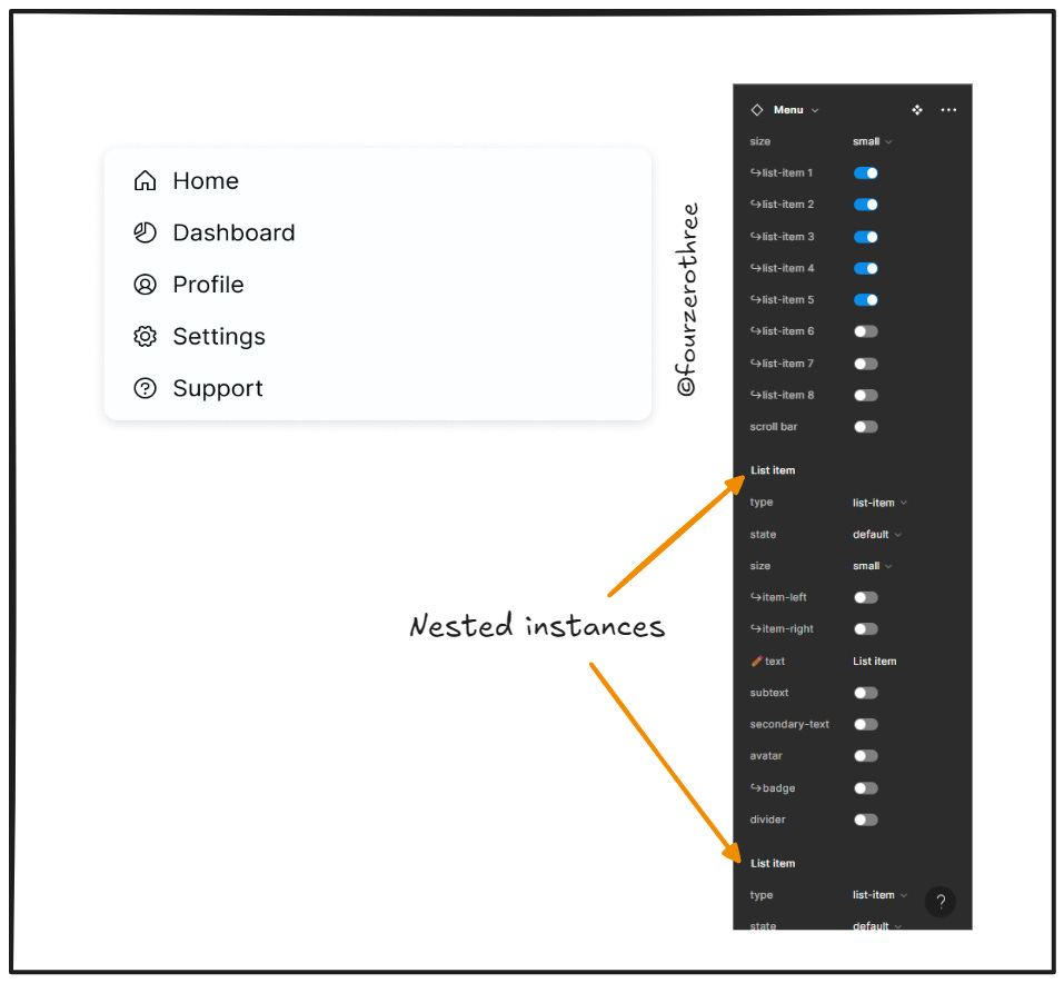
While exposing nested instances I increase the discoverability of the nested component and its properties. While nested components have their advantages, exposing nested instances creates an information overload in the props panel, for designers. Maybe it makes sense to expose it in certain cases? In cases like the above examples should I expose them?
This was a dicey decision to make. To counter this I decided to do 2 things.
I added a prefix emoji for all nested components housing inherent properties that can be manipulated. Doing so gives me the option to not expose the nested instance while also telling the designer that a prop with that particular prefix is a nested instance that can be manipulated.
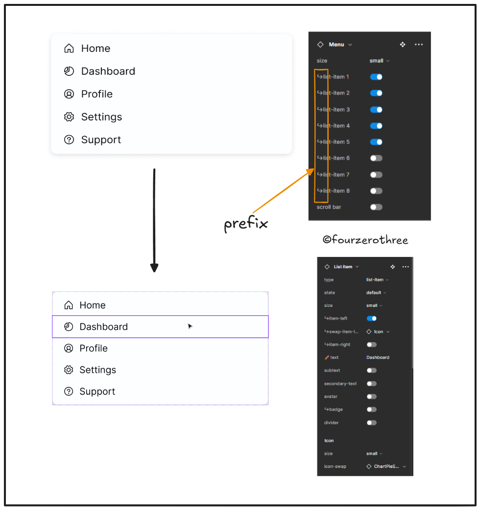
While the designer has additional clicks to make, this makes it easier for the designer to process the props behind the component, making it less overwhelming.
However, there are times when this is not straightforward. The “Nav-item”, that is the subcomponent nested in the main component (Side Navigation) does not appear in the props menu (I can’t add a prefix as I did for the Menu component).
In this case, I may have to use the component configuration panel to help explain the nested instances inside the component.
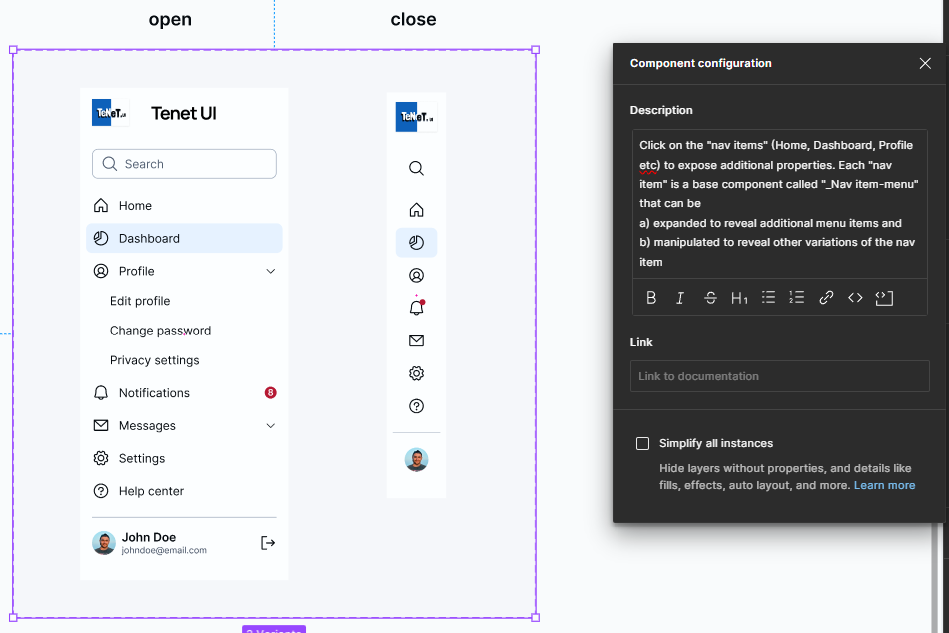
I could keep the props panel clean while also giving additional context to the designer using the component.
Closing Notes
For me, building components was about solving problems, especially problems of efficiency and usability. The challenge of building a component apart, the art of making it usable for other designers who aren’t involved in their creation, is an interesting problem to solve.
My goal with Tenet UI is simple: to create a lightweight UI kit that empowers designers to build faster, smarter, and with less friction.