
Crafting Components with Subcomponents and Nested Instances
Flexible components that adapt to any challenge

I previously explored the fundamentals of manipulating component properties in Figma. Mastering these basics to the point of being on autopilot, empowers designers to advance toward building more complex components and layouts. Real-world projects are rarely straightforward; they scale, evolve, and demand adaptable solutions.
Building components are interesting in that they are puzzles in themselves, that have to be solved. Components must not only address product requirements but also remain efficient and intuitive for the designers using them. While I’ve explored component design, focusing on efficiency and consumability, in a prior case study, this time I’ll delve deep into the concept of subcomponents and nested instances.
Flexible components
I want my components to be flexible. I want to produce many variations of a component without having to create many variants. In essence, they should be flexible enough to accommodate changes and variations without requiring significant overhauls.
- Building for efficiency and usability: A Case Study on Component Design
When building systems, the goal is to make components flexible (not every time though). Instead of building dozens of rigid variants to cover every possible use case, you should design components that can handle diverse scenarios through thoughtful structure and intuitive properties.
A flexible component can accommodate layout or content changes without needing a complete redesign.
A flexible component set minimizes overhead reducing the need to build umpteen number of variants to fulfill the system’s needs.
Subcomponents and Nested Instances
Subcomponent: an independently composible UI component with a well-defined API intended for use only within a specific parent component or context.
Think of it as just smaller parts made and tailored to be used within the context of a well-defined parent.
While component properties allow for creative variations, subcomponents take flexibility a step further by enabling greater adaptability and modularity.
📖 Read next:
- Breaking It Down: The Basics of Component Properties
- Building for efficiency and usability: A Case Study on Component Design
Improved Modularity and Reusability
Subcomponents are self-contained and can be reused across different components or patterns. This reduces duplication and ensures consistent design elements across your system. Like Nathan Curtis’s definition, they could have their own “well-defined API” meaning, a subcomponent can be designed to function independently, with its own defined structure, style, and behavior. It operates as a modular unit that can be reused across various contexts or larger components.
Let’s go through a few examples.
Icons
The smallest subcomponent I commonly use is the icon. After importing my icon set, I create a master icon with these properties 👉 a) size and b) icon.

Both the icon-swap and the size variants together make the workflow a lot smoother. I can swap icons to my liking, and also change sizes accordingly.

When creating components, I make sure to add the instance of the Icon component, so I can quickly swap icons or change sizes in the property panel itself (read in detail).

Notice that the icon component I use has properties that I could manipulate. There are many components that use the icon. The button is another common example where icons are used.

Buttons
Speaking of buttons, the button, a component itself, could be used as a subcomponent inside another component.
Take these examples.


This way you could use smaller components inside of bigger, more advanced components to minimize rework.
Subcomponents help build complex components
The examples I listed so far are actual components by themselves that could potentially be reused across many other more components.
What about complex components that may require changes in layout or interaction? Like a card or a Navigation panel, for example. Such components may actually require “independently composible UI components with a well-defined API intended for use only within a specific parent component” , more so like what Nathan Curtis defined a subcomponent. Let's take the example of this Side Navigation bar.
Let’s break it down first.
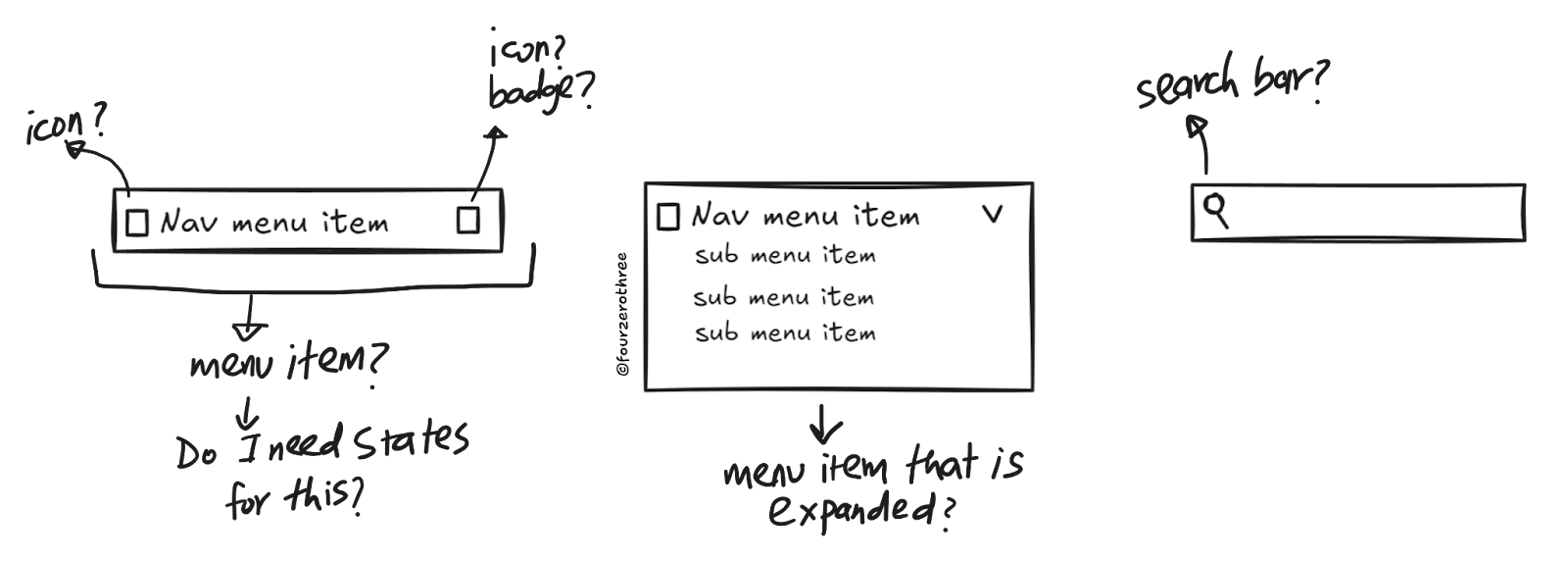
Note that there is
Search bar
Nav menu items with different states - default and selected. Maybe, I would need a hover state as well.
Nav menu item that can be expanded with sub-menu items inside.
Nav menu item with a left and right icon.
Nav menu item with a badge (counter) on the right.
The search bar could be a component by itself, an autocomplete that may already exist in my set of components.
Notice the recurring theme of the “Nav menu item” that I may require. This item is complex by itself, having different states, expanded menu items, icons and a badge.
In this case, the “nav menu item” is the subcomponent that I would need to create bulk of the Side Navigation bar. The nav menu item would be an individual composable unit with its own API and most importantly, I would use it only within the context of building the “Side Navigation bar” component.

This could become a worm-hole in itself, but stay with me.
I create the “_Nav item-base-open” (I know, that name could have been better) subcomponent first by packing it with all the states and other components like the icons and the badge (the first component set in the image).
I then use an instance of the “_Nav item-base-open” to create another component set called “_Nav item-menu” (this is our nav menu item subcomponent we’ll use to build the Side Navigation bar) which is either expanded or closed (the second component set in the image).
Why do I do this?
I could have packed the icons and the badge and created just one component set - the “_Nav item-menu”. However, I need states - Default, Hover and Selected. And to do that, I need a base component set (_Nav item-base-open), which I would use to build the “_Nav item-menu”.
Phew! With the “_Nav item-menu” I then build the Side Navigation bar!

Though this may look complex on the outside (which, it quite honestly is), try breaking down a complex component like the “Side Navigation bar”. This is where the principles of atomic design are very helpful. When creating a component like this
Have snapshots of examples from other design systems (for research).
Create a quick, dirty wireframe of the component.

Map out the dependencies. What atomic element do I need to build another element (atoms needed to build a molecule - in turn building an organism and so on). What is it that I may need to reuse?
Map out states (does it need a hover/selected states) for the dependencies, if needed.
Start from building the dependencies (these would end up being your subcomponents).
Build the complex component.
Nested Instances
As the name describes, these are instances (of the subcomponent) that are nested inside another component. When I “nest” a subcomponent within a component, I could, in Figma, expose these “nested instances”. Exposing them helps designers know
The subcomponents inside of components
The properties that could be used to manipulate the subcomponent
This is important.
By exposing it, designers are aware of what manipulations are possible within the component.
Heck, the designers know the component is made of another modular component.
And, exposing them, saves designers the hassle of clicking through repeatedly to reach the subcomponent so they could manipulate it.
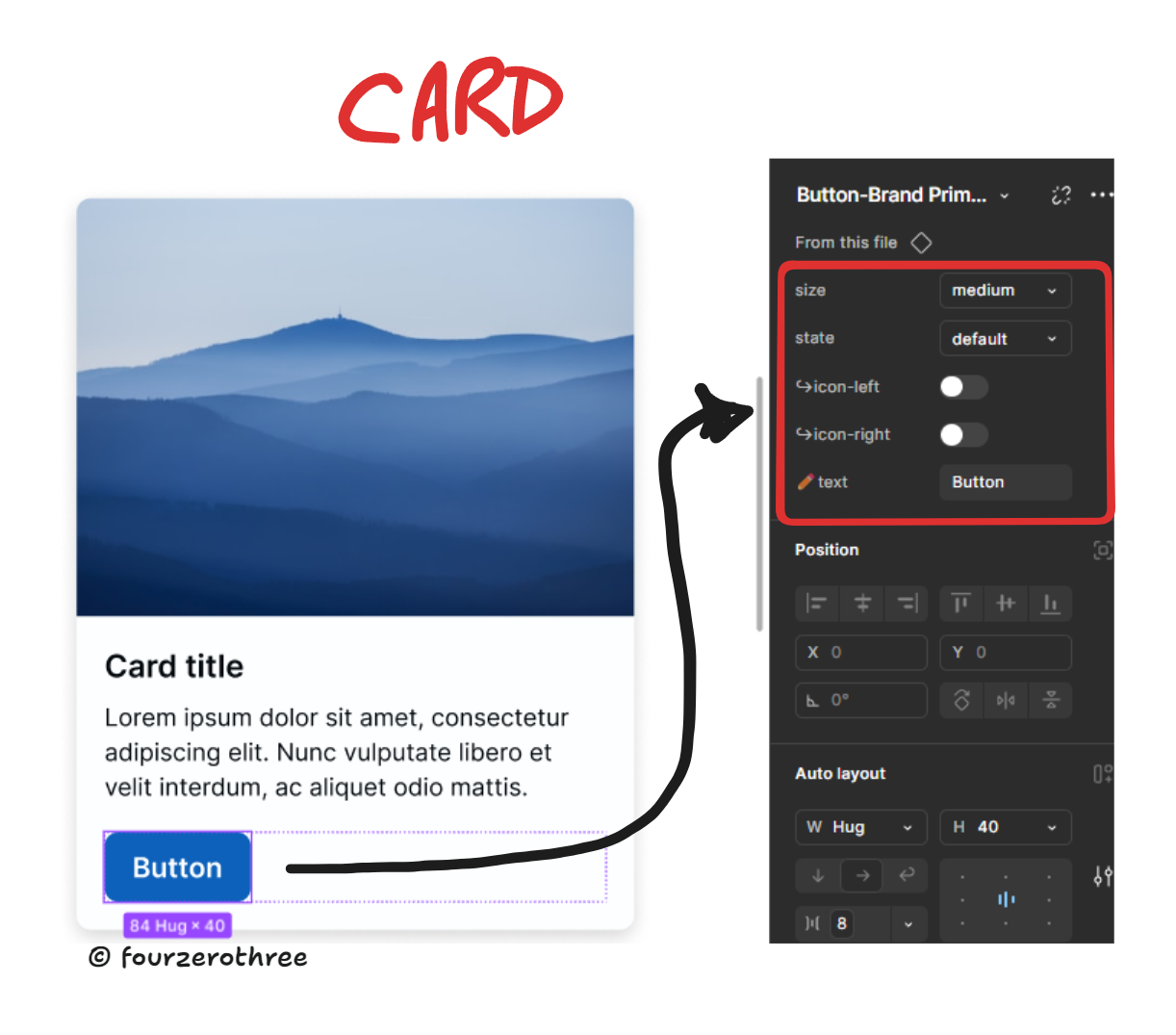
Let's start with the button.
I have icons (left and right) in this button component set which I have hidden (boolean:false) by default. Now the icons themselves have 2 properties - size and icon swap, that if exposed could help manipulate my icons from the property panel itself.


Now that I have them exposed, the instance of my button component would show me the icons and their properties (once I toggle and make the icon visible).

Side Navigation bar
This example could get a little overwhelming due to the sheer number of nested components and properties, but here goes.
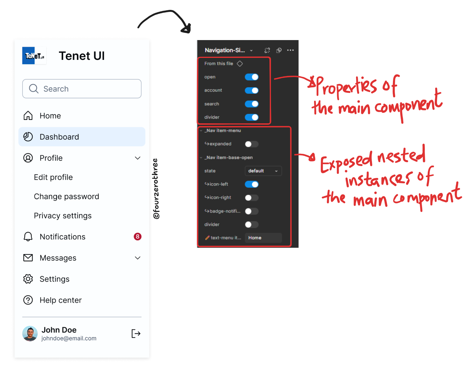
Here, note the first set of properties in the panel. They are the actual properties of the main element “Navigation-Side” (side navigation bar)
The second set of properties are those of the exposed instances “_Nav item-menu” (the boolean property ↪️expanded) and “_Nav item-base-open.
Here’s what’s interesting and makes building these components in Figma really exciting (and powerful).
The “_Nav item-menu” is the subcomponent of “Navigation-Side”.
Whereas, each “_Nav item-menu” subcomponent in turn has an exposed instance called “_Nav item-base-open” that has its own set of properties.

So you have a subcomponent inside of a subcomponent inside of a component 👉_Nav item-base-open inside of _Nav item-menu inside of Navigation-side.

While this nested structure may appear intricate or complex, its power lies in its flexibility and ease of use. Designers can leverage these exposed properties to quickly customize layouts, swap elements, or tweak states, all while maintaining the integrity of the component. Careful application of nested instances ensures that even the most complex designs remain intuitive and manageable.
Closing Thoughts
All this being said, flexibility and simplicity of components is always a fine balance, a see-saw of sorts. While subcomponents and nested instances bring flexibility and scalability to your design system, wield them thoughtfully.
Its easy to overengineer components and have complicated or unintuitive properties that can be a cause of migraine to the designers using your system. Add to these woes the problem of inconsistent and complicated naming conventions. Things quickly escalate to become a nightmare.
Embrace subcomponents and nested instances, but remember: simplicity is your ally. Design systems should make life easier, not harder. Strike the right balance, and empower your team to create amazing products - without the migraines (wink 😉).