
Breaking It Down: The Basics of Component Properties
Simplifying the basics of Figma components so you can design smarter


Creating components in Figma is one of those things that makes you feel like a wizard - until it doesn’t. It’s all too easy to either overload a component with excessive complexity through countless property combinations or end up with an overwhelming number of variants cluttering your component set. Neither scenario is ideal.
What we aim for is clarity and usability - components that are easy for other designers to work with, all while keeping our design system lean and efficient. Also, by reducing the number of variants in a component set, we minimize the risk of bloat and keep our systems scalable.
Understanding the basics of component properties and their potential is key to designing consumable components. Think of component properties as the secret ingredients that elevate a design system from good to exceptional.
Understanding component properties
Component properties help determine how a component or rather what parts of a component can change
Can an element in the component be hidden or shown?
Can the text be manipulated/changed?
Can an element inside a component be swapped for another?
Can the component have different sizes, colours or states?
Boolean Property (Can an element in the component be hidden or shown?)
Boolean property is like a switch. I either switch off (hide) an element in a component or switch it on (show). The Boolean property is a boon in the sense that you could pack numerous variations of a component without having the necessity to create different variants.
Instead of creating multiple variants for minor differences, you can use a Boolean property to handle optional elements.
Take this card component.

Variant 2 has a “description” switched on or shown.
Variant 3 has a “subtext” shown.
Variant 4 has an avatar shown.
I create one card component, but the Boolean property allows me to pack 4 variations of a card into a single component. This removes the need to create 4 different variants within the component set.

Creating a Boolean property for a component is quite straightforward.

Select the element that you want shown or hidden.
Select the Boolean property icon in the right toolbar (design panel).
Click the “plus icon” to create the Boolean property.
Add a suitable description, set the value to True (visible) or False (hidden) and create the property.
📖 Read next:
- Crafting Components with Subcomponents and Nested Instances
- Post #9 (Design System Chronicles) - Component Thinking: A recap of my component design workflow
Boolean in action
Text Property (Can the text be manipulated/changed?)
The Text property allows you to manipulate, change or override text in a component, directly from the design panel (tool bar on the right). Quite honestly, I seldom use this property and manipulate/override the text directly in the component itself. But this property could come in handy when you have numerous layers in your component and the need to click and drill down to the layer of text (to be manipulated) is painful.

Select the text you want to add the property to.
Select the text property icon in the right toolbar (design panel).
Click the “plus icon” to create the text property.
Add a suitable name and value and hit “Create property”.

Text property in action
Instance swap (Can an element inside a component be swapped for another?)
Instance swap property allows you to replace specific elements inside a component with instances of other elements. You basically “swap” an element with another. Like the Boolean, this property allows you to make your components flexible. You could create many different variations without having to create many variants of your components.
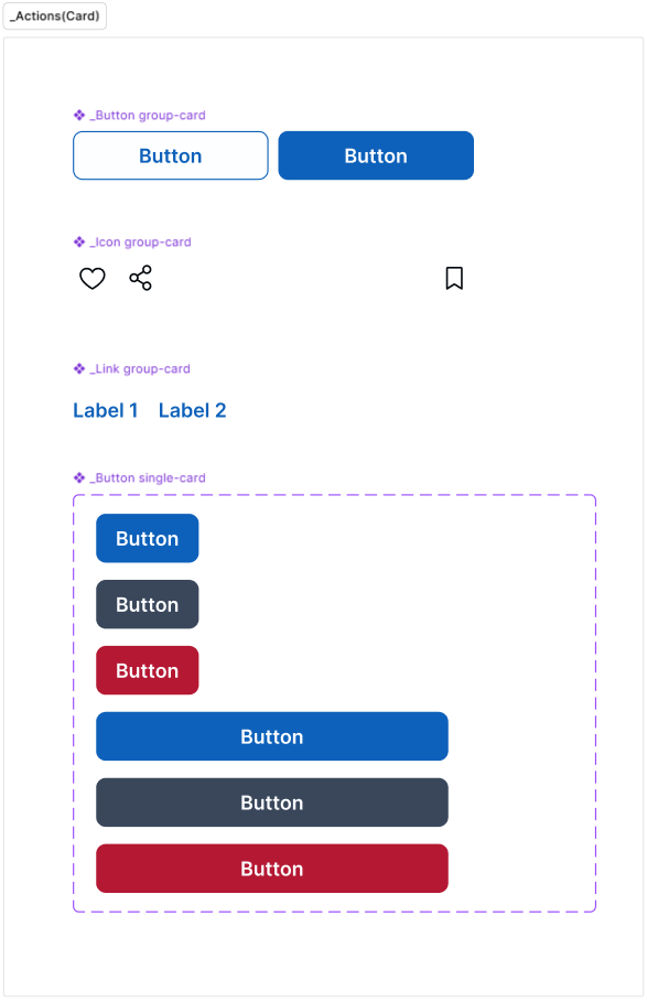
Let's take the card example again.

I want to be able to swap the button in the card with other components, namely
Button group (primary and secondary button)
Icon group (like and share icons)
Link buttons
Instance swap as the name suggests, only works with “instances” of other components.
That would mean, you should have the Button, Button group, Icon group and Link buttons defined as components upfront.
Choose the button in the card.
Hit the instance swap icon in the design panel.

Clicking the instance swap icon opens up the property modal.
Create a name for the property.
Click the preferred values icon.
Choose the components that you want to swap the button in the card with.

The “preferred values” step is optional. You could do it if you choose to. The advantage of sticking with this step is that you have only the necessary components (that you want to swap with) displayed to you upfront, so you have no confusion or decision paralysis. Else, you would have to search your library for a particular component, causing some tedium.

I usually use instance swap with my icons. When creating the component library, all components requiring an icon would have placeholder icons. Later when using components in design I would swap the placeholder icon with an icon of my choice.

Variants (Can the component have different sizes, colours or states?)
There is only so much you could do with the properties we discussed so far. What if you want to incorporate other attributes to a component?
States - Default, Hover, Focus, Pressed, Active, Filled, Disabled
Sizes - Small, Medium, Large
Styles - Primary, Secondary
Colours - Blue, Red, Accent, Yellow
Variants are a way to group related components together, creating a unified system where users can toggle between different versions of a component. Variants allow you to manage multiple states, sizes, or styles of a component in one organized, cohesive set.
The attributes above are some examples. You could custom attributes depending on the context and component.
Here’s a “Notification” component set.

The notification component set has 8 variants defined by 2 attributes namely “state” and “style”.
When creating variants one has to define the name of the attribute/property and the value for the attribute/property.

Our notification component set has the following properties/attributes and values which makes up for the 8 variants in the set.

Creating variants

Start by creating 1 variant of the notification component.
Click the “Add variant” icon in the design panel.
Notice that a variant (duplicate of the 1st component) gets added to the component set.
Notice there is a default property name and value that you must change.
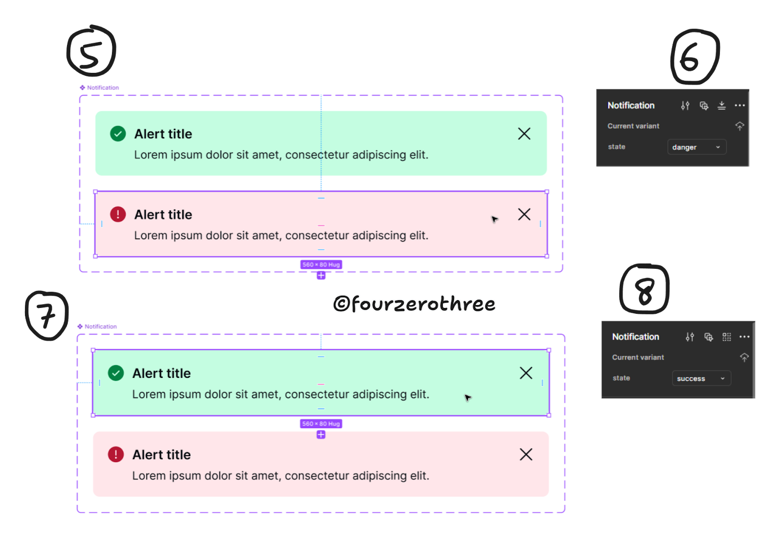
Make the necessary changes to the 2nd component added to the set.
Enter the property name and value for that component. In this case I want the property to be “state” and the value to be “danger”.
Similarly, select the first component and
change the value of “state” to be “success”.
And like that you have 2 variants in the component set.
Closing thoughts
While there’s a ton more I could explore with components, I’ll leave it here and call it a day. Maybe this is part 1 of a series of articles I might write on components. Maybe. Because there is so much more I want to/can cover that is beyond the scope of this post.
Just so you know, I have written a detailed case study on component design as well that you could read 👉 Building for efficiency and usability: A Case Study on Component Design.
Getting around components and component properties is just a matter of spending time geeking around and solving the puzzle of building consumable components. Component libraries are important facets of design systems and rolling up your sleeves and getting the fundamentals of manipulating component properties can go a long way. Mastering this helps you build components that flex, adapt, and scale effortlessly, making your life as a designer a whole lot easier.