
How to use a Figma Design System effectively in real projects
Lessons from building and maintaining a consultancy design system

Most of my experience with design systems comes from working in a consultancy setup.
We were building multiple enterprise products in parallel - different clients, timelines, and designers rotating in and out of projects. Each project had some foundations, some components, and enough structure to ship, but this approach led to fragmented systems, inconsistent outputs, and inefficient workflows.
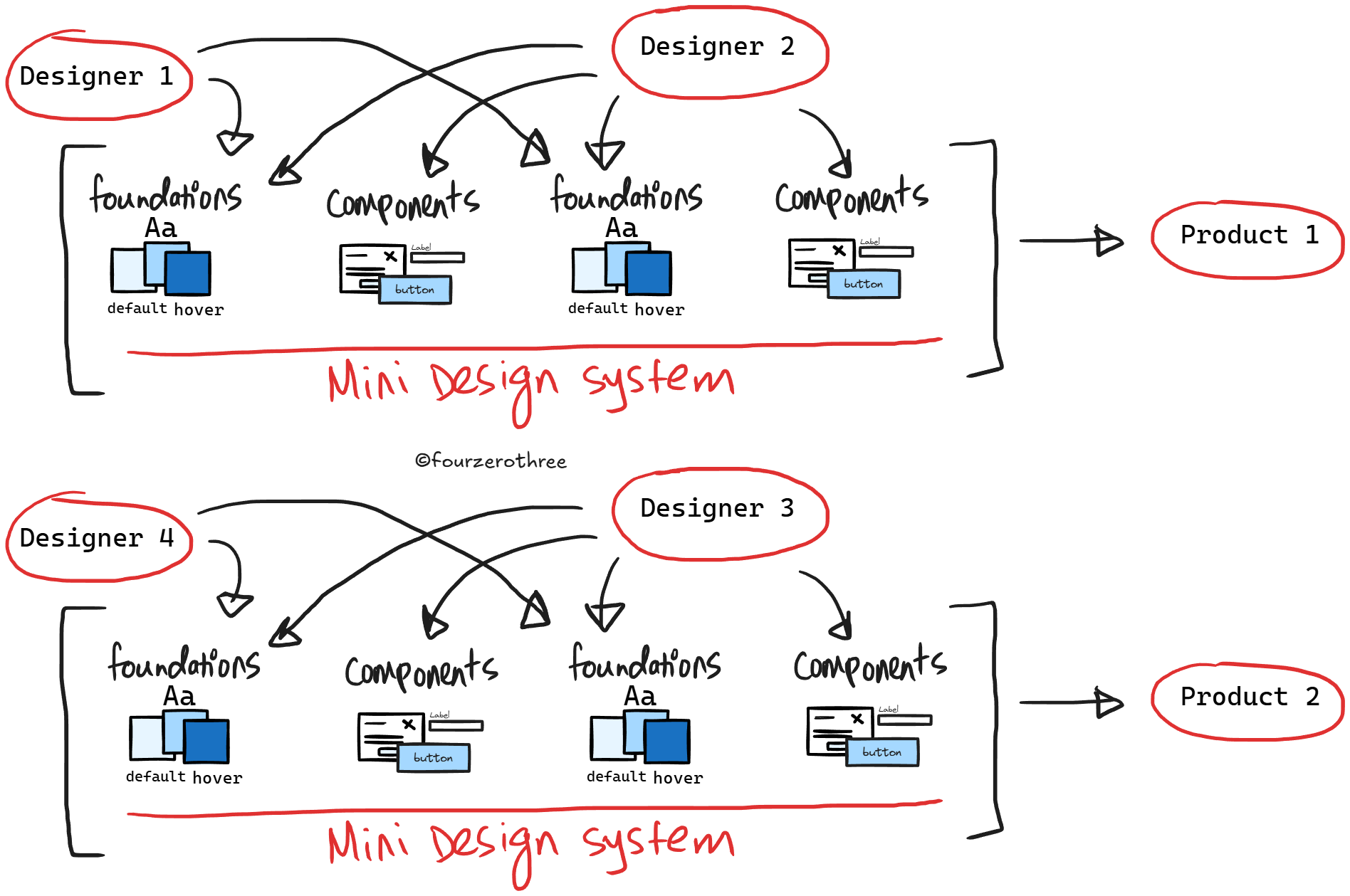
This is a common problem especially across consultancies, agencies and freelancers simply because of how work functions. Multiple clients over time, multiple designers touching the same product, and very real delivery pressure.
And that is why, I was tasked with building and maintaining a design system in my consultancy - a shared system that could support multiple enterprise products, stay consistent as different designers used it, and still adapt to the unique needs of each client project.
Having a shared design system solves a lot of problems. Workflow becomes efficient. Also there is faster delivery, more consistency, less reinvention and all of that stuff. But there is also the hard part which is helping designers use it effectively in real projects. Which, in practice, means design system designers need to be intentional about how the system is structured, and other designers need clarity on how to work within it.
💡Let me be clear…
I’ll use the term “design system” throughout this article, even though a lot of Figma community “design systems” are closer to a UI kit - which includes foundations, design tokens/variables/design decisions, component library and documentation in Figma.
Whether an organization pairs this with partial or full code parity is not the focus here. This article is specifically about the designer workflow inside Figma.
Where things get tricky
Consultancies, agencies, freelancers and even small design teams in startups or product companies, in practice usually take one of two paths.
Build a Figma design system over time and work toward code parity with engineers.
Start from an existing UI kit - something like Untitled UI or the Simple Design System and layer their system/decisions on top of this.
Either ways, designers need to know how to use the design system effectively.
Design folks generally know what a design system is. There’s no shortage of content on the internet about building one from scratch. But using an existing Figma design system, navigating its constraints, understanding what to touch and what not to, and making practical decisions under real deadlines is a different problem altogether.
When there are designers using the system, a familiar set of questions crop up.
How am I supposed to add my brand colors to the UI kit for my product?
Can I tweak this component, or should I duplicate it?
Is it okay if I detach this?
Does this custom component live in my project (module) file, or in the design system?
How do I cascade changes from the Master Design system to the Project Design system?
This applies to both,
design system designers tasked with creating a system and
designers using the system in their day-to-day project work.
This piece is about the practical side of using a Figma design system in real work. If you’ve ever opened a design system and thought, “I know this exists. I’m just not fully sure how I’m supposed to use it”, this article is for you.
Getting started
There are differences in how a Figma design system is used across consultancy/freelancing versus in-house product teams. Since most of my experience comes from consultancy work, I’ll anchor the examples from that perspective.
Consultancy setup
In a consultancy (inclusive of freelancing/agency), a design system typically needs to support multiple client projects.
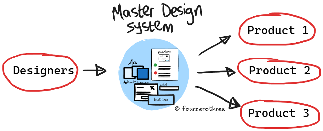
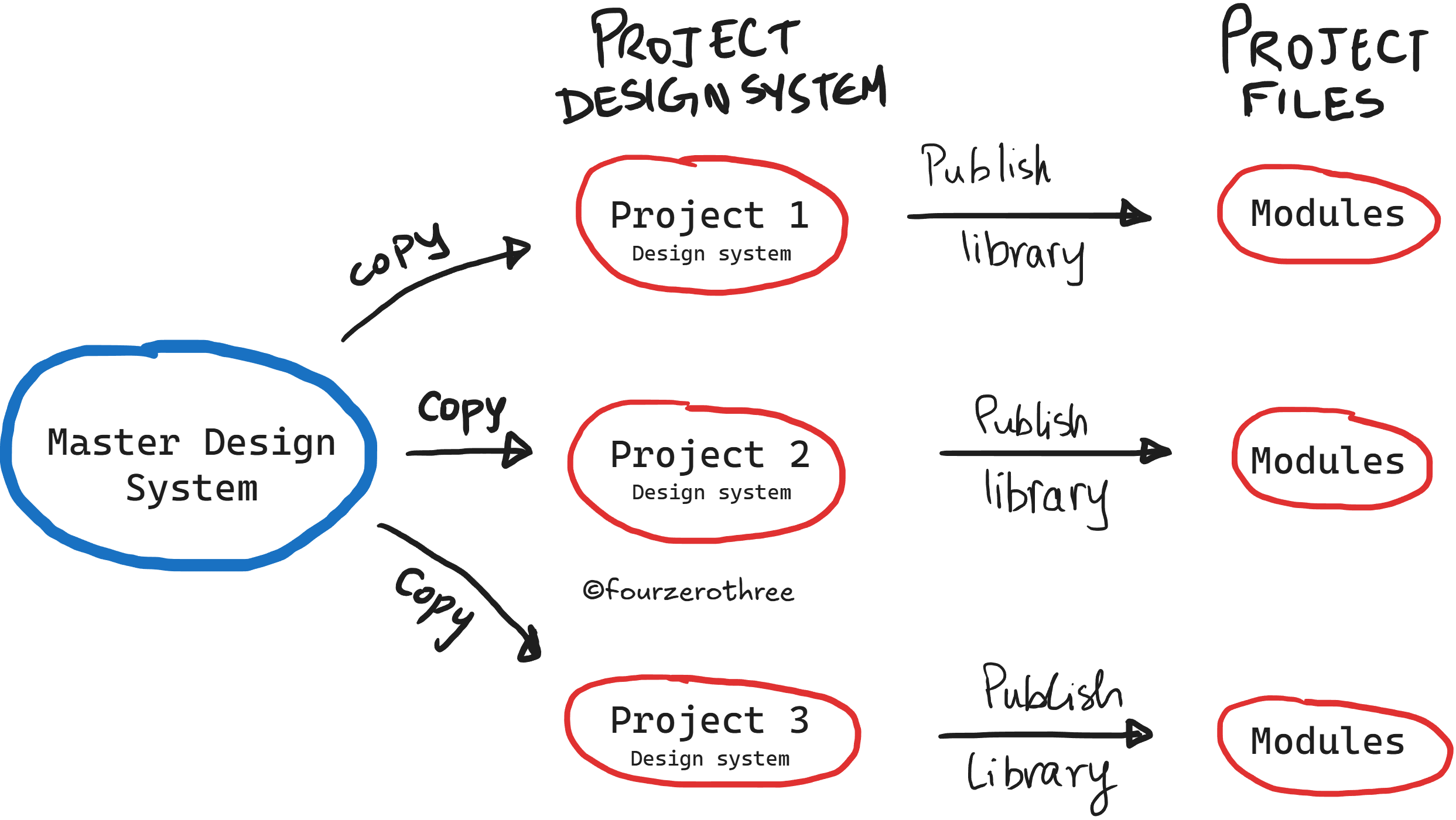
In this setup, I usually work with what I call a Master Design System (MDS). The MDS acts as the source of truth. It contains the foundations, design tokens / variables / rules, component library, and documentation.
This Master UI kit might be built internally from scratch, or it might be based on a publicly available UI kit like Untitled UI. Either way, this is the system that defines the core decisions and is often the one translated into code.
The Master Design System is intentionally flexible. It supports multi-theming, multiple component variations, and a broad set of patterns that can work across projects.
Project Design System (PDS)
Don’t directly use the MDS. For every new client or product, I would duplicate the MDS. That duplicate becomes the “Project Design System (PDS)”.
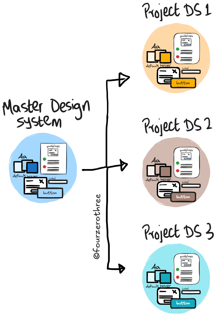
The PDS is:
scoped to a single product,
the source of truth for that product,
and the place where branding, theming, and project-specific adjustments live.
This allows designers to start with a robust system immediately, without rebuilding foundations for every new project.
Once duplicated, the PDS is published as a library and used by the actual product design files (screens, flows, modules).
💡An important implication
Because the PDS is a duplicate, changes made later to the MDS do not automatically cascade. If something is improved in the Master Design System, those changes need to be reflected manually in existing PDS files.
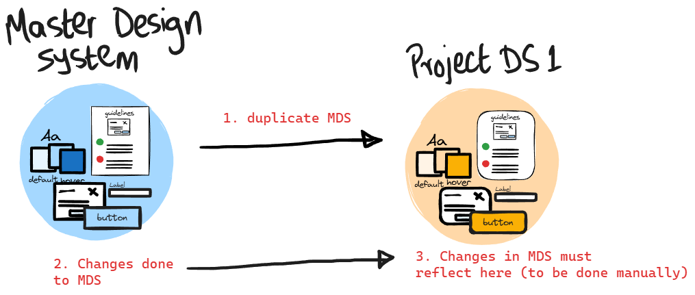
This is intentional. Each PDS represents a stable snapshot tailored to a specific product. Automatic cascading would introduce unexpected changes into live projects.
Duplicate → Publish → Use
Once the MDS is duplicated,
Rename the PDS clearly to match the product.
Publish the PDS library.
Use the PDS library, not the MDS, in your project files.
Note in the example below - Tenet UI (a personal design system I published to the Figma community) is my MDS which I duplicated. The duplicated file (PDS) - in this case “Tenet UI (duplicate)”, is the one I publish.
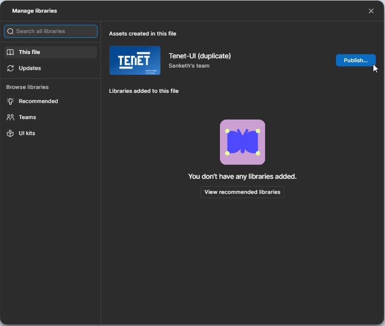
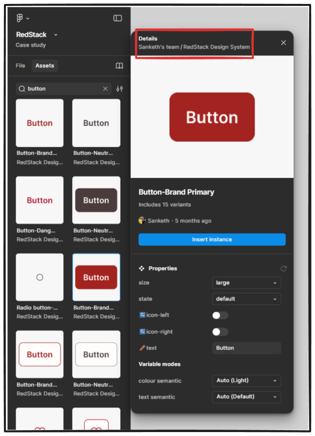
In my example, the PDS (Tenet-UI duplicate) is renamed “RedStack Design System”.
💡 Note
When working with a Master Design System (MDS) and multiple Project Design Systems (PDS), there’s one mistake that designers might do.
It’s tempting to simply copy-paste components or instances from the MDS directly into your project files.
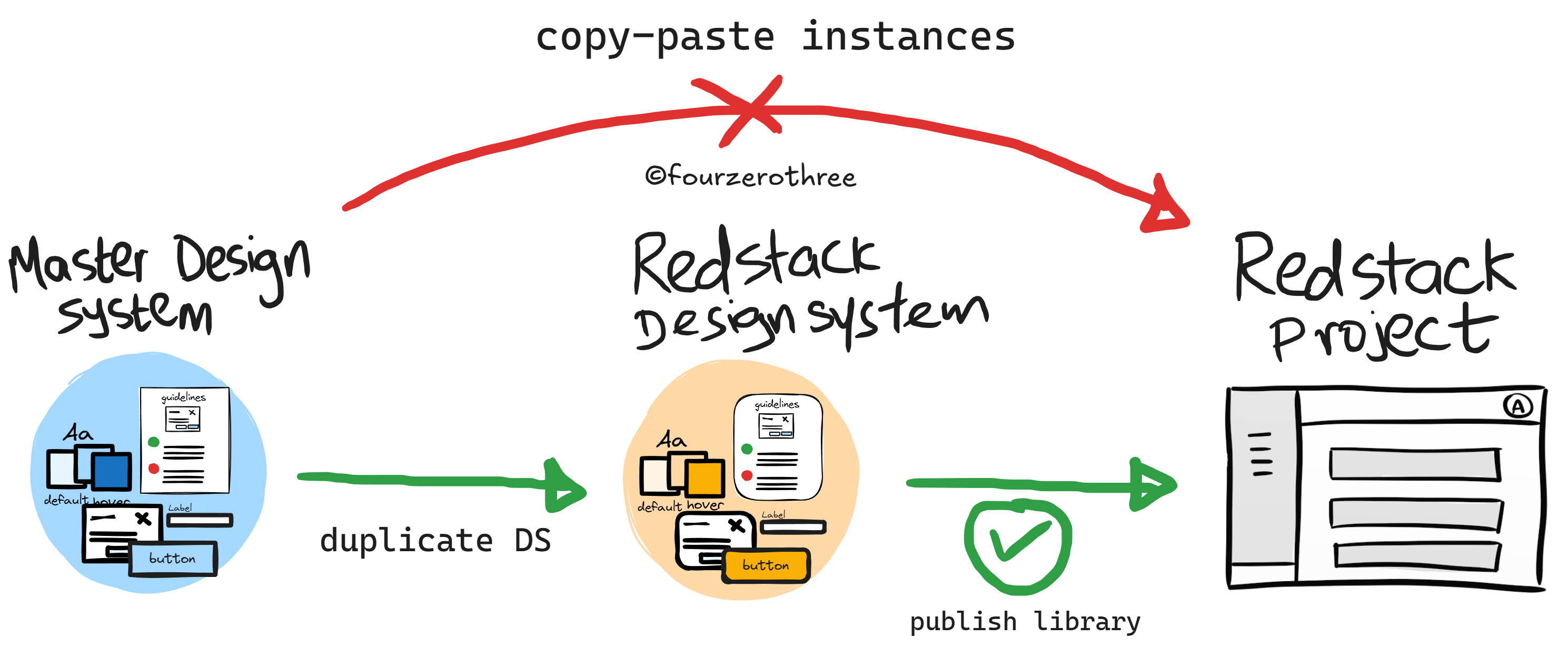
Here’s what actually happens when you do this:
The pasted components continue to inherit properties from the Master Design System (they don’t adhere to the local theme and rules of the project).
They do not respect the local design decisions made in the Project Design System (PDS)
Any changes you make at the project level won’t behave the way you expect
This is never what you want. Project files should only consume libraries from the PDS. The MDS should stay “upstream” and untouched by product work.
💡In-house product teams (quick note)
In in-house product teams with a single product, this MDS → PDS split is usually unnecessary.
There’s typically one design system, and that system is published and used directly.
However, for design system designers in product companies, understanding this consultancy model is still useful. It forces clarity around:
what should be customizable,
what should remain stable,
and how to design systems that others can adapt without breaking.
Manipulating variables/design tokens
For the branding and visual language of a product the Project Design System (PDS) should be adapted by manipulating variables, mostly “primitives”.
I’m not going to re-explain variables here, but it helps to understand how any system has been set up before changing anything.
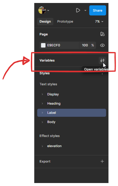
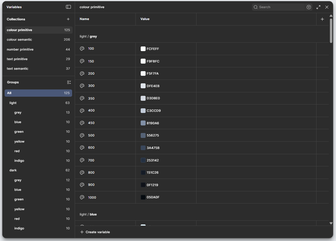
I have a "Design System Chronicles" series where I have written in depth about creating a design system - right from foundations to component manipulation. I recommend going through them, if need be.The first thing I recommend doing is opening the variables panel in the PDS and understanding how the system is set up:
which variables are primitives,
which are semantic,
and which ones are intended to change per project.
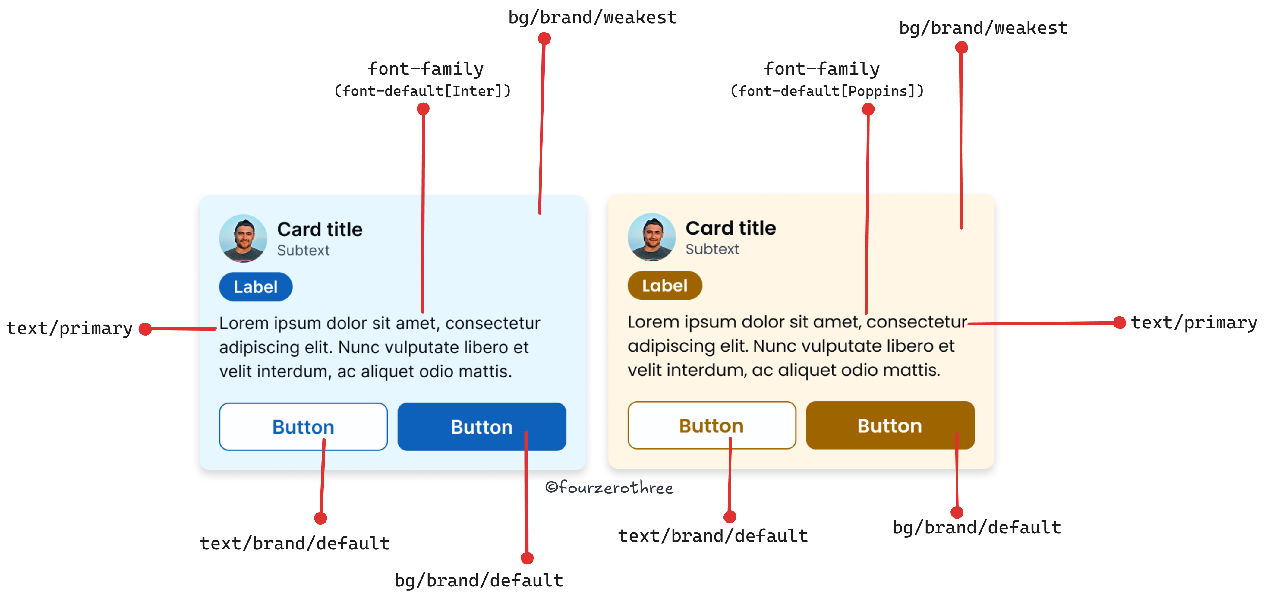
In Tenet UI, for example:
color primitives define the raw palette,
semantic color variables reference those primitives,
typography follows a similar primitive → semantic structure,
numbers (spacing, radius) are usually primitives and rarely change.
The biggest advantage of this setup is that, in most cases, you only need to change primitives in the Project Design System to adapt the system to a product. Components and semantic mappings usually remain untouched.
This of course, is the overarching principle. But,
you could change or introduce new semantic or component specific variables if the project requires it,
change the values of a semantic variable. In Tenet UI
bg/brand/default=brand 600.Maybe your project demands it to bebrand 500.This differs between projects, more specifically with the type of colour palette generated.
Hence its important you assess the needs of the project, understand how the variables in the PDS have been setup and then manipulate them as needed.
Working with components in real projects
At times, designers feel that working within a design system restricts creativity and leads to cookie-cutter or templated outcomes. In practice, this usually isn’t true.
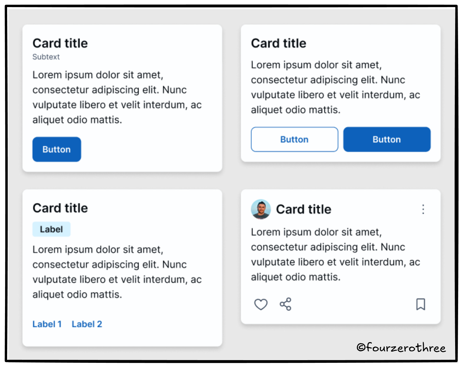
Most of the visual character of a product comes from decisions around spacing, layout, borders, corner radii, typography, colour, and iconography. All of these are already adjustable within a well-set-up Project Design System. The system isn’t preventing customization.
Instances are not where changes should happen
You can make small adjustments at the instance level. Width and height changes are usually fine. Content changes are expected. But the moment a change needs to be repeated, relied upon, or shared across screens, it no longer belongs in an instance.
Any meaningful change should happen in the main component, inside the PDS.
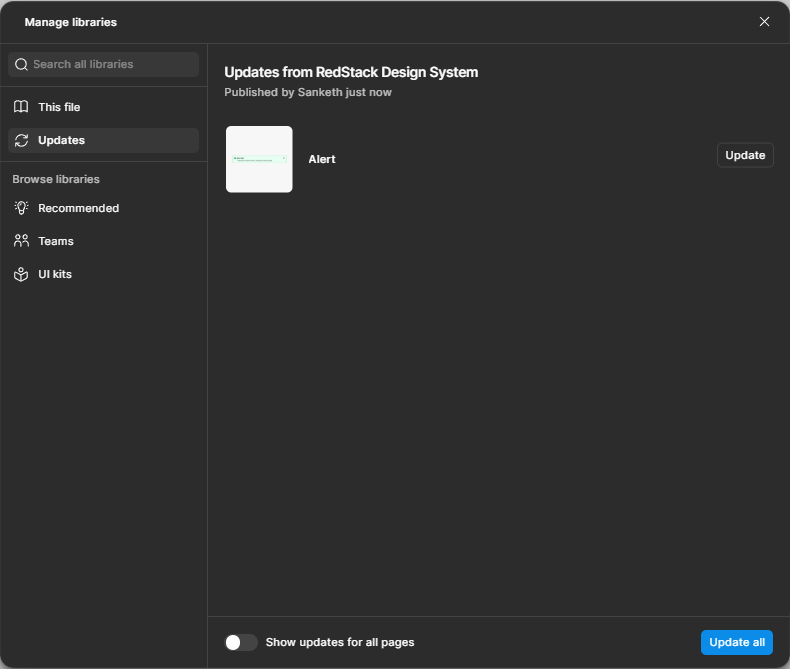
Making changes the right way: component → publish → update
Once a change is made to a component in the PDS, it needs to be published.
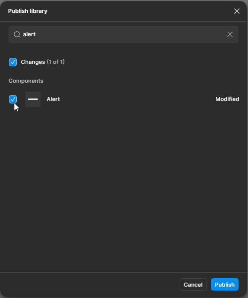
Once published, you update the library in your local project or module file. That’s it. This loop sounds obvious when written down, but it’s one of the most commonly broken workflows I’ve seen in real projects.
Don’t create custom components unless you actually need to
Another common issue designers run into is assuming they need to create new components too early.
Take a card component as an example. In Tenet UI, the basic card ships with size variants and a set of properties that control structure and content.
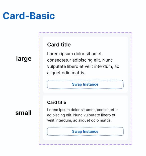
At first glance, it might feel limiting. In reality, most designers haven’t spent the time to explore what those properties can already do.
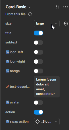
For more complex components, this takes patience. You need to inspect the component, understand the props, and see what combinations already exist before deciding it doesn’t fit your use case.
Apart from cards another common example could be the header or navigation component. Maybe your project needs six menu items, but the component supports only five. Before creating something new, it’s worth understanding why that limit exists and whether the component can be extended safely.
In a consultancy catering to many different projects, you cannot have a design system that could have all possible combination of variants needed to cater to your project. On the flip side, such a design system would be flexible enough to give you a good number of variations.
Hence it becomes important to know the variations that are possible to rule out the need for creating a custom component. If the variation genuinely belongs in the system, you have two options:
extend the existing component by introducing a new property, or
create a new component that clearly represents a different pattern.
Once that decision is made, the workflow stays the same. Make the change in the PDS, publish it, and update your project files.
Working with atoms instead of forcing complex components
Some patterns are inherently complex. Tables, side navigation, headers, dense lists. Even when a design system provides these components, manipulating them at the instance level can feel painful.
In those cases, it’s often easier to work with the building blocks or “atoms” that were used to create them.
Let me give you an example.
At work, I have had a designer tell me he never used the table component in our system. Instead, he preferred using the table atoms directly to build what he needed. That feedback shaped how I approached tables in Tenet UI.
Rather than shipping a rigid table component, Tenet UI exposes flexible table atoms.
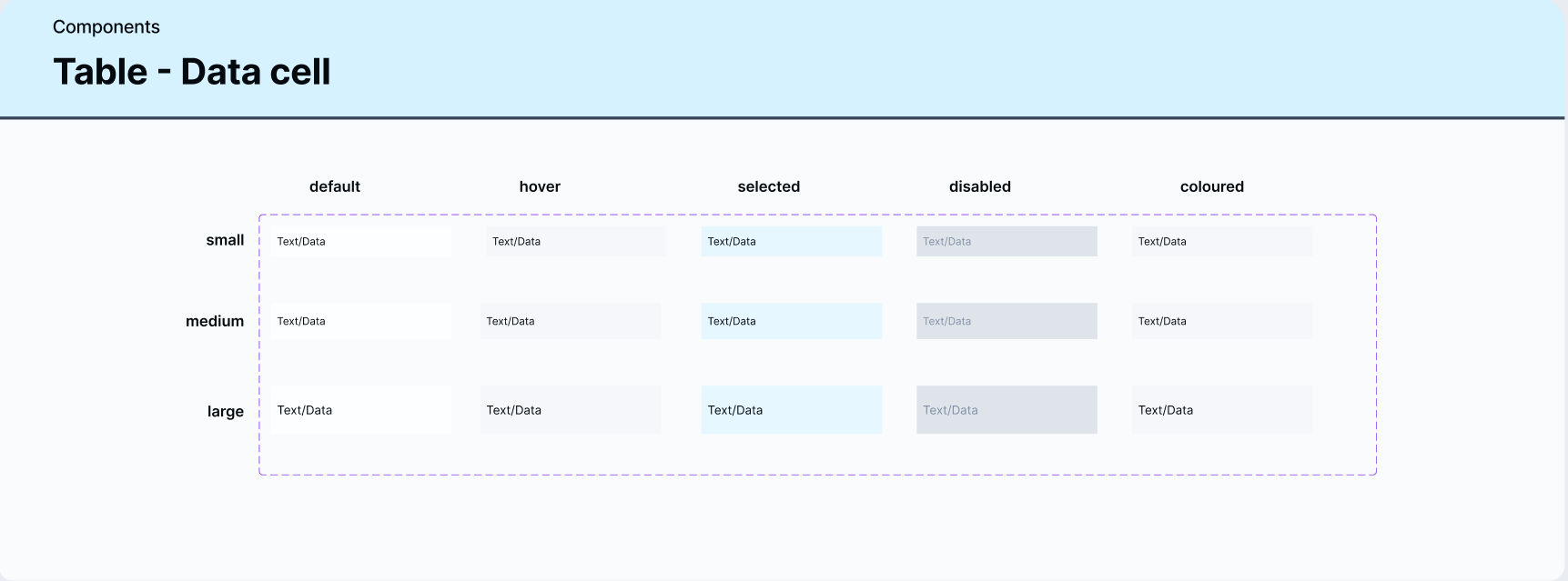
Data cells with strong variant support.
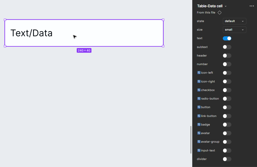
These atoms can be assembled as rows or columns, depending on how a designer prefers to work. The pattern stays consistent, but the construction is flexible.
The same idea applies to side navigation.
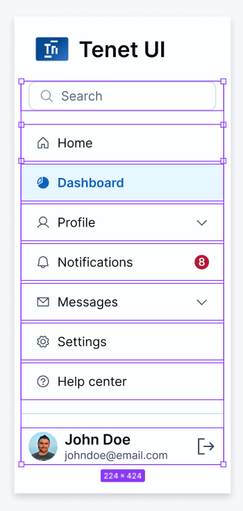
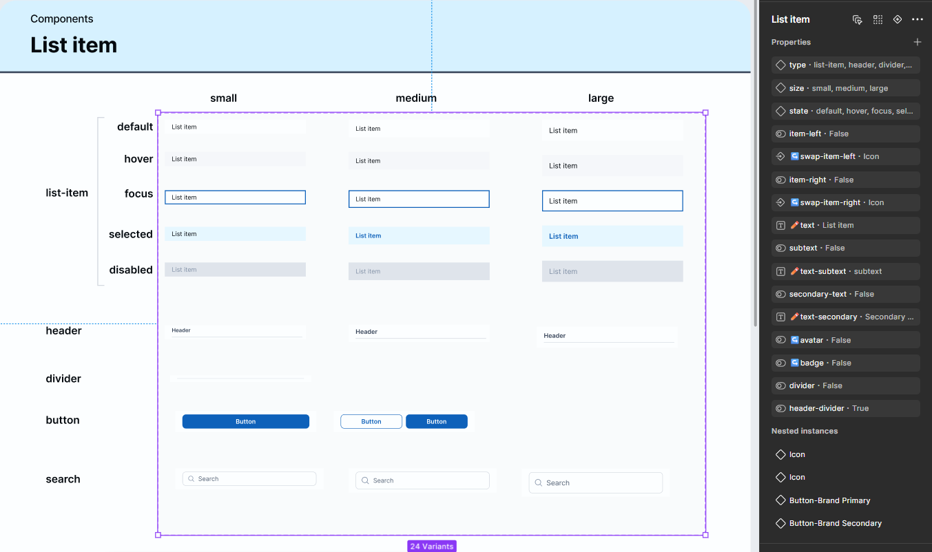
Instead of relying on a single, heavy side-nav component, you can often rebuild it quickly using flexible atoms like “list items”. When those atoms are well designed and property-rich, assembling a navigation becomes faster and easier than fighting a locked component.
This approach won’t look the same in every system. The specifics depend on how your system is built. But the idea holds. When a complex component becomes hard to manipulate, step down a level and work with its parts.
Closing thoughts
The goal of this article was to show how to use and adapt a design system sensibly in real projects, especially from a consultancy or agency perspective, since that’s where most of my experience comes from.
In a follow-up piece, I plan to go deeper into common “why can’t I do this?” questions pulled directly from Reddit and Figma community discussions, with more tactical, tutorial-level answers.
For now, if this article helps you approach your next project with a little more clarity and a little less frustration, then it’s job done!