

Tables are complex components. Honestly when I started out in design, they gave me a lot of anxiety. I mean, the data cells could have infinite combinations, different states and worst of all, the table had to be in auto-layout!
The hack, though, is getting that one “data-cell” component just right, and then using that to build your entire table. I had to figure out how to build that one “atom” so it had me covered. In essence, what we’re doing here is going outside-in.
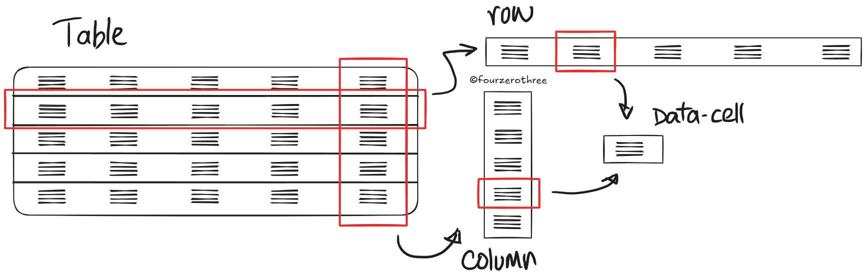
Break the table down into either rows or columns and then break those down into individual data cells.
Creating a data-cell
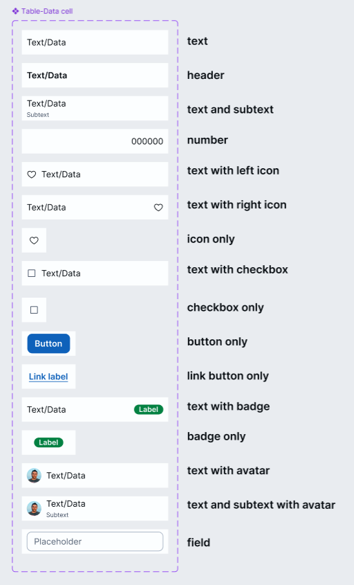
This is where the real work is. Tables can hold many different types of data and each of those could demand a slightly different layout or style.
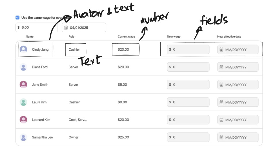
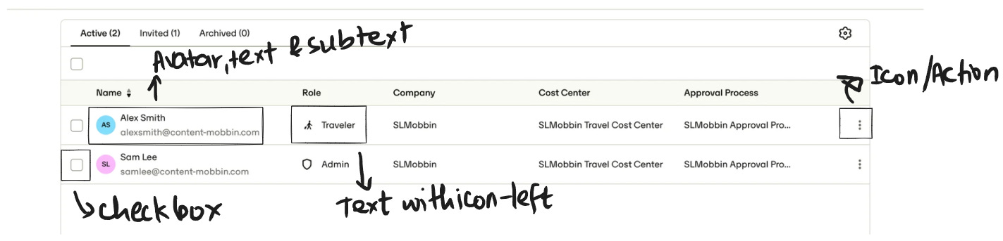
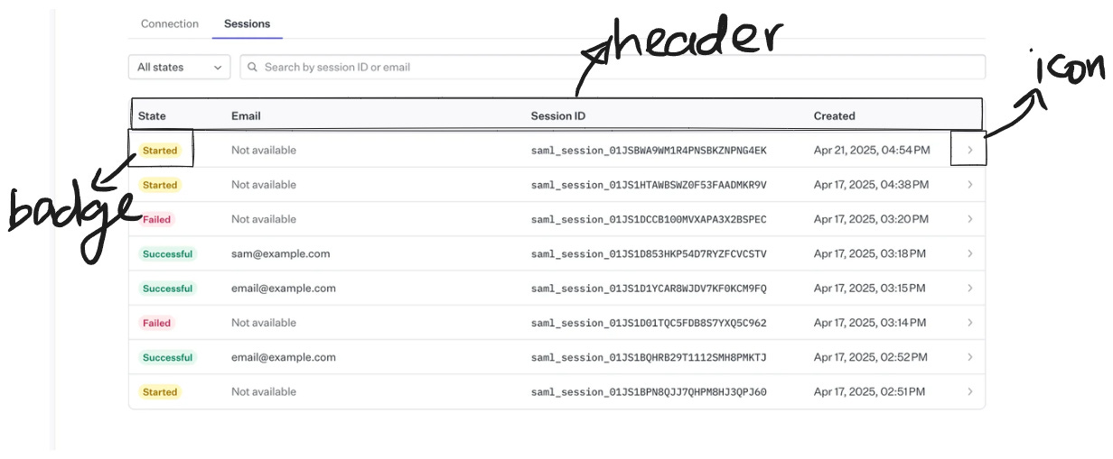
Different contexts could demand different types of data to be displayed.
So the idea is to create a data-cell component set that:
Covers most common types of variations we may need.
Handles different states.
Scales to different sizes.
There are 2 common ways to approach this:
All variations as separate components.
Lean component with packed properties.
All variations as separate components
Personally, I don’t prefer this (though it’s not wrong). It feels bulky. Too many components cluttering my panel. But it’s very straightforward, and a lot easier for designers to pick the variant they want from the variants dropdown.
This becomes a problem when you start stacking variations:
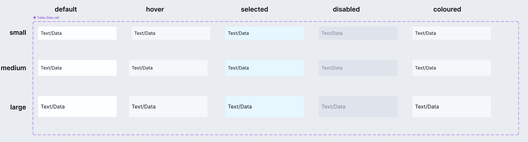
States: default, hover, selected, disabled
Styles: colored or striped
Sizes: small, large
Your component set explodes!
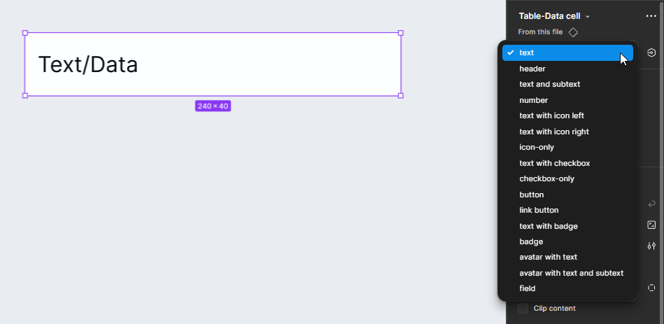
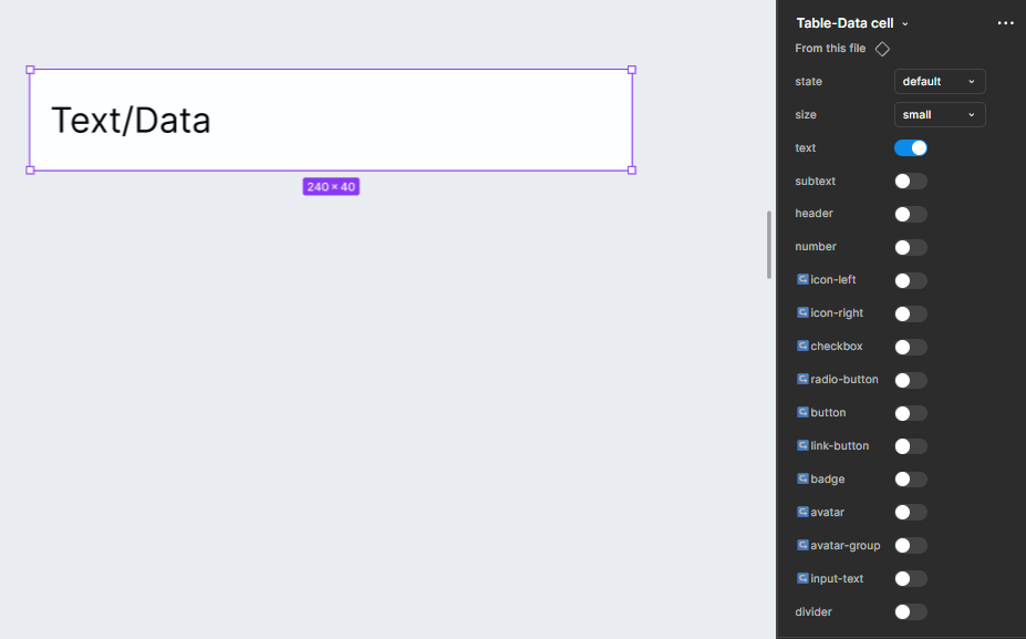
Lean component with packed properties
This is my preferred approach. It’s much leaner. You can achieve a huge number of variations with a compact set of components.
The downside? You might end up with a bit of a “prop-soup” in the properties panel, potentially overwhelming you. But honestly, I feel this is a small learning curve and can be handled with a little practice.
As you can see in the image below, this setup includes both size and state variations (including the “colored” variant). This helps me create a very flexible component set with just 15 variants.
The variations are packed with the help of component properties.
Example video - Manipulating properties to get different variants
Building rows or columns
Once your data-cell is ready, you can use it to build either rows or columns. Honestly, I started off building tables as columns, but I now prefer rows. Either way, it’s just a matter of preference.
Many UI kits, design systems and designers treat the “data cell” as the atomic unit of the table. They often include pre-built column components that use data-cell instances, so you can just drag in the whole column and go.
In Tenet UI, I kept only the data-cell as the main component. Rows and columns are up to you, which made things more flexible and customizable. This was actually a piece of feedback I got from teammates (at work). They liked having that level of control.
Example table 1
Example table 2
Closing thoughts
Tables can feel overwhelming, but its about cracking the logic behind building a single, robust data-cell. So, focus on that atomic unit. Build it well, and your tables will practically build themselves.