

Design System Chronicles (Tenet UI)
Post #7 - Typography variables | Post#8 - Component research | Post #9 - Component Thinking

Component research was easily my favorite part of building Tenet UI. Colors and design tokens are fun (and sometimes a bit of a rabbit hole), but there’s something deeply satisfying about the craft of building a component.
It’s tempting to jump straight into Figma and start designing based on a few screenshots or existing patterns. But diving in without groundwork feels reckless. Because behind every well-designed component are tiny, intentional decisions.
What should this actually do?
How have others handled it?
How many variations is too many?
Will other designers find it easy to use?
In this post, I’m sharing my process for component research - from digging into existing systems and mapping out possible states, to creating component props (API) and shaping how everything fits into the broader system.
Starting with curiosity
Every new component begins with a simple question:
“How have others solved this before?”
Some interface problems have already been solved: there’s no need to reinvent the wheel every time you start a new project when the hard work has already been done by someone else.
The Component Gallery created by Brad Frost has been my go-to starting point. It’s a curated collection of real-world components from well-known design systems like Material, Atlassian, IBM-Carbon, Polaris, and more. A goldmine for anyone trying to understand how different teams approach the same UI challenges.

Since Tenet UI is meant to be a general-purpose UI kit, my goal is to make each component as flexible and adaptable as possible - useful across a variety of contexts without being over-engineered.
To get there, I spent time researching each component across multiple design systems (mostly via Component Gallery), capturing tons of screenshots and digging into patterns. I also did a thorough analysis of existing UI kits like Untitled UI, Simple Design System, UI Prep, Shadcn UI kit, IBM Carbon, and a few others. This research helped me understand:
How a component might be structured

Variations in a component in terms of styles, sizes, layout

The different states a component may need (default, hover, active, disabled, etc.)

This phase wasn’t just about inspiration, it was about getting a well-rounded view of the component’s problem space. While the documentation in different design systems was super insightful, studying how components were built in UI kits gave me a more hands-on understanding of how they could actually be designed and structured in Figma.
📖 Read next:
- Crafting Components with Subcomponents and Nested Instances
- Building for efficiency and usability: A Case Study on Component Design
Mapping out the madness and sketching the “Props” (API)
Variations
I would drop my screenshots into Excalidraw (my favorite sketching tool, by the way) and start analyzing them.

Then I’d sketch out wireframes of the possible variations I observed.
Here’s another example. This process was all about getting messy and sketching out potential combinations.
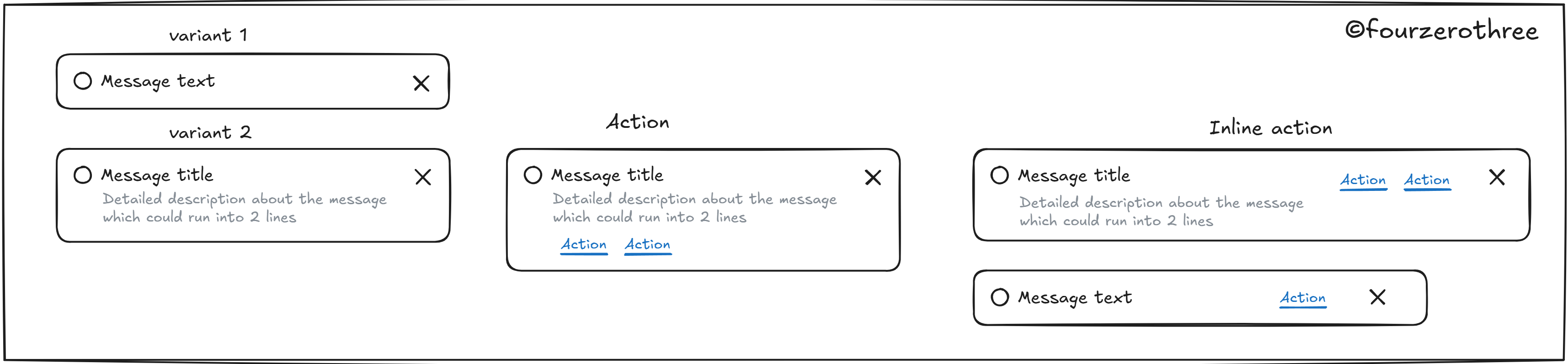
This exercise helps me figure out three things:
The anatomy or structure of a component.
Changes in layout
How many variations (in terms of layout and styling) can I realistically pack into a single component set? (as you can see in the images above)
Designing the component API (props)
Component properties or props are designed so a component can be controlled and configured. This sketching phase directly informs which props I may need to support the variations I plan to offer.

Should this be one giant set, or a few focused mini-sets?
Making a component too flexible by packing in too many variations can quickly introduce unnecessary complexity and make it harder for designers to discover and use effectively.
This part of the research helps me decide whether the component should exist as one large, all-encompassing set or be broken down into smaller, more focused component sets. Take the case of the Card component.
There were just too many variations to keep it manageable. So, I decided to split it into separate sets:
Card-image(card with image)Card-basic(card without image)
The component props would have become way too complex if I had tried to accommodate everything within a single set.
What’s inside? (Subcomponents & dependencies)
Sketching out the structure and variations of a component also helps me determine its dependencies - that is, any subcomponents or smaller building blocks needed to construct the main component. These could be things like buttons, icons, list items, avatars, or even utility components that support layout or interaction.
I’ve spoken about this in more depth in my post Crafting Components with Subcomponents and Nested Instances, but here’s the gist.
Let’s take the Navigation-Side component as an example.
💡Quick note: this one’s tricky. It's a fairly complex structure and honestly, it might be more accurate to think of it as a block or pattern rather than a single component.)

Within Navigation-Side, you’ll likely find:
Navigation items (the menu item in the sketch)
This menu item should have “Open” and “Closed” types.
The Menu-item should have different states - default, hover and selected.
The Menu-item should be expandable.
You see the pattern here?
By identifying these dependencies early, maybe I also can:
Avoid duplicating the same patterns elsewhere
Reuse components consistently across the system
Keep the design system modular and easier to maintain
Wrapping up
Foundations like color tokens often steal the spotlight, but for me the component is the unsung hero behind a well crafted system.
So the next time you see a slick, polished component in a design system, remember,
it probably began with 20 open tabs, a chaotic Excalidraw board, a pile of screenshots and one designer asking…
“What’s the best way to solve this?”
Try Tenet UI
If you found this breakdown helpful and you're building your own design system (or just want to see how mine turned out), feel free to explore Tenet UI on Figma.
It’s a general-purpose UI kit built with flexibility, modularity, and real-world usability in mind, designed to help you design faster, better, and with fewer headaches.