

Design System Chronicles (Tenet UI)
Post #5 - Semantic tokens in action | Post #6 - Typography system | Post #7 - Typography variables

Typography is one of the most critical foundations of a design system. After all a lot of the interface is text! A good typography system dictates readability, hierarchy, accessibility, and overall user experience. Yet, many times typography is treated as an afterthought - leading to inconsistencies and unnecessary complexity.
Honestly, I am not getting into the weeds of how to choose the right typeface for a project or any of that fluff with this post. What I rather aim to do, is to walk you through how I set up a typography system for Tenet UI - from defining typographic scale, roles, line height to setting up variables in Figma (setting up variables would be the next post).
If you’re building a design system, this will help you skip the trial and error and set up a typography system that’s easy to maintain and update.
Defining a Typographic Scale
The natural first step is to define a typographic scale - take a base font size and scale it to get a nice hierarchical system. But before this I wanted to make sure how I categorize them. I didn’t want to go the conventional “H1, H2, H3” route.
Typography “Roles”
I thought I should make it more semantic. Semantic enough to understand how I wanted to apply the text styles. I went through a few design systems but stuck to what I have always found very simple to use - Base’s (Uber) typography “Roles”.
I broke down the typography system in Tenet, like Base(Uber), into 4 roles
Display
Would be the largest text or numerals on the screen. Would most probably be suitable for large text on landing pages.
Heading
As the role’s name indicates, this would be used for headings. Headings help establish clear sections and help create hierarchy.
Label
Labels are also, in a way, headings, but for small blocks of text whenever needed. Think “List item”, headings for text in components like “Cards”, or titles for components like “Alert”.
Anything that may not be suitable for Body is Label (e.g. Button).
Body
For body text requiring long blocks of text.
Used for any text that may be lowest in the hierarchy of these 4 roles.
To make this more tangible to digest, let me show you a breakdown of these typography roles with a real world example - a screen from Teachable taken from Mobbin.

Typography Scale
To create a scale for typography I used proportio.app. This tool would ensure a modular scale for my system.
With a base font size at 16px, I used a major second scale (1.125) to create typescales. This number (1.125) is a common multiplier. What this means is, it would multiply 16 (base size) with 1.125 and the result (18) is again multiplied with 1.125 (20.25) and so on. As seen in the figure, I did this for 13 steps above my base size (larger sizes) and 2 steps below my base size (smaller sizes).
When doing this, numbers are in decimals and proportio rounds it up to the nearest whole number. Depending on how close these numbers were to being multiples of 4, I either bumped it or slightly reduced the numbers to make them so (except for size 18). I did this so my typography scales could align to a system and it would be more scalable and easier to work with.

📖 Read next:
- Post #7 (Design System Chronicles) - Typography variables
- Post #9 (Design System Chronicles) - Component Thinking: A recap of my component design workflow
Assigning roles to each size in the scale
I then segregated categories of sizes to each Role (Display, Heading, Label, Body).
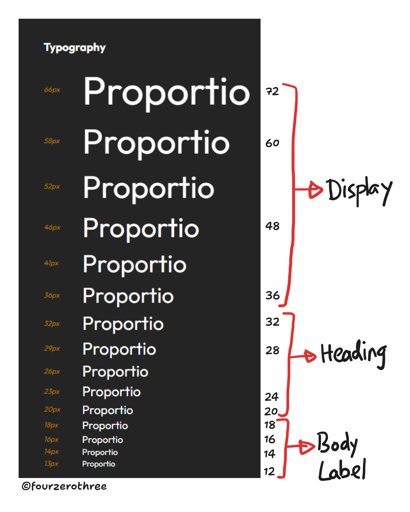
Also note that since there is more than one font size for each role, I further broke them down into “T-shirt” size categories.

Defining a “Line Height” for each font size
Line height is an important property to define and directly affects readability, hierarchy, and vertical rhythm across an interface.
What if the line height is a little too tight?

What if the line height is a little too loose?

What if the line height is somewhere in between both our previous examples?

Establishing optimal Line height
Body copy is text dense, and users will sometimes spend a long time reading it. As a starting point for figuring out the right line height, I recommend multiplying the font-size of your body copy by 1.5. Then evaluate whether that's legible enough.
A good rule of thumb is to set your line height at approximately 145-150% of your text size. For example, 14px text often works well at a 21px (150%) line height, 15px text often works well at a 22px (146%) line height, and so on. Every font is different, but 145-150% is a good place to start.
Small text may have a longer measure, meaning, they could be used in long lines of text (Body). Long lines are easier to read if they are well spaced, hence needing a larger line height.
Large text, however, would have a shorter measure, like Heading and Display, for example. Since short text like Heading don’t span many lines (usually just one line), they would require lesser line height.
Label is an exception here, because of the role it plays. Even though Label is of a smaller size as compared to Heading and Display, it is basically used for headings for small blocks of text like in Cards or Alerts. Hence it would have a smaller line height as well.
Line height for Body text was calculated by multiplying the font size by 1.5. For the rest (Label, Heading and Display), the font size was multiplied by 1.25.

Now I wanted my typography to align to a 4 point grid system so it is easier to establish a vertical rhythm (spacing between elements) and maintain vertical alignment of text. Hence when calculating the line height, I would round the value I get (on multiplication of font size by 1.5 or 1.25), to the nearest multiple of 4.

With all of this established, I created the styles for typography.
Key takeaways
By breaking typography into semantic roles (Display, Heading, Label, Body), defining a modular scale, and ensuring alignment with a 4pt baseline grid, Tenet UI makes typography systematic and adaptable.
Used semantic roles instead of traditional H1, H2, H3 labels for better clarity.
Built a modular typography scale using a predictable ratio (major second - 1.125x).
Aligned typography with a 4pt grid for vertical consistency.
Set line height dynamically
(1.5x the font size for Body and 1.25x the font size for Label, Heading and Display) to balance readability.