
Learning by Deconstructing: Trying to Reverse Engineer a Design System for the Coursera Mobile App - Part 1 (Foundations)
Design Systems - Product Audit/Foundations

Starting off learning Design Systems early
This was during my early days of learning Product Design (back in 2023). Around 6 months in, I had a newfound thirst to learn Design Systems.
Honestly, I thought I was jumping the gun here when I had so much to learn about the basics of Product Design but here’s why I thought it would be worth the shot.
Reason 1
From the ground up, if you list what you might need to build a good interface design, at a minimum you have colours, typography, spacing rules, grids and components.
Get these right and you have a solid interface.
Learning Design Systems would mean forcing myself to know everything I listed above. I would have to double down and research every step mentioned. Every foundational element in design is a rabbit hole of its own and I could have a holistic learning experience.
Reason 2
I learnt a lot about UI by recreating screens of popular, real-world apps (from websites like Mobbin) that are well-designed. One thing I understood was my lack knowledge of how components worked. My recreation was random. I didn’t know how to dissect a screen into various components. I thought learning about Design systems could help me understand the world of components and how I could build them.
The Prep
The idea was to learn as much as possible about Design Systems. I decided a hands-on approach would work best. But before undertaking this, I did a lot of homework to cover the basics of UI design and Design Systems (I also covered Figma variables). I knew a basic foundation was needed if at all I had to have a roadmap to build one.
My homework was the usual - reading books, and articles, watching videos and doing necessary coursework.
The homework got me rolling. I was itching to go hands-on and start a Design System project.
The Challenge
The challenge was to pick a mobile app and reverse engineer a Design System for it. I have a liking for Ed-Tech products and Coursera was a product I had been using frequently. So I decided to go with Coursera.
📖 Read next:
- Creating Tenet UI (design system) for Cohesive, Consistent and Scalable Design - a case study
- Architecting a “Remote Execution Platform” with AI-augmented UX workflows - a case study
What makes up a Design System?
“ Design system is a set of interconnected patterns and shared practices coherently organized to achieve the purpose of digital products.”
“Design system offers a library of visual style, components, and other concerns documented and released by an individual, team or community as code and design tools so that adopting products can be more efficient and cohesive.”
The words in bold stand out to me. These are my keywords 👉 patterns, shared practices, visual style, components and other concerns documented.
Marcin Tredor of UXPin summarizes this with this schematic diagram 👇

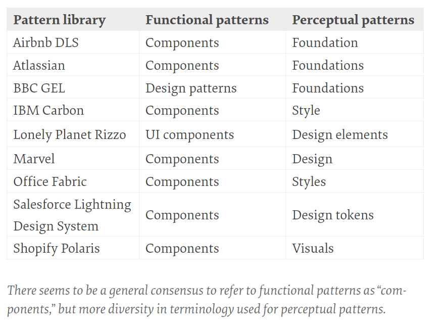
Honestly, I wanted to omit the guidelines and specifications part of the Design System. That was not my concern (I regret that. I should have done that too). So I was left with the styles and components/patterns. To digest everything it made sense for me to stick to what Alla Kholmatova says in her book, that everything is a pattern of 2 different types:
Perceptual patterns - Styles in the interface, colours, typography and so on.
Functional patterns - The blocks that make up the interface - components.
I wanted to dumb this down even more. I decided to stick to conventional terms, namely
Foundations
Components
Atomic Design?
Okay, so much for what makes up a Design System. What about naming conventions? Do I call the elements I create “components” or maybe follow atomic design?

What is more important here is to imbibe the principles of atomic design. Using metaphorical terms in the Design System would be confusing (at least for me). I found validation for this in one of Nathan Curtis’s articles where he says
“Call things Elements and Components rather than Atoms and Molecules, or whatever other platform-specific or metaphor-rich jargon is being considered. Again, to be clear: Atomic Design is awesome, but most libraries employ less metaphorical terms such as components for reusable parts.”
He further breaks this down.
Don’t distinguish Elements from Components. Just call them all Components. Sure, HTML is made of elements (P, LI, BUTTON, INPUT). But the line between what’s an element versus what’s a component is subjective. It’s annoying to constantly debate. It creates confusion in finding things. So why bother? It’s a longer list, but they’ll always find Buttons and Forms and Lists in that single place.
In general, I found his article to be very useful when it came to how I could classify and break down my Design System into different constituent parts. I decided to “Just call them all Components”.
The Goal
I had to reverse engineer the Coursera mobile app and create a Design System for the same.
I had to then, recreate as many screens as possible from as many sections/flows as possible in the Coursera mobile app using the Design System. In other words, I had to only use instances of components I created in the Design System. And of course, all components I create should use the foundations of the Design System.
Creating the Design system
To start, I performed an Interface Audit, mainly comprising of a Colour audit and a Component audit.
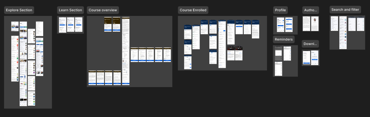
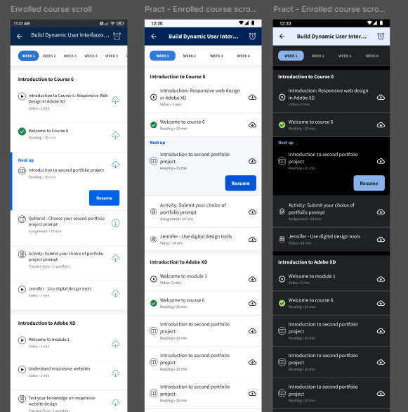
For the audit, I dove deep into the app and took screenshots of different “modules” or “flows”. This is opposed to the usual component-driven approach where screenshots of various components or patterns are taken and an audit is done. I found the first approach easier. Here’s a snapshot of how I split my screenshots across different modules.

I then pasted the screenshots by category in Figma…
…and scanned the screenshots screen by screen.
Colours
For the colour audit, I asked myself what was I trying to apply a colour to. This was inspired by the Base (Uber) design system. It made things a lot easier for me. Here’s an example of how I did the colour audit.

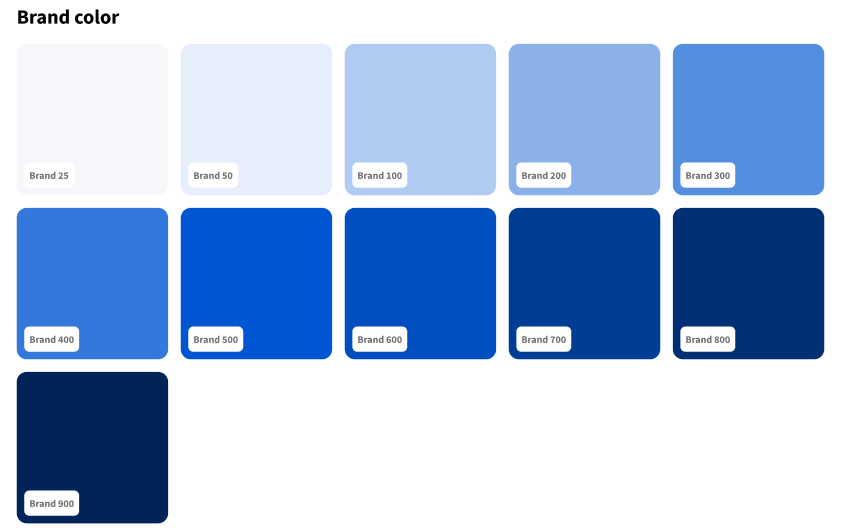
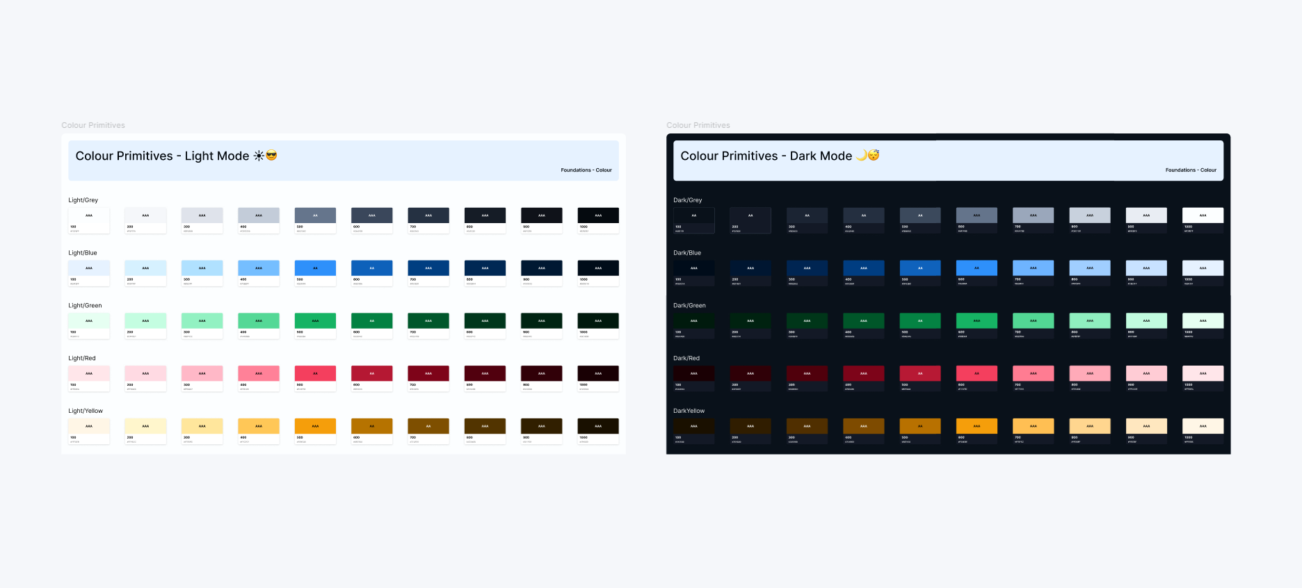
Finding the brand colour was obvious. It was blue and to narrow it down I checked interactive elements like the button which had the colour #0056d2. The official Coursera branding page also helped validate this. And honestly, Coursera had a pretty consistent interface with minimal brand colours. For my extended colour palette, I created 6 tints (lighter versions) and 4 shades (darker versions) of the brand colour (Brand 25 - Brand 900) using a plugin called “Foundation Color Generator”.
Mapping neutrals was difficult. I found there were many shades of grey. Notice the image above has 7 shades of grey excluding pure white and black. Extend this to numerous other screens and mapping greys was a nightmare.
For neutrals, I picked a shade in the interface that sat somewhere in the middle of the neutral spectrum and overlapped it with the Brand colour that was toned down to an opacity of 8%. The colour of the overlap was my “Neutral 500” which I used to create tints and shades of grey. This way my Greys were monochromatic (with a hint of the brand blue colour) rather than being “Neutral”. I did this to make my designs look a bit more cohesive with the brand.

Also by generating around 12 sets of Monochromatic greys, I had a limited set of Greys to use so I could maintain consistency across designs when I had to recreate screens.

My screenshots didn’t record “states” and hence I generated the supporting colours like information, warning and error myself.
💡Rookie mistake
Forget screenshots of error or success states, I didn’t even think of creating different states (hover, active, filled, disabled, error, success etc) for the components I created. A rookie mistake.
Creating colour tokens
This was a great exercise in learning and creating colour tokens. Reading about them or watching videos is one thing, creating them for a project is another. It could especially get confusing when the project scales and the number of tokens increases in number.
Primitive and Sematic tokens
I classified colour tokens as
Primitive tokens (example - blue-600)
Semantic tokens (example - surface/brand)
The Primitive token holds the raw hex value of the colour, while the value of the Primitive is mapped to a Semantic token.
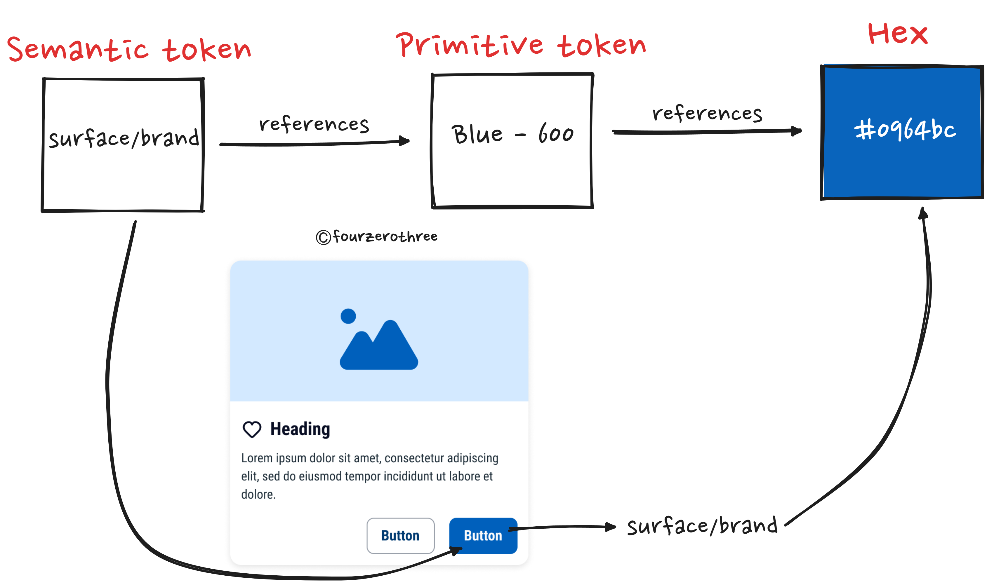
This greatly helps maintain consistency when applying colours to different elements. I know what colour to apply where without having a decision paralysis (should I apply blue-600, 500 or 800?).
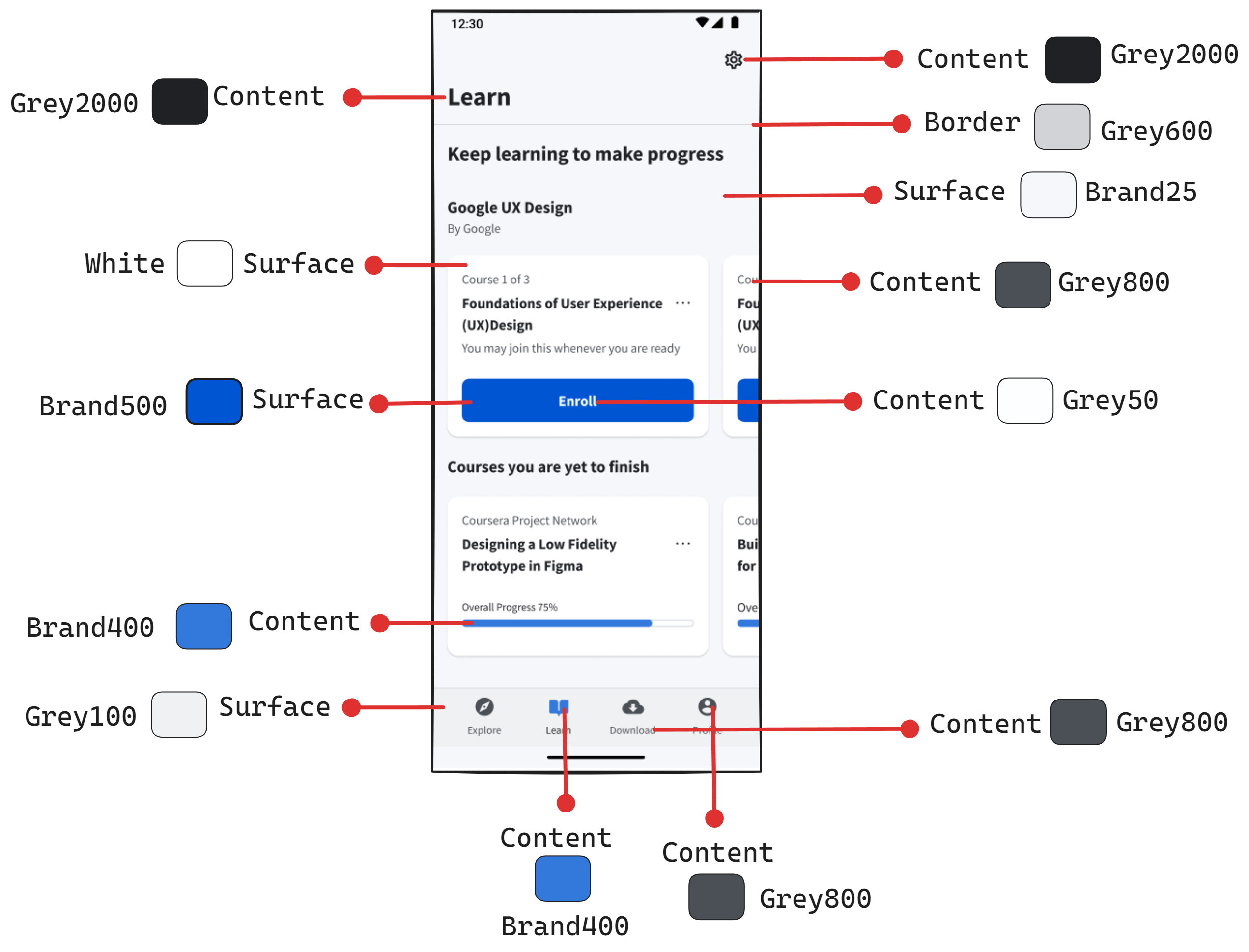
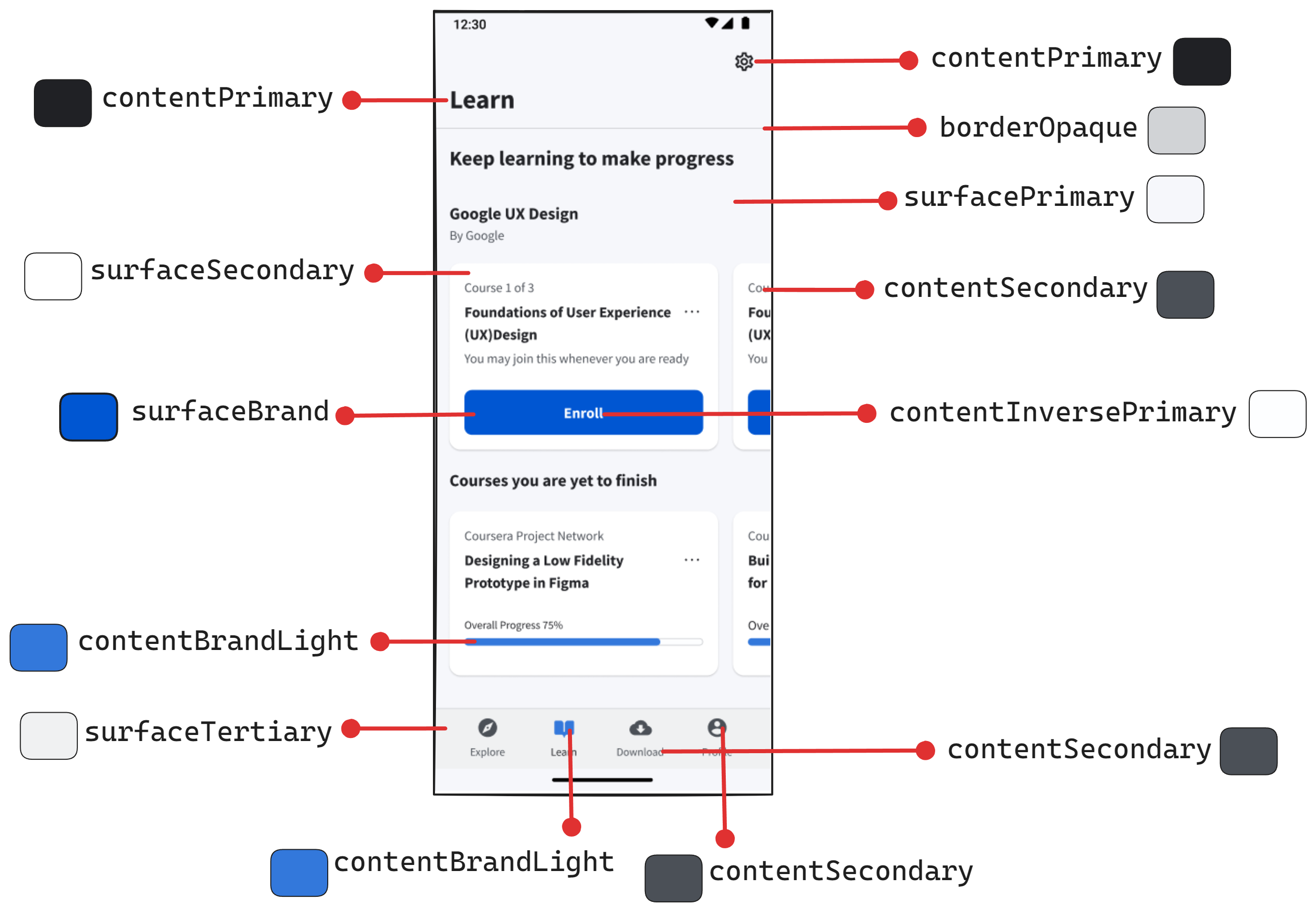
I asked myself what was I trying to apply a colour to (element). I was applying them to
Surface (background)
Content (text/icons/other types of foreground)
Border
Though it was the first time creating tokens at the time of doing this project, I somewhat loosely followed this structure (that I routinely now follow at work).

💡Note:
My tokens didn’t have “state” (eg-hover, pressed, focus) as I didn’t create different states for the components I created. I clubbed “Text” and “Icon” (element) and called it “Content”. I didn’t do the slash and hyphen notation. I used the camelCase style for naming tokens.
I laid down my screenshots and started annotating them, to get a sense of the tokens I might need.
Creating Dark Mode
💡Update
I talk about setting up a scalable dark theme in detail here 👉 Post #4 (Design System Chronicles) - Designing a Scalable and Accessible Dark Theme
What I was also doing was creating a set of tokens for dark mode simultaneously.
For dark mode, I divided my colour swatches into 2 halves and each half becomes the mirror of the other.

As you can see, if brand 50 was used in Light mode the corresponding colour in Dark mode would be Brand 900 and vice versa.
💡Rookie mistake
Note that it is very important you have a “structure” for your token (like the image above) and adhere to it. Also, establish names that scale well. For example, note in the screenshot that I have names like “surfaceBrandLight” and “surfaceBrandxxLight”. These are not good names. You see, the colour for surfaceBrandxxLight for dark mode is assigned Brand/900 (which is the dark version of the brand colour). This could quickly become very confusing.
You could stick to names like surfaceBrandWeak, surfaceBrandStrong or surfaceBrandSubtle and so on. These names make sense for both light and dark modes.
Honestly, it was a decent attempt for someone who was doing it for the first time, but I am not particularly proud of the way I assigned Dark Mode tokens. I found it very challenging and I quickly found I had no particular system for doing this. My assigning of dark mode tokens was very “trial-and-error”.
But I was very happy seeing the modes flip as I toggled between light and dark mode.

💡Note:
I have since then found it easier to create an entire set of primitive colours solely for Dark mode and use them to assign corresponding semantic tokens. Though a little more laborious, it would make your life easier as you begin to scale.
Typography
💡Update
I talk about setting up typography for a design system in detail here 👉 Post #6 (Design System Chronicles) - Establishing a typography system
For establishing a typography guide and system I went through other Design Systems, especially Base (Uber) since I found its documentation quite straightforward to understand. They had a great way of naming their typography tokens, it was semantic. I took some notes and inspiration from it. Here is a snapshot of some notes I took while doing this.

And this is precisely what I did. After establishing this semantic hierarchy, like for colours, I started annotating my screenshots for different typography hierarchies.

For the text size and weight, I did a 1:1 mapping of the text in the screenshots. Meaning, that I used to type over the text in the screenshot and then adjust the size accordingly until it was almost an equal size and a weight match.

I then established a system for my project.

💡Rookie mistake
Note that my line height was all over the place. It was based on “trial and error”. Since then I have had a system for establishing line height. Usually, the line height is 1.4-1.5 times the font size. After this, I round it to the nearest multiple of 4. However, for larger font sizes like “Heading” and “Display” you don’t want a large line height. You could multiply the font size by 1.2 and then round it to the nearest multiple of 4.
Spacing
Spacing for me was a little straightforward. I wanted to follow the 8-point grid rule. For the 4 smallest sizes I jumped by increments of 4 (I want granular control for where small spaces are required) and then onwards jumped increments of 8 —> 4,8,12,16,24,32,40,48,56,64.

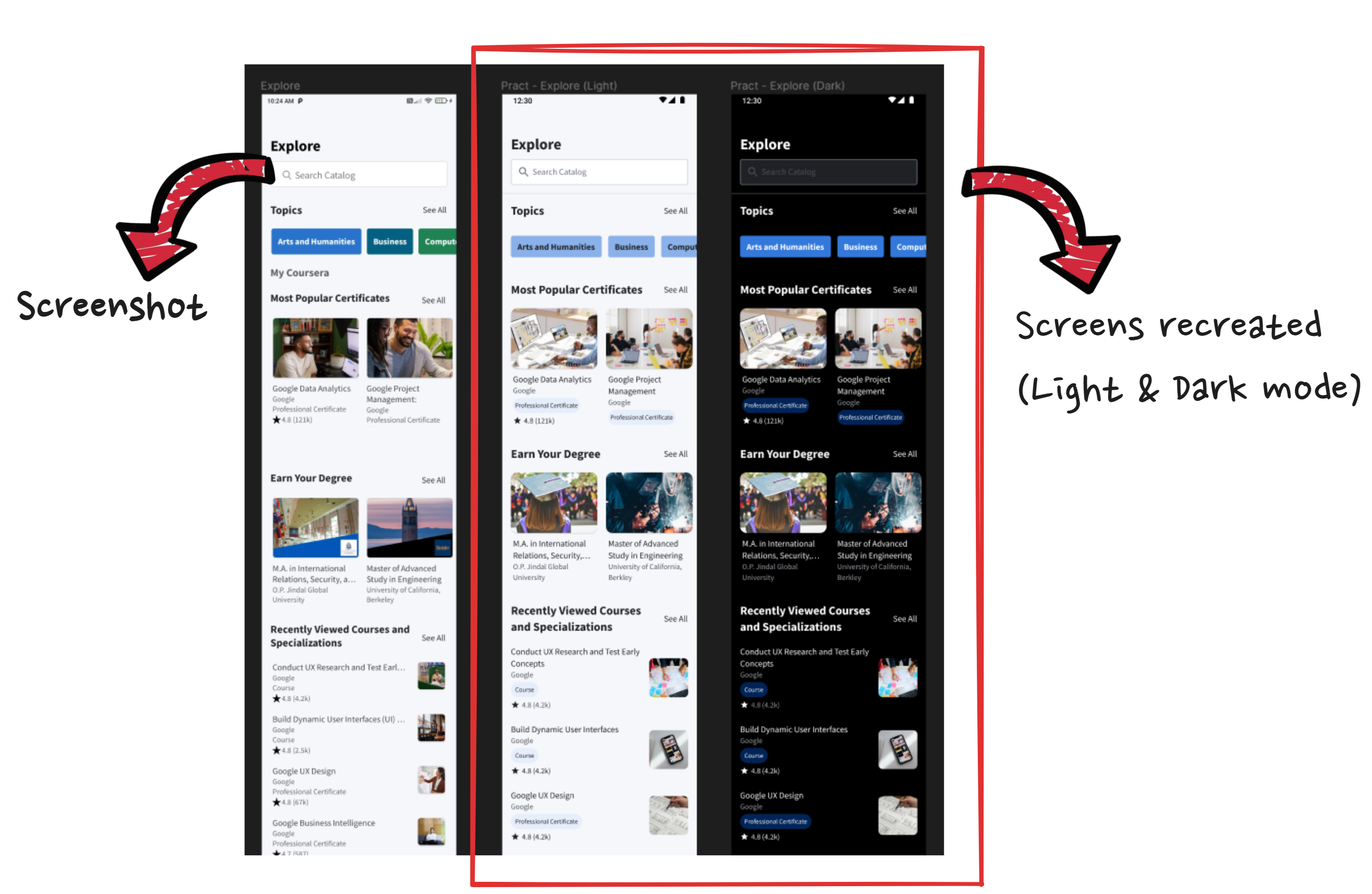
Some screenshots of recreated screens

Closing Notes
For this article, I would stop here and move on to how I went about doing the component audit and building the components in part 2 of this series.
Also note throughout the entire article, that this process wasn’t perfect. The idea was to experiment, challenge myself and learn along the way. And that this learning experiment gave me way more insights into Design systems than just watching videos or reading articles would have.