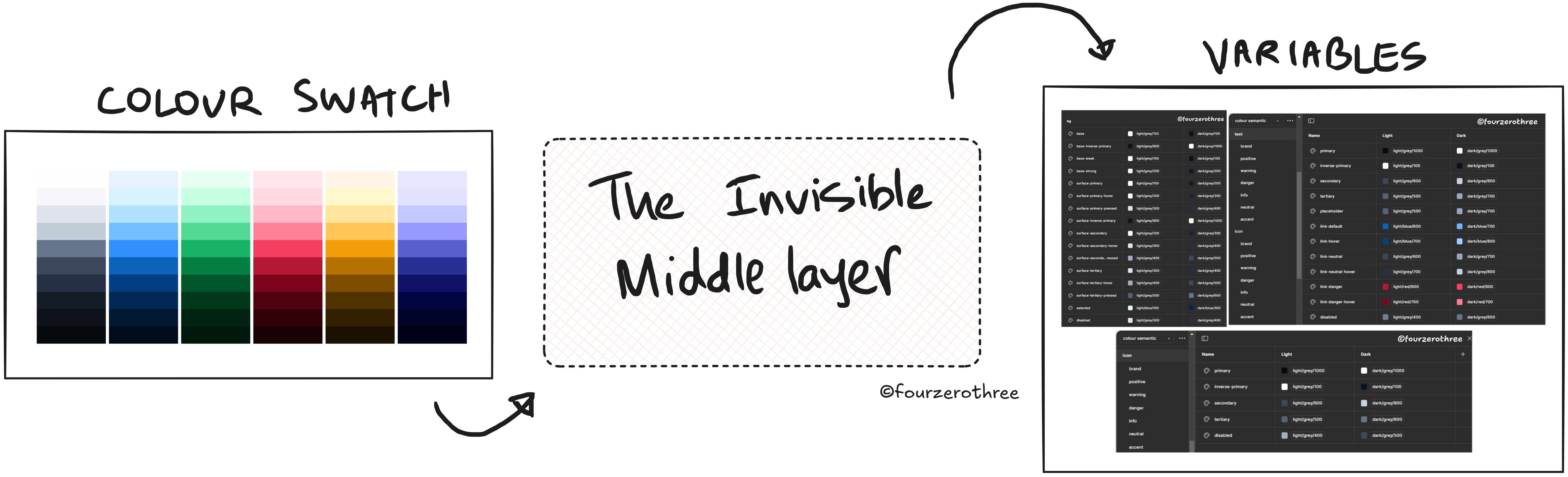
I used to think the hard part was choosing/creating the color palette. And yes, it’s a good start. But if the goal is to build a system that scales, we can’t stop there.
So, a) creating colors is one side of the spectrum and b) tokens - those neat variables in Figma or code are the other.
What connects the two is a crucial middle process. And this is where the real DNA of a color system gets written.
It’s in this middle layer where we answer the questions that actually make colors usable:
What’s the default background, and do we need lighter, darker, or inverse variations?
Which shade of grey becomes body text, and how does it hold up across surfaces?
If blue-600 is our brand primary, does it still pass accessibility on a 100-level background?
This “middle process” isn’t just a bridge to variables/tokens. It’s where accessibility, usability, and the overall logic of how color behaves in your product are established. Think of it as the set of design decisions that form the foundation of a scalable color system.
And this isn’t just a personal workflow. Mature design systems recognize it (I learnt from mature systems). Carbon talks about “layering models”. USWDS defines theme tokens that abstract color families into accessible, flexible roles. Orbit bans dark shades as backgrounds.
None of them stop at “here are our colors.” They all define the invisible choices that sit between palette and tokens.
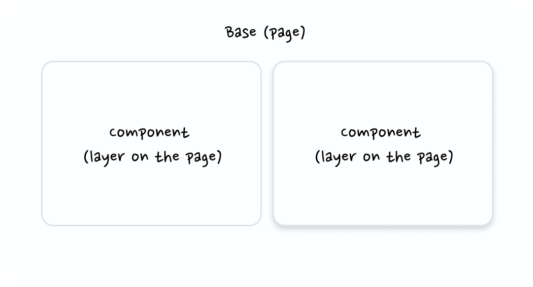
Surfaces & Background Layers
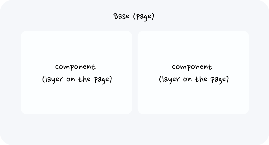
The first thing I decide after creating a palette is how my surfaces behave. Because surfaces aren’t just “background colors” - they’re the stage where everything else plays out. Text sits on them. Components stack on them. Accessibility succeeds or fails on them. If surfaces aren’t defined, everything else in the system becomes guesswork. So, in order to map out my background layer (surface) colours,
a) I try to understand how I would want my surfaces to behave.
b) I roughly try to predict the components I might end up using most often.
Surfaces (greys)
When I talk about surfaces, I’m mostly talking about neutrals - the deepest layers of the UI. Think of the page or screen itself, the canvas that other components sit on.
Take this screen for example.
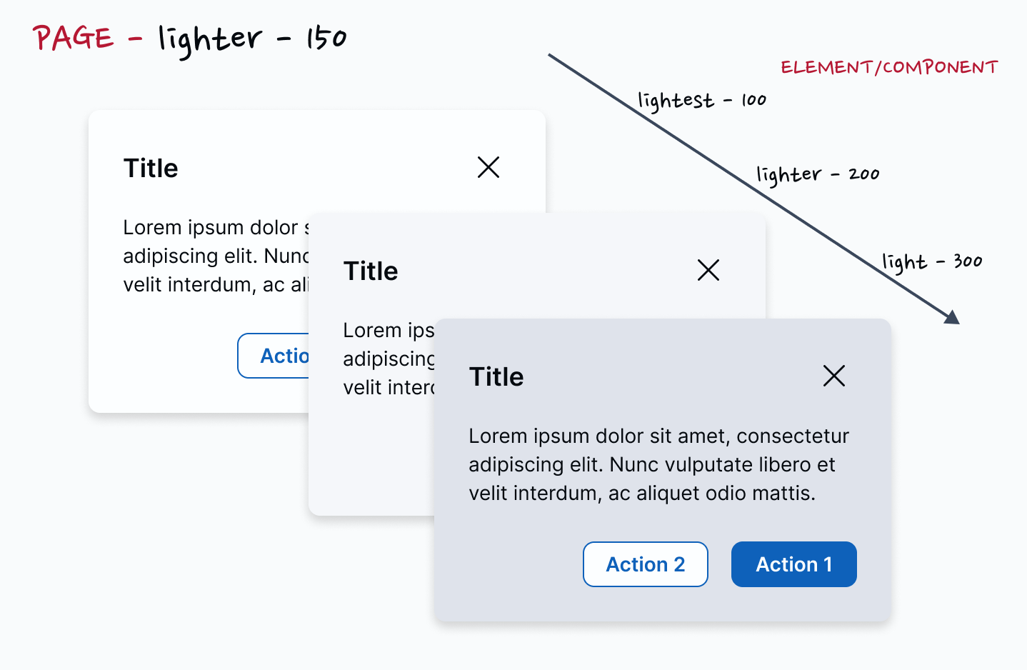
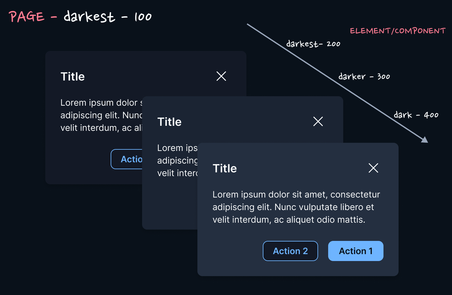
The page is bright white, with components blending into it and using borders or elevation to separate themselves from the “base” page or screen.
Have a look at these screens.
The page is a subtle grey. The components may or may not have borders or an elevation but they pop by simply being lighter than the background.
Now this depends on the product you are working on and different products handle this differently.
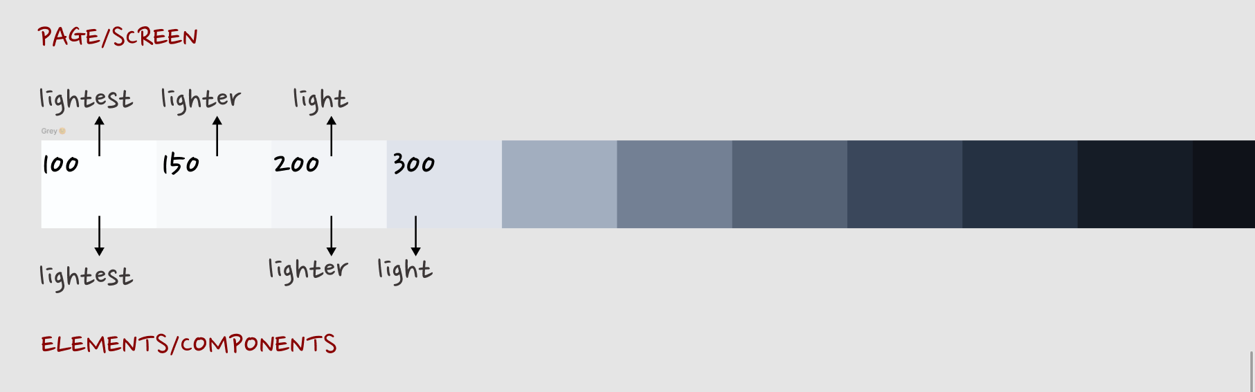
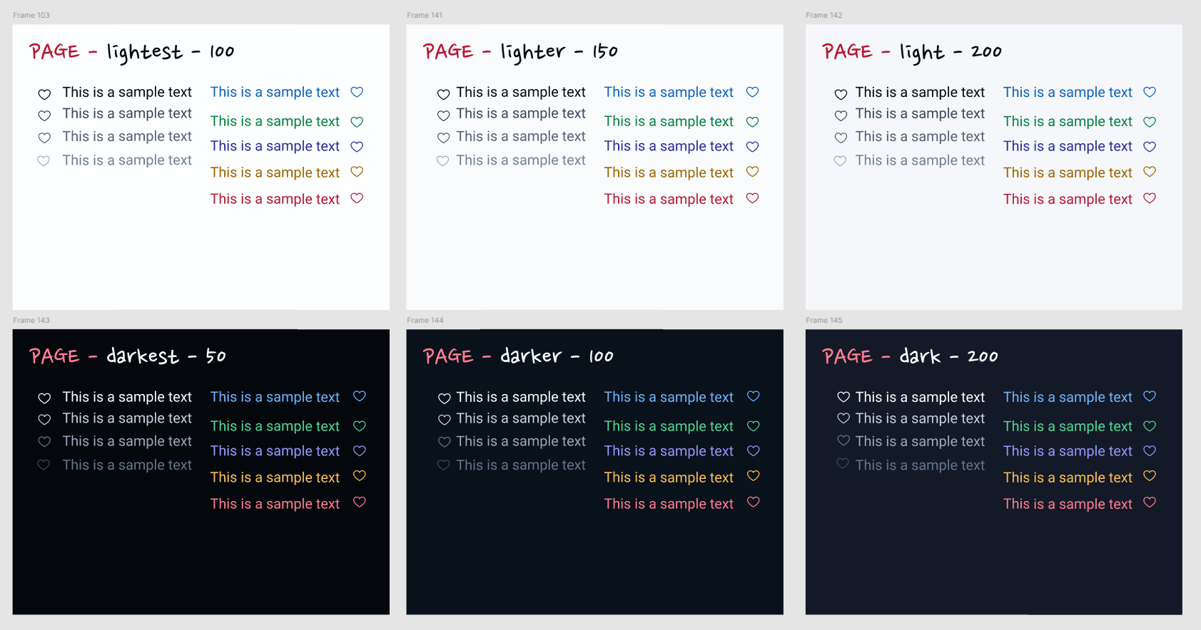
Colors in the neutral gray palette are layered on top of each other to create depth and spatial associations. The layering model defines the logic of how colors stack on top of each other in a UI.
In the light themes, layers alternate between White and Gray 10 with each added layer.
In the dark themes, layers become one step lighter with each added layer.
So you can see where I’m coming from. Its very important to understand how layers stack one on top of each other in the UI. And so this is how I look at it.
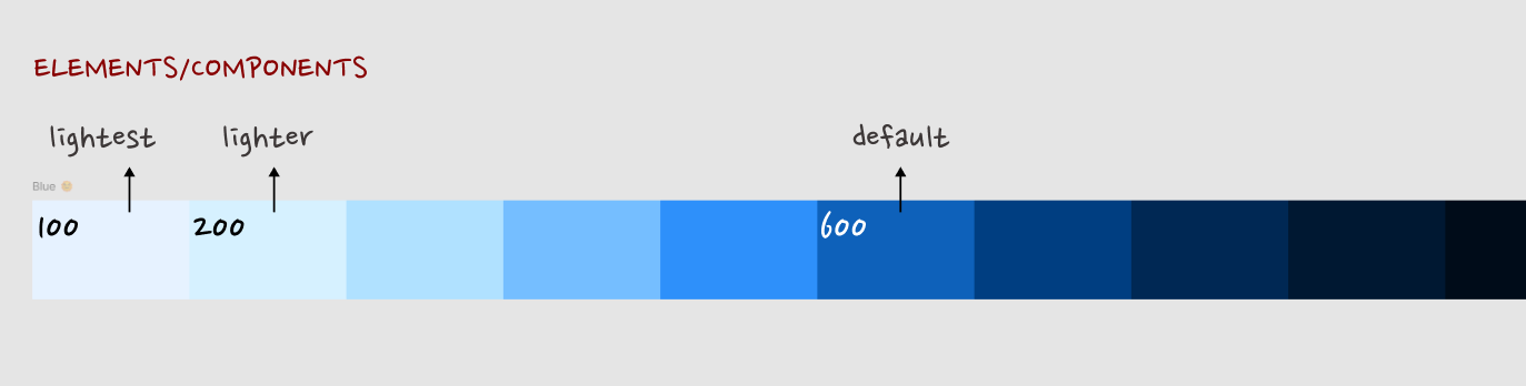
When it comes to greys (neutrals), I usually pick 3 shades going from light to lightest. I would use this for pages or elements/components that reside on the page. The shades could be the same or slightly different for each category (pages and components).
After I have created the palette, I literally stack one on top of each other, eye ball it, tinker if necessary and pick.
Dark mode works the same way, only inverted: the deepest layer is the darkest surface, and each level up gets progressively lighter.
TLDR - first set of greys for surfaces → light, lighter, lightest (I also always choose a dark shade that acts as an inverse to the lightest shade).
Surfaces (brand and semantics)
Its a lot more harder to fathom the different shades of brand and semantic colours I might need for the project. When I started out in design, I would just map out the bare minimum variables or tokens that may be needed for a project and build as I go.
Over time however, I believe there are a bare minimum set of colours one might need. The way I went about establishing this was to actually quickly create (“wireframy”) components, fill them with colours from my palette and understand what I may need. Or even better, just pick (copy-paste) components from existing Figma UI kits and play around.
A lot of your components would just require greys but lets take a few examples.
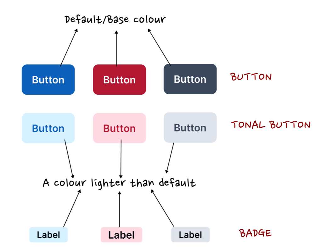
I might require “default” buttons and tonal buttons. Tonal buttons have a much lighter shade than the default ones. Similarly I might need badges that have the same shade as the tonal buttons.
I also have alerts and selected states.
These have the lightest shade of the respective semantic or brand colour. Lighter than my tonal buttons or badges.
So maybe I might need 3 shades of these colours starting from default/base to a much lighter shade and lightest.
TLDR → sets of brand and semantic colours → default, light, lightest.
Foreground (text & icon)
Foreground (greys)
For neutrals, I usually define three roles: primary, secondary, and tertiary. Unlike surfaces, these start with the darkest shade for primary text, then step lighter for secondary and tertiary.
How do I decide which shades? I start visually stacking them on my surfaces to see if the difference feels clear, then confirm with contrast checks. Accessibility is non-negotiable here. Every foreground shade has to pass WCAG contrast ratios across all surface levels. The only exception is disabled states.
User Interface Components that are not available for user interaction (e.g., a disabled control in HTML) are not required to meet contrast requirements.
That’s why I allow a “disabled grey” that falls below contrast thresholds.
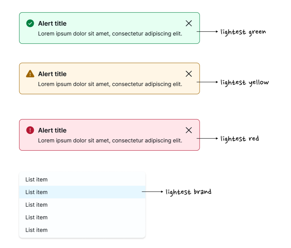
Foreground (semantics)
The same logic applies to brand and semantic colors. My “default” is usually the 500 or 600 shade, strong enough to hold its own against light surfaces. But I also define light and lightest variants. These are critical when semantic colors need to appear as text or icons on darker backgrounds, or when used in badges, alerts, and tonal components.
Default, light, and lightest - this set usually covers the practical cases without overcomplicating the system.
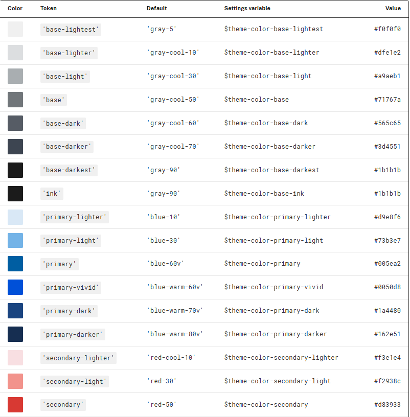
Theme Tokens (USWDS’s Approach)
Interestingly, I found validation in USWDS’s approach, where they formalize it into what they call theme tokens.
Each color family has seven possible lightness grades, from lightest to darkest, though not every family needs to include a color at each grade. Some grades may be set to false in your project’s theme settings. The default USWDS theme palette does not use every grade for every family. The primary and secondary families also have a vivid grade available.
Theme tokens (For the full set, see USWDS theme tokens)
In other words, they start with a full spectrum, but intentionally don’t use every single shade. Instead, they enable only the grades that make sense for the project’s theme.
This is almost exactly how my own workflow has evolved into. Instead of trying to define and maintain every possible shade, I decide upfront which ones matter.
💡The takeaway here is important: you don’t need every possible shade in your palette to make a color system. What you need is a consistent, role-based selection that can serve as a foundation.
Interaction States
Once surfaces, text, and semantic roles are in place, the next layer of decisions is around interaction states. Hover, active, focus, and disabled are essential for usability. But they don’t need to be overcomplicated either.
In my workflow, I usually extend a simple logic.
Hover → a lighter or darker step from the base color.
So if the lightest (surface) needs a hover state, its one step darker than that - Grey-100 is the base shade and 200 is hover. Same logic to any shade.
Active/Pressed → a stronger shift, often two steps. The pressed state is usually 2 steps away from the base or 1 step ahead of hover - Brand-600 base would have a Brand-800 as pressed (Brand-700 as hover).
Disabled → a de-emphasized neutral that intentionally falls below accessibility thresholds.
Focus → a clearly visible color (often brand or accent) with guaranteed contrast (usually a 600).
This makes the transitions predictable and not subjective. You don’t need a special hover color for every button or a dozen unique active states. What you need are clear, predictable rules that apply system-wide.
Decisions → Variables/Tokens
At this point, it’s worth stepping back to see how these middle-layer choices flow into tokens. To me, variables have some sort of a foundation because of the decisions we make in the middle. Otherwise they become just arbitrary names with no shared logic to back them up.
But once you’ve defined surfaces, foregrounds, semantics, interactions and the logic of why you may need certain colours in your system, variables almost write themselves.
A few examples:
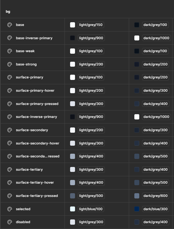
Surface or background
The variables base-weak (lightest), base (lighter) and base-strong (light), reflect the colours I may use for the deepest surface, the pages.
Variables surface-primary, surface-secondary and surface-tertiary reflect the colours that are used for the components.
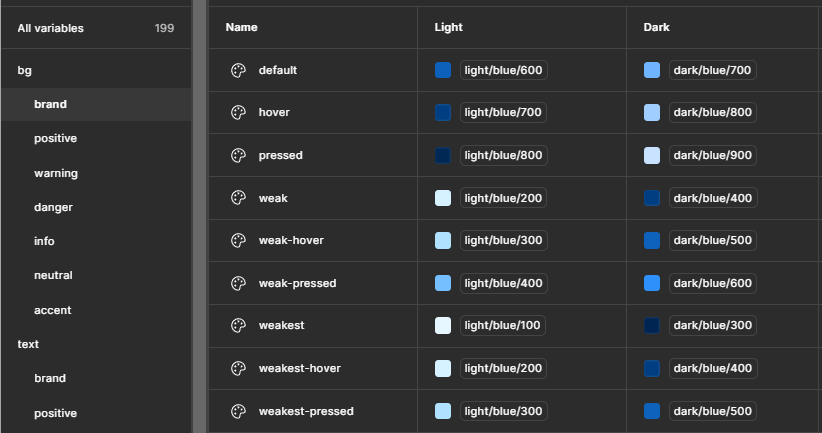
Brand colour examples
The variables I may need are backed by the decisions I made in the fuzzy middle layer.
The point is simple: variables/tokens aren’t the starting point - they’re the outcome. They’re the visible layer of a much deeper set of design decisions.
💡 Tenet UI is a Figma design system/UI kit that I built as a personal project, available in the Figma community. The UI kit has a robust and lean semantic colour system (design tokens/variables) established. Visualizing the variables in the UI kit could give you a better sense of how the variables have stacked up.
Closing thoughts
It’s easy to think of a color system as just palettes and variables/tokens. Pick some swatches, name some variables, and move on. I’ve done this in the past, and never knew what or how many variables I needed. I built them as I moved forward and the result was inconsistencies and a lack of a clear plan in creating variables.
The work that makes a system scalable happens in the “middle”. That middle (invisible) layer is where accessibility gets baked in, where consistency is enforced, and where a palette actually turns into a system.
And that’s the point - don’t stop at colors. Define the decisions in between. Because that’s where the DNA of a colour system really lives.