

Designers have this love-hate relationship with Auto-layout. I’ve seen 2 things usually - either the designer is openly of the opinion that auto-layout slows them down and stifles their creativity or we have the designer who accepts and knows auto-layout is useful but silently refrains from using it.
For me, the problem with not using auto-layout is the fact that designers treat designs as static, flat compositions and not structured, fluid and responsive layouts.
Because, lets be honest, manually placing every element, creating pixel-perfect, static mockups looks good…until it breaks when you need it to adapt. You’re left realigning everything by hand, manually. Spacing collapses, text overlaps, nothing aligns. For me this is more of a mindset problem rather than tooling. Its more about understanding,
why Auto Layout makes sense in the first place
how the web is structured through boxes and rules, and
how a clear content hierarchy leads to logical, responsive layout structures.
Once you see layout as a reflection of relationships and not just visual positioning, everything starts to fall into place.
Part 1: Think in terms of “boxes”
Lets first embrace or adopt the mental model of the web - everything is a box. Every element, be it a paragraph, a button, a section is a box. Imagine an invisible boundary around each piece of content. These boxes,
Stack either vertically or horizontally inside a parent box (nesting)
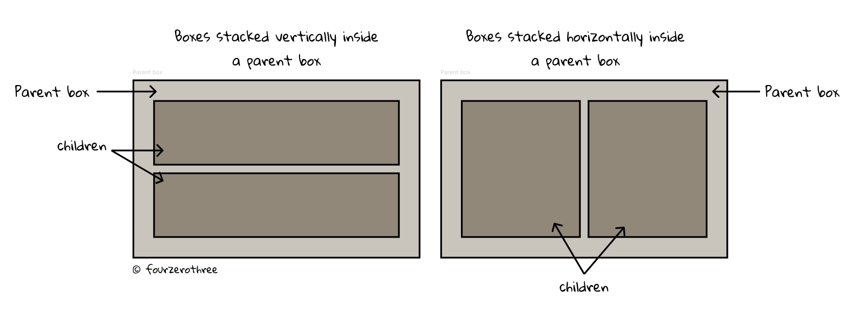
Could contain other boxes (parenting)

Have space between them (gap) and around them (padding)

Can grow (be fluid), shrink, or stay fixed based on rules
I haven’t delved into details, but this is the “Box Model”, and it governs how every web layout is structured. Unlike print or slide decks, where you can position elements freely , web content exists inside a set of rules. A heading doesn’t just float on the page! The layout system isn’t based on absolute positions. It’s based on rules.
📖 Read next:
- "Auto layout" Chapter 1 - Fundamentals
- "Auto layout" Chapter 2 - Building a responsive card
Real world design examples
While it sounds simple at the outset and seems doable, we may flounder while trying to apply this to real world components. Lets take the example of a card component.
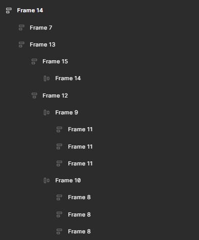
Essentially, note that the “Card” is the outermost parent box and it comprises of 2 children (boxes).

The second box at the bottom of the card, is further made of 3 boxes - 3, 4 and 5 (image below). Further, “Box 5” has 3 children 6, 7 and 8.

Another simple example would be the top nav bar.

I see 4 boxes here. Also understand that the creation of these boxes are intentional, a design choice. What do I mean?
These boxes translate into my auto-layout frames when I design this component.
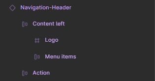
Box 1 (parent) -
Navigation-HeaderBox 2 -
Content left(this houses Box 3)Box 3 -
Menu itemsBox 4 -
Action(this houses the buttons)
To me thinking in terms of boxes becomes very relevant as that’s how I would end up designing my component.
Part 2: Auto-layout is “Flexbox” in disguise
Flexbox is a CSS layout system used to arrange elements efficiently inside a container. It lets developers align, distribute, and size elements in a container, even when the content is dynamic or unknown.
A “flex container” is the core building block of CSS Flexbox layouts. It acts as the parent element that controls how its children or “flex items” are arranged. By establishing a flexible layout (flex container), it allows items (flex items) to align, wrap, and distribute dynamically.
This sounds familiar right? Because Figma’s auto-layout is essentially a similar visual implementation of Flexbox.
🙎♂️The Parent = Flex Container = Auto Layout Frame
While not a direct 1:1 equivalence, Figma's auto-layout is designed on the Flexbox CSS model and shares a strong conceptual similarity.
I started with the box model, because its important to understand that each box influences and responds to its parent or children.
The Parent Container (Flex Container): This is your main auto-layout frame. By applying auto-layout you turn this frame into a flex container, and its direct children become flex items. This parent frame sets the overall rules.
This parent container defines:
Direction – Do children stack vertically (column) or horizontally (row)?
Gap – How much space between each child?
Padding – How much space around the children inside the frame?
Alignment – How are children positioned inside the container (parent)?
👶The Children = Flex Items = Elements Inside the Frame
The Child Elements (Flex Items): These are the elements directly inside the auto-layout frame. While they still follow the overall rules of the parent, they have a degree of individual freedom. Each child (a text label, button, image, or any element) can now be:
Hugging Content - Shrinks to fit its content
Filling Container - Grows to fill available space
Fixed Size - Has an explicit width or height
We can control their growth (how they expand to fill the container), their shrinkage (how they reduce in size when there's not enough space), and their default size (their default size before growing or shrinking). These children respond to the rules of the parent and also influence the parent in return.
Part 3: From content to structure - designing inside-out
Though everything we just discussed seems straightforward, the challenge with auto-layout, in my opinion, is because of how “nesting” containers throws us off balance. Not only does it complicate layouts, it creates challenges in creating responsive design.
Why?
Because here’s the trap many designers fall into: they start building a layout by eye.
They draw what they see: a row of buttons, a column of text, an icon here, a label there. And then they try to force the layout to match. Auto-layout becomes a game of trial and error.
Why won’t this align? Why is there too much space here? Why is that element overflowing?
But when you start with the content (children), understand the relationships between them, and then map it to structure, everything clicks into place.
Have your mental models right and this shouldn’t trouble you. I need to look at it from an atomic perspective and make decisions regarding which elements to group or nest within my component.
If we take our card component from the previous example, on a broad level, I decide what elements to group (how many boxes to create). After this, the idea is to keep drilling down to see if further grouping is required (are further boxes required).
I start off with the
image and the
content at the bottom.

Its very obvious from the image that, I would further group or box the title and the description together and the icons together.

I am not done here. An interesting grouping is boxes within the Icon group-card itself. I particularly want 2 icons (“like” and “share”) to the left and the the “bookmark” icon to the right.

So, I’ve got two little boxes “Icons-left” and an Icon container within Icon group-card.
Why is this important?
Though, “Card” is the ultimate parent, understand it dictates rules only for 2 auto-layout frames or groups - “Image” and Content bottom”.
Vertical direction
Gap of 16px
Overall padding (horizontal and vertical) - 16px
Alignment - top and left

These rules don’t apply to other children.

Content bottombecomes the parent ofContentandIcon group-card,with its rules applied to these children.Contentbecomes the parent ofTitle textandDescription, with its rules applied to these children.Icon group-cardbecomes the parent ofIcons-leftandIcon container, with its rules applied to these children.
You see how the layout for the card was built here?
Designers may try creating a “rectangle” or a “frame” and then dropping items on it to manually adjust spacing between them. Or they may even use auto-layout but then, they try to build it “outside-in”.
Whereas, the card structure we had, that is a hierarchy, a layout plan which we could build “inside-out”.
Applying auto-layout this way becomes easy:
Each group (parent) is an auto-layout frame with its own direction, spacing, and alignment.
You’re only ever managing one level of logic at a time.
Finally select all your auto-layout frames and “auto-layout” them within a master frame.
Nesting doesn’t feel like chaos!
Part 4: Debugging through hierarchy
When something breaks, reverse-engineer the structure:
Ask: Which child is misbehaving?
Then: Who’s the parent controlling that behavior?
Then: Are the resizing and alignment rules correct for that parent-child pair?
Debugging becomes about navigating the layout tree, not guessing.
⭐ Trivia
Didn’t name your frames? You are done for! Naming frames becomes so helpful to debug non-responsive auto-layout frames that break.
Closing thoughts
At its heart, auto-layout makes us move beyond arranging things by eye, and instead builds layouts based on structure, relationships, and behavior.
That’s why I started with the box model and flexbox. A deep understanding of foundations refines the way we think about designing with auto-layout. It starts to feel less like a puzzle and more like a plan. And when things break, that same structure gives you a reliable path to debug and refine.
If you treat auto-layout as a system, not a workaround, it rewards you with layouts that scale, adapt, and endure. It’s worth the effort.