If you are new to the concept of auto layout, I recommend you read the first part of this series - "Auto layout" Chapter 1 - Fundamentals before you proceed reading this post. Chapter 1 would serve as a primer for a fundamental understanding of auto layout. This post intends to go deeper into the nuances of auto layout by practically building a responsive card using auto layout.
Auto layout is a pain
The problem with auto layout, I realized early on was that, on a high level it feels like you have a grasp of the concept. But it is when you try to build components, especially complex ones having layers of nested auto layouts, is when the frustration and pain kick in.
The component you are trying to build is not responsive (at least, not the way you want it to behave).
The elements inside of a component just don’t sit where you want them to!
Sound familiar?
But here’s something very obvious. Building components or layouts with auto layout, like everything else requires practice. Push through it.
Building a responsive card
Auto layout is best learnt while building responsive components and layouts.
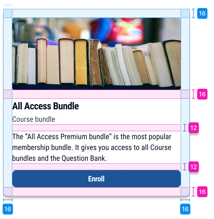
Let’s build this card using auto layout.
Mapping “Parent-Child” relation in an auto layout
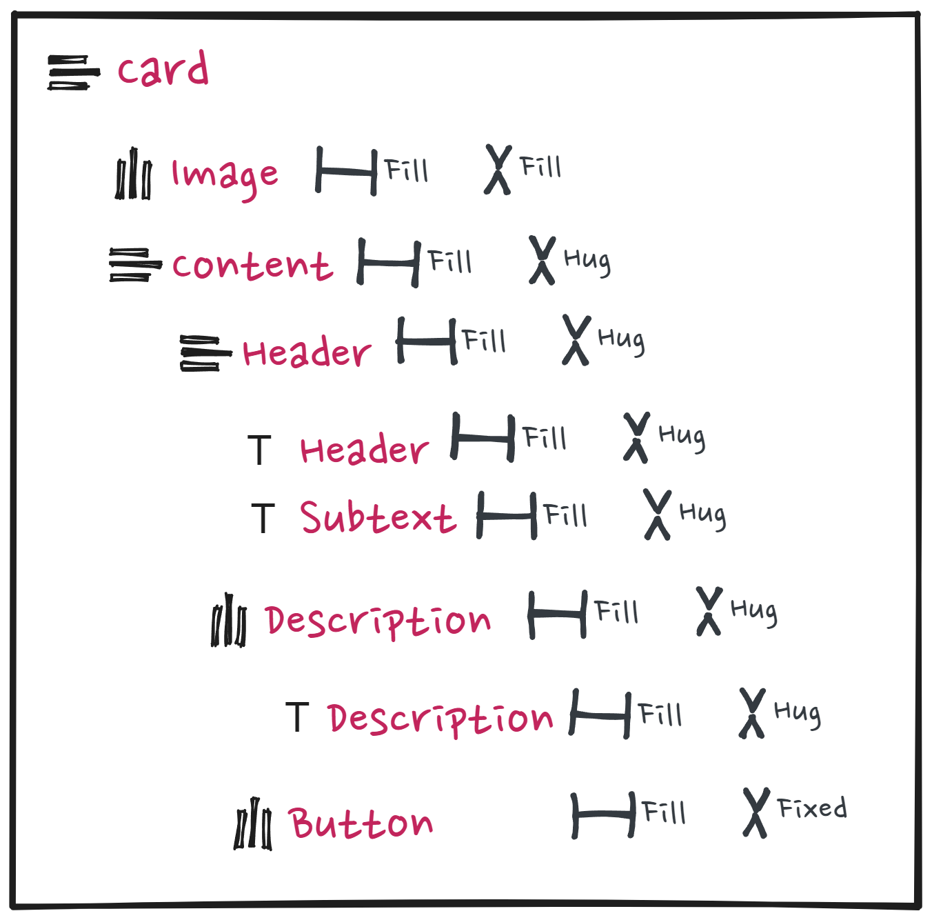
Before you build a component with auto layout, it's good practice to map a component’s structure to understand how it could be laid out with auto layout. What you want to do here is to map the parent-child relationship.
📖 Read next:
- "Auto layout" Chapter 1 - Fundamentals
- Building for efficiency and usability: A Case Study on Component Design
Very simply, you could structure the card with 2 children.
“Card” is the parent auto layout with two children, them being “Image” and “Content”.
Notice, that the child “Content” has multiple element types (children)
Header having the title and subtext
Description
Button
Now that you have the different layers of “Parent-Child” relations for the elements within the card component mapped, you could start by building it with auto layout.
Building the card with auto layout
The mapping exercise is necessary, as it helps us build the entire component in auto layout part by part and then piece the whole thing together. Contrary to what beginners may think, building a component with auto layout is done inside out. You start from the innermost layers and come out.
For the card component in this exercise, the “Content” section (child of “Card”) forms the bulk of the card, so we start our auto layout from there.
Creating “Header”
Type out the title (“All Access Bundle”) and subtext (“Course bundle”) for the header section, select them both and hit “Shift + A”. You have your “Header” in auto layout.
Make sure the direction of the frame is set to vertical since you want the subtext to be below the title. The direction of the frame in this context is important, since you have 2 elements inside this auto layout and you want Figma to know that the elements need to be stacked one below the other.
Set your gap and padding values to zero.
Creating “Description”
Type out the “Description” and wrap that in an auto layout. Ensure padding and gap are set to zero. The direction of the frame is set to horizontal by default.
Creating the “Content” section
After you’ve created your button, select your “Header”, “Description” and “Button” all at once and hit Shift + A, wrapping them in auto layout.
The “Content” section has 3 children. You want them to be stacked one below the other. Hence ensure the direction of frame is set to vertical.
For now, have the gap and padding values set to zero.
Let’s worry about the layout of this later.
Creating the “Card”
Draw a frame and wrap it in an auto layout. This becomes your “Image” section of the card. We can add an image later.
Finally select the “Image” and “Content” sections and hit Shift + A. Now you have your card with the children “Image” and “Content”.
Ensure the direction of the frame is vertical and your padding is zero.
Next, you would want to manipulate the resizing, padding and gap properties to ensure you have the final version of the card.
Building the final version of the card
Spacing between Children - Image and Content
Let’s give a spacing of 16px between the children “Image” and “Content”.
Select the card and input 16px in the “gap” section of the auto layout properties panel.
Spacing between Children - “Header”, “Description” and “Button” of parent frame “Content”
Select the “Content” auto layout frame and give it a spacing of 12px.
Giving the card its final structure
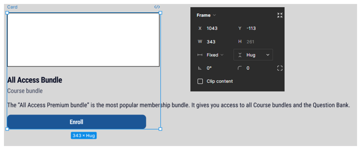
Set the card’s horizontal width to 343px. This means setting a “Fixed” width for the card (parent frame).
Note that the children inside the card behave weirdly. They don’t fit inside the parent frame.
This is because the children inside are not fluid. They do not flow inside the parent. In other words, they are not set to “Fill” inside the parent frame.
Map the children inside of each parent frame and set their width to fill their respective parents.
💡Note that the vertical resizing for text content is set to “Hug”. Since the parent width is set to “Fixed”, you want the text to fill and wrap into the next line. Hence you want the auto layout frame of any text container to resize vertically automatically (when set to "Hug").

Remember,
- You want the first or the outermost parent (in our case - "Card") to be "Fixed" width (and "Hug" height).
- Once this is done, you want all children inside to be "Fill" width and in most cases "Hug" height.
Resize the card correctly and you have the card almost ready
Give a horizontal and vertical padding of 16px for the card. Place an image inside of the image frame and give a slight elevation. Finally, give your card a colour fill and your card is ready.
Closing Notes
Auto layout is best learnt while building responsive components. In my opinion learning auto layout while building responsive components is more holistic. Getting a good grasp of auto layout is very helpful, especially when you need to build responsive components and layouts.


