Auto Layout is a constraint-based layout system that allows for building dynamic user interfaces that respond to any change, internal or external.
Constraints refer to the relationship between the “parent” and “children” frames/elements.
Internal changes are those those that occur within the child and external changes are those that occur within the parent.
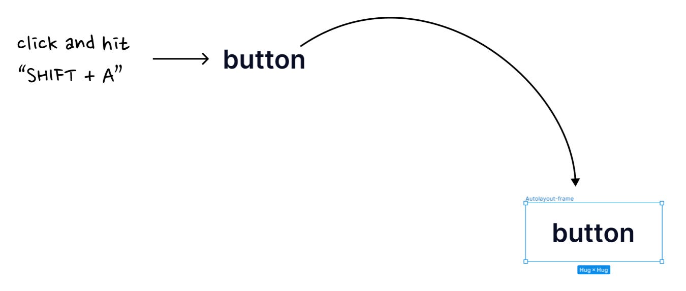
To apply auto layout to an element, select it and hit "Shift + A". In this example,
button “text” gets wrapped in an auto layout frame.
💡Remember, in this context, the “Autolayout-frame” is the parent and button text is the child.Add a colour to this frame, a corner radius and some padding. You have a button!
Resizing (Parent) - Hug (horizontal) and Hug (vertical)
In the button example, Figma automatically sets the “resizing” options of the button (parent frame) to “Hug” and “Hug”.
Set these options and you have the button (parent frame) expanding or shrinking to fit its text (child)👇
The “button text” by virtue of the font size, weight and line height has an intrinsic content size that fits within the parent frame - “Autolayout-frame”.
💡The Hug-Hug resizing options make the parent frame snuggly fit around the child (horizontally and vertically). This makes the parent frame expand or shrink based on the size of its child.
Wireframe representation
📖 Read next:
- "Auto layout" Chapter 2 - Building a responsive card
- Post #9 (Design System Chronicles) - Component Thinking: A recap of my component design workflow
Gap between items
Notice that Figma by default assigned a “gap between items”. This is horizontal in this case, as the “direction of the flow” of elements has been set to horizontal.
This means children inside of the parent frame would have a gap of 8 pixels between them.
💡This is important to understand.
Just like the parent frame, the child's intrinsic content size is also determined (width and height). The text in the button example is also bound and has resizing options set to hug and hug, that behaves the same way the parent frame behaves.
Resizing (Child) - Fill (horizontal) and Hug (vertical)
Ideally, in responsive design, you want elements to flow fluidly inside of a frame. Just like how you had the parent frame adapting to the size of its child in the previous example, you want children to “flow” as and when the parent changes its size.
Wireframe representation
Let’s take this simple card as an example.
This is it’s parent-child relationship
💡In this example, you have a nested auto layout.
"Parent" is an auto layout frame, and
Its child "Content" is an auto layout frame
"Content" is the parent of
"Title" - Header
"Subtext" - Sub-Header
But remember, that "Content" and its children as a whole are children of the "Parent" auto layout frame. "Parent" is the outermost frame or the parent for all.
Resizing the child’s width to “Fill” and height to “Hug” helps achieve this behaviour. Also note, ideally you would want the parent width to be fixed and height to be “Hug”. When this is done, changing the parent’s size would make the child inside flow, since the child is set to “Fill”.
Let’s visualize this. Here’s what would happen if you didn’t set the above constraints.
If you had the “Parent” hug (width) and “Hug” (height"), the children inside could keep growing and the parent would keep adapting to the “filling” children inside.
If the child is not set to fill, the children wouldn’t flow to changing parent size.
Closing Notes
While there’s a lot more we could explore with “Auto layout”, the concepts I covered here is fundamental to understand so we could build robust responsive components with auto layout.
The reason I stopped here is because auto layout is best learnt while building responsive components. In my opinion learning auto layout while building responsive components is more holistic.
I have written Chapter 2 as a continuation of this post, where I navigate the nuances and explore other properties of auto layout while building a responsive card.


