


You open a Figma file and start noticing inconsistencies - duplicated components, uneven spacing, unclear page naming, multiple versions of the same screen. At first, it feels minor. But those inconsistencies add up, until working inside the file starts to feel harder than it should.
This is “design debt” and it’s easy to overlook, especially in a fast-moving team.
Design debt is the result of shortcuts, workarounds, and missing structure. It's what happens when design scales faster than the system supporting it. You’ll see it in messy files, bloated color palettes, fragile components, and inconsistent experiences.
Some of it is driven by systems - tight deadlines, scattered documentation, teams that reward shipping over structure.
But some of it comes from us too.
From skipping cleanup.
From not knowing best practices.
From never learning how to use our tools properly.
From getting too comfortable with what works “for now.”
From not thinking in systems — or not realizing we should.
From focusing on UX while letting our UI craft slide.
Design debt isn’t always intentional. But once it’s there, it slows you down — often when you can least afford it.
In this article, I want to walk through the most common forms of design debt I’ve seen (and caused), and how to think about solving them in a structured, maintainable way.
#01: The disorganized file

You open a Figma file. And you’re instantly lost.
Pages are named things like “Homepage FINAL”, “Homepage New”, and “Copy of Homepage FINAL (v2")”. There’s no visible order. Old iterations sit right next to production-ready screens. Exploration, experiments, handoff flows — all blended together on one endless canvas.
It’s impossible to tell what’s active, what’s deprecated, or what’s just leftover noise.
It’s not just confusing — it’s chaotic. And more importantly, it slows everyone down.
Everyone works how they prefer. There’s no agreement on naming, no habit of archiving, and no signal for what’s done versus what’s in progress.
The result
Designers waste time trying to figure out which version is current. Developers sometimes build from outdated flows. And onboarding a new team member becomes far harder than it should be.
Root cause
The root cause is usually a lack of structure. There’s no clear file hierarchy, no naming convention, and no system to separate exploration from execution.
What helps
The fix is surprisingly simple - bring structure into the file!
Use clearly named pages.
Label frames visually - “WIP,” “Ready for Dev,” “Deprecated”, especially for those that are deprecated. Whether it’s a Page, a Frame, or even a Component, just prefix the name with a “🚫” emoji or a "DEPRECATED" tag.
You don’t need a complex documentation system. Just enough structure to make the file understandable.
📖 Read next:

Learning UI design through deliberate practice
#02: The colour ramp that wasn’t
One of the most common and overlooked forms of design debt is when colour ramps look consistent numerically, but not visually. This is a deep form of design system debt. Design systems adopt a scale-based naming convention like blue-100 to blue-1000, green-100 to green-1000, and so on. But when these scales are created without calibrating saturation and brightness across hues, the system begins to break down.
You’ll find that brand-600 is far more saturated or darker than accent-600, green-600, or blue-600. Even though they all sit at the same point in their respective scales, they don’t carry the same visual weight. They don’t feel like they belong to the same system.
The result
Visual imbalance - The same “intensity” number across hues doesn’t carry the same visual weight. Buttons using
blue-600may feel quiet and neutral, while buttons usingbrand-600look aggressive or out of place.Broken hierarchy - If
600doesn’t represent the same level of saturation or emphasis across ramps, you lose the ability to maintain predictable hierarchy. The design becomes inconsistent and unpredictable.Colour accessibility issues.
Root cause
This usually happens when ramps are created manually by eye, without comparing how each level of the scale behaves across different hues. Colours are added individually without considering how they relate to the rest of the palette.
Designers choose what “looks good” in isolation, rather than designing colour ramps as a system.
What helps
Build your colour ramps intentionally and early. Aim for at least 8–10 steps per colour ramp, and calibrate them so that the
100,400,600, etc. feel tonally consistent across hues.Use tooling that help control perceived brightness and saturation across hues and generate cohesive ramps. Plugins like Foundation Color Generator and tools like Colorbox and Atmos helps with this.
Make sure all colours in the ramp match at each level. When colour scales align across hues, your entire interface becomes more harmonious, legible, and scalable.
#03: The semantic colour system that wasn’t
Colour inconsistencies often start small - slight variations in blue between buttons, greys that differ between icons and text, backgrounds that don’t quite match across screens. This points to a deeper issue: the absence of a semantic colour system.
Colours are applied using names like grey-200 or blue-600. One designer might use brand-600 for a primary button and another might use brand-500. There’s no agreed-upon meaning - just values applied based on instinct or visual similarity.
The result
The same colour gets reused for unrelated purposes, or different colours get used for the same role.
Designers spend time guessing or recreating decisions that should’ve already been made.
Theming like light and dark mode becomes harder to implement, because colour values and usage roles are tightly coupled
When you have hundreds of styles but no rules for applying them, you don't have a colour system. You have a collection of swatches!
Root cause
This usually stems from treating colour as a visual choice, not a systems decision. Colours are assigned without considering the role each colour plays in the product. As the system scales, the lack of semantic structure makes it hard to manage or extend.
What helps
A strong colour system is built on semantic tokens, not just ramps.
Start by mapping out your core usage roles: backgrounds, text, icons and borders. Keep the grey-200s and brand-600s as primitives, but reference them through semantic names like
bg/surface-primarytext/primaryicon/primaryborder/primary
and so on.
Apply these consistently across components. If a designer can’t tell what a colour is for by its name, it’s not a semantic system yet.
💡Quick note
It’s a common take that small projects don’t need a semantic colour system, especially when the goal is to move fast and get something out the door. In practice, I’ve found the opposite to be true. A well-defined semantic layer doesn’t slow you down. It protects you from the kind of visual inconsistencies that inevitably creep in as a project grows.
#04: The frame formerly called “Rectangle 87” (unnamed frames)
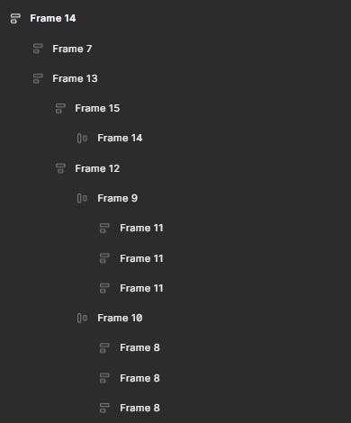
You open the layers panel and its chaos — Frame 123, Rectangle 87, Group 5, Vector, Text, Frame, Frame, Group 13. No structure, no names!
Are you trying to inspect a modal with 17 unnamed elements? Good luck. You’re left clicking, expanding, scrolling and just hoping you land on the right thing.
The result
Time is wasted. Instead of working efficiently, you’re stuck navigating through layers that don’t make any sense.
The design quality suffers. If you can’t easily see what’s going on with the layers, it’s easy to miss issues like inconsistent spacing, or unwanted nesting of components. And these might stay hidden until later, when they’re harder to fix.
Working with a cluttered file is annoying. Every task becomes harder, and soon you’ll be asking yourself: “Why is this taking so long?”
Root cause
Fast-paced exploration often pushes structure aside. Naming layers feels like a “tomorrow problem” but tomorrow rarely comes.
Add a couple of designers to the mix, and things start getting messy fast. Layers get duplicated, grouped, and hidden in ways that don’t make sense to anyone else, and the chaos builds on itself until you have no idea what’s what.
What helps
Naming layers isn’t just about tidying up the file. It’s about making your design understandable to everyone who’ll work with it, including yourself.
Name your key layers intentionally. Frames and key elements inside components and screens should be easy to identify. Think:
CTA Button,Card Container,Header, etc. This will save time in the long run and make the design feel more structured.Use Figma AI to rename layers in bulk.
Before sharing your design, take a moment to review and tidy up your layers
#05: The legacy layout (No auto layout)

A frustrating form of design debt is when layouts look clean but fall apart the moment you make a change. Resize a frame, update some copy, or shift an element - suddenly spacing breaks, text overlaps, and the structure collapses. Components aren’t fluid. Layouts don’t respond.
You end up spending more time cleaning up than designing.
This is what happens when layouts are built without “Auto layout”. Auto layout is a constraint-based layout system that allows for building dynamic user interfaces that that adapt to any change.
Without auto layout, everything looks fine on the surface, until you try to make a change!
The result
Designs are fragile and don’t scale. Any small change, whether it’s resizing a frame, changing copy, or swapping content - triggers layout issues.
Adjustments are manual and slow. You waste time nudging elements pixel by pixel.
Spacing becomes inconsistent. Without auto Layout, spacing is often eyeballed or misaligned by fractions of pixels. These inconsistencies add up, making the UI feel slightly off.
There is no room for responsive thinking. When layouts are “hard-coded”, it’s difficult to explore how the design might adapt for smaller viewports, dynamic content, or other use cases.
Root cause
This kind of design debt usually starts early in a project. You’re exploring quickly, mocking things up to share a concept or test an idea. Structure feels unnecessary. You’re moving fast and optimizing for speed. You feel auto layout slows you down.
What helps
Always build with auto Layout. Don’t wait till the end to add structure. Use auto layout for everything - for cards, modals, tables, navigation bars, content blocks.
Think in flexible containers, not just fixed shapes. Auto Layout works best when you design layouts as flexible systems - with paddings, gaps, and alignment built in
Learn sizing logic. Understanding how “Hug”, “Fill”, and “Fixed” sizing work (and when to use each) will transform the way you design interfaces.
If you don’t know how to build components with Auto Layout, learn to! It’s not just a skill. It’s a superpower.
#06: The “Component Catastrophe”
While some of the design debt we discussed earlier could be forgiven (I am cutting some slack here) as symptoms of tight deadlines or fast-moving projects, this one’s different. The “Component Catastrophe” as I like calling it, apart from time pressure, also comes from a lack of systems thinking and UI chops.
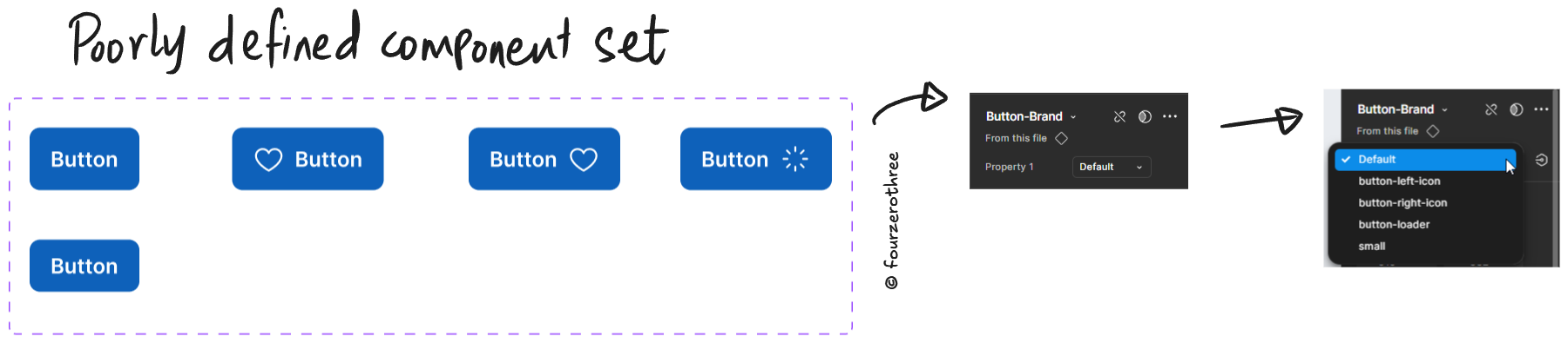
When components are duplicated instead of abstracted, when states are ignored, and when properties are poorly defined, it reflects a gap in designing for reuse, scale, and collaboration.
This kind of debt shows up when designers haven’t yet developed the habit of thinking like builders (not just creating what looks right).
The result
Redundant components everywhere - A left-icon button? That’s one component. A right-icon button? That’s another. Need a loading state? That’s a third one. Every small variation spawns a new, standalone component - instead of a property.
Default-only components - Most components include only the default visual state. Need hover, focus, or disabled? They’re missing. Designers hand off just the happy path and engineers are left to invent the rest.
Inconsistent interaction design - With no defined states, engineers guess what hover or pressed should look like.
Confusing component APIs - Even when variants exist, the properties are named things like
Property 1orVariant 2which gives zero signal about what they actually do. The component is technically functional, but practically unusable.

Root cause
This debt doesn’t usually start with bad intentions. It starts with limited awareness.
Designers at times don’t think like engineers — designing with reuse and variability in mind. They design the version they need now, and move on. Edge cases? Not their problem. States? Maybe later.
Sometimes, it’s a lack of familiarity with how Figma variants work or how flexible components should be structured.
The core issue is this - components are being treated as static visuals instead of dynamic, reusable systems.
What helps
Think in systems, not snapshots - Before building, define states, sizes, icon positions, and optional elements. Design for the full lifecycle, not just the default case.
Use variants to encode states - States like
hover,pressed,disabled,loadingshould be part of the component set.Name your properties like an API - Avoid “Property 1” or “Variant 2.” Use names that communicate intent:
State,Size,With Icon, etc.Make components flexible - Use props to create component variations instead of creating a new component for every variation.
#07: The last mile (Unclear developer handoff)
The design looks clean. But under the hood, components are detached, tokens or variables are not defined, spacing isn’t consistent and documentation is poor. Engineers try their best, but the design files aren’t clear. So they ship what they interpret.
Here’s the truth - Developer handoff is not a separate step. It’s the output of everything upstream being done well.
Closing thoughts
Design debt shows up in many ways and this article doesn’t aim to capture every one of them. But the ones outlined here? These are the patterns I’ve seen most often, across projects, teams, and systems.
They slow down iteration, increase implementation gaps, and introduce friction between design and development. Left unchecked, they make every project harder than it should be.
But they’re also solvable.
By recognizing these issues early and treating design like a system, not a collection of screens, we move toward a practice that scales.