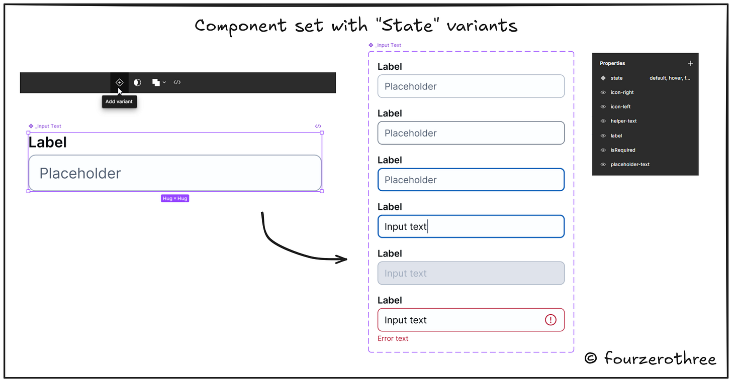
Learning to create component sets and manipulate their properties can come as a boon, especially due to the fact that it could help improve design workflow, maintain consistency across the product and help create efficient design systems.
I love the craft of creating robust and scalable components. Its a lot of fun. And I love design systems. I think its good practice to start learning the craft starting with a basic yet fundamental and crucial component - the Input Text.
I say this because deconstructing and creating an Input Text component could be straightforward and is not a lot of cognitive load to create. Its a good stepping stone to get acclimatized to the world of components and component properties.
Analysing the Input Text component
State and Size variants
Rather than diving straight in to creating the component set, let’s take time the to think about 2 things first:
What states might you need for an Input Text
What size range might you need
The former is straightforward. Think of yourself as a user and the sort of interactions you might you might have. You would have a
default state,
hover state
focus state (user tabs or uses keyboard controls to navigate selections),
active state (when you are typing an input)
disabled state and an
error state.
These pretty much sum the most often encountered states for the Input Text.
Size range (referring to the height of the component) may vary according to product. Let’s get to this while creating the component.
These two together would make up for the “State” and “Size” properties (variants) when creating the component set.
Anatomy of an Input Text
Now that we know what variants of an Input Text we may need, next is to figure out the anatomy. I’ll cut the fluff and paste a snapshot from an article in Baymard Institute.
📖 Read next:
- The "Icon properties" hack: Manipulating icon component properties
- Crafting Components with Subcomponents and Nested Instances
Getting your hands dirty
Creating the component
Starting off, I want to create my default Input Text component with a height of 40px. Now, I prefer taking the inside-out approach to creating components. Essentially, rather than drawing a rectangle and then putting text inside of it, I like to start from the text (inside) itself and then draw the frame around it (outside).
Lets start by creating a
Label
Helper text and
Input text/Placeholder
Note that I also have a “Required” asterisk for the Label.
Place the elements in order and wrap all of them in auto layout. Remember to give the placeholder/input element (Input Field) a border and set the dimensions and auto layout settings right.
Make your Input Text a Figma component.
Going back to the Input Text anatomy, note that the component could have a leading and a trailing icon as well. Add them in the component.
Creating properties and variants
Before creating the State and Size variants, lets first create other minor properties that may be required for the component. We do this, before creating the variants because, once you create them, the properties would carry over to all variants.
Most of the minor properties in the Input Text would be boolean properties.
Let’s add boolean properties to the
leading icon
trailing icon
label
"Required” asterisk
helper text
placeholder text
Set them to true or false accordingly.
Create 6 variants corresponding to the 6 states for the Input Text
Remember these variants of the component have a height of 40px. Let’s now duplicate this set, set a height of 32px for them and accordingly set a “Size” property - “Size → large and small”.
Remember, for the active state variant, add a cursor with the input element and for the error state, switch on the trailing icon and the helper text.


