
The Design System Story: Turning design debt into a scalable system - a case study
One System, Endless Possibilities

Act I - Setting the Stage
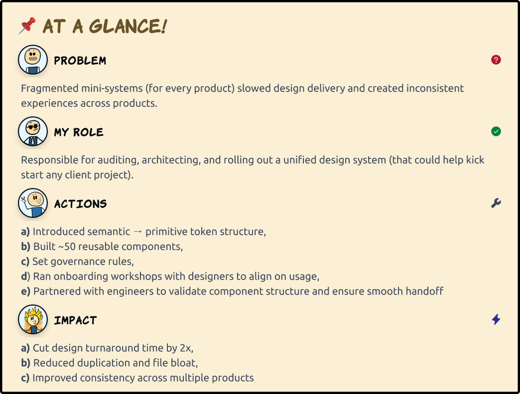
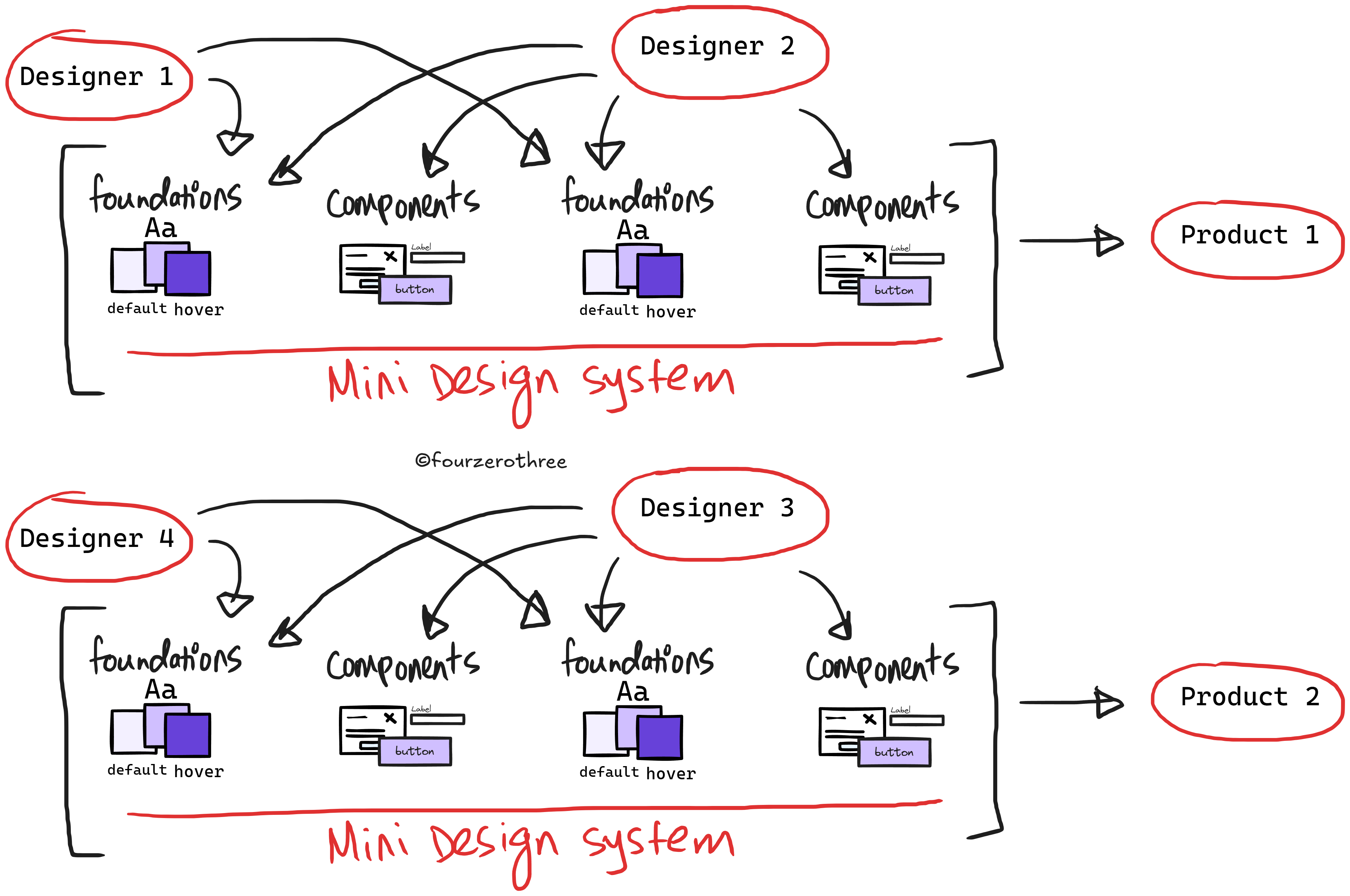
At our consultancy, we were building multiple enterprise products in parallel. Each project spun up its own mini design system - more like a style guide than a scalable system.
Designers often worked in silos, creating their own components and patterns, and applying colors and typography inconsistently. The result? Inconsistencies across products, duplicated work, and slower delivery cycles.
We needed a shared foundation, a system to unify, scale, and speed up every project we delivered.
Note: This case study shares my design process and key learnings from building an internal design system in my consultancy. They are not tied to any client projects, brands, or confidential company information.
Act II - The Problem
Our design process wasn’t broken, but it was slowing us down.
Fragmented systems - Each project had its own lightweight design system, but none of them were built to scale.
Inconsistent outputs - Designers working in isolation produced mismatched results in colors, spacing, and component anatomy.
Inefficient workflows - Without shared foundations, turnaround times stretched longer than necessary.
Reinventing components - Designers repeatedly rebuilt same components for different products from scratch.
Missed opportunities for reuse - Components that could have been shared across projects stayed siloed in individual files.
Act III - The Challenge
I was tasked with building a design system that could serve multiple enterprise products. Honestly, I had never done this before, and I wasn’t sure if I could pull it off. But it was a fun challenge.
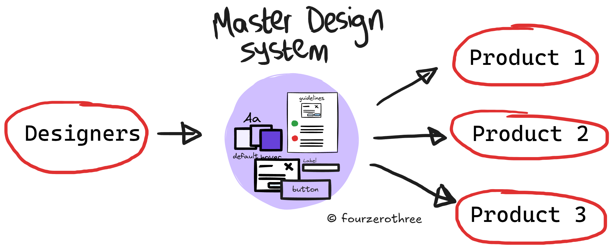
The challenge wasn’t just about creating components. It was about creating a system that could scale, stay consistent as different designers used it, and adapt to the unique needs of each client project.
Act IV - The Foundations
If the system was going to scale, the foundations had to be solid. That meant starting with design tokens.
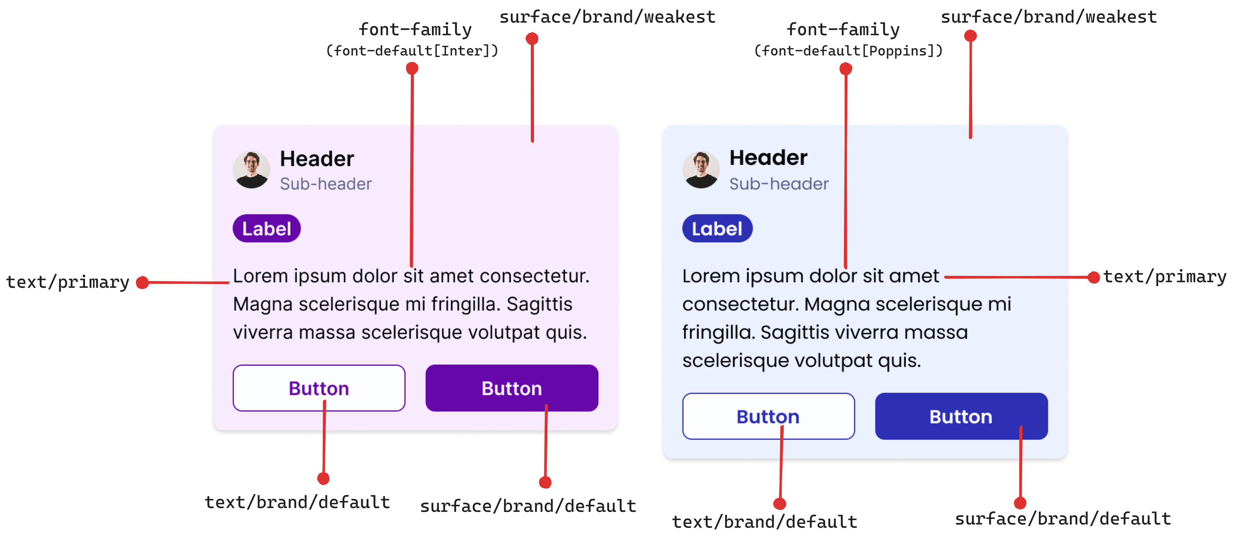
I focused first on colors and numbers. Colors were structured with a semantic → primitive → hex referencing model.
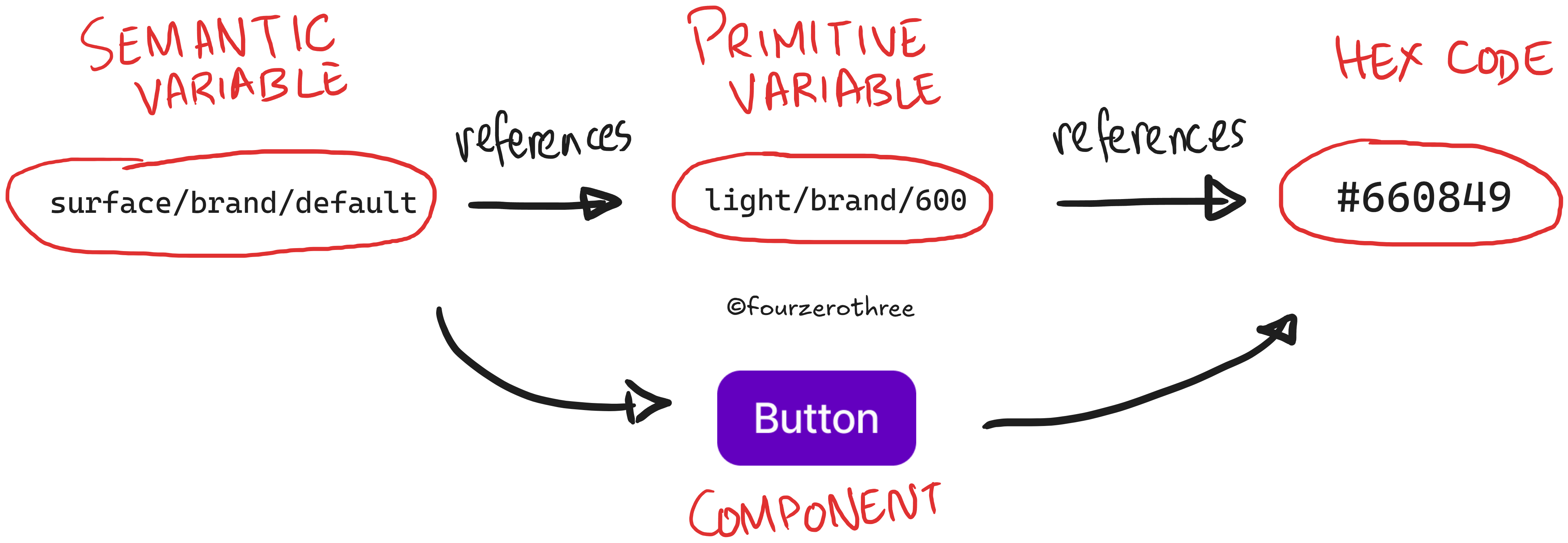
Semantics made tokens reusable across projects, while primitives allowed us to swap hex values depending on the brand or theme.
To keep things consistent, I set up a clear naming convention:element/semantics-hierarchy-state
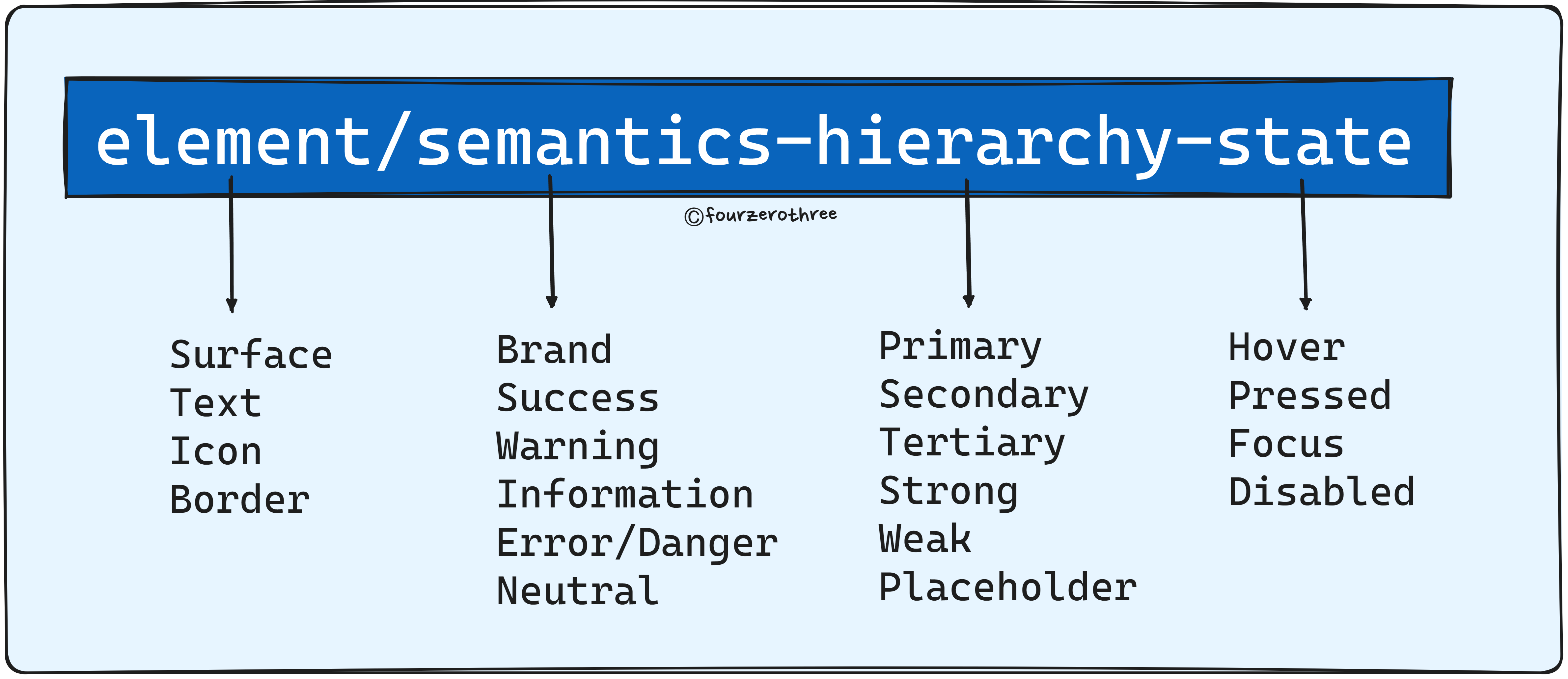
This broke down tokens into predictable, scalable parts so designers didn’t have to make ad-hoc decisions every time.
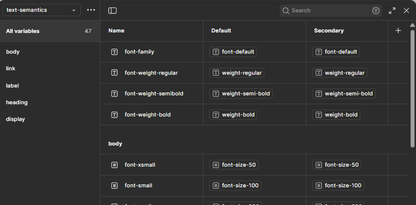
Typography variables came later, but the core idea was the same: set rules once, and let them ripple through every component.
The result? A foundation flexible enough to support multiple products, but strict enough to guarantee consistency.
Act V - Components
Once the foundations were stable, the real challenge began: components.
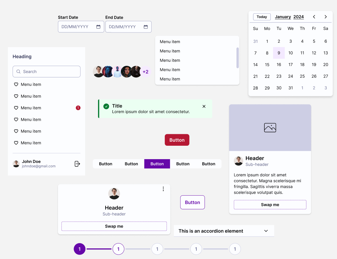
At least 50 components were mapped and listed, starting with the most common components we needed for projects.
I then dug into how each one should be built: balancing constrained components (for simplicity) with flexible ones (so it could be used for multiple use cases).
Every component was designed with:
Slots and sub-components for flexibility wherever possible/needed.
Clear anatomy so any designer could pick it up and use it.
Code-aligned properties so developers could consume them easily.
Act VI - Feedback & Outcomes
Designers found it easy to set up workflows. Changing a primitive value in the tokens file updated colors across the entire system. Components could be reused, extended, or built upon instead of recreated from scratch.
The outcomes were clear:
2× faster turnaround - projects moved quicker because the heavy lifting was already done.
Consistent outputs - Designer A and Designer B could work on different modules and end up with the same look and feel.
Reduced duplication - common components were no longer rebuilt from scratch.
Less miscommunication - with shared tokens and rules, there was no confusion about colors, spacing, or typography.
For the consultancy, this meant faster delivery for clients and less design debt across projects.
Act VII - Governance
The system wasn’t perfect. As it grew, new challenges appeared:
The Figma file became heavy and harder to manage.
Component bloat made the library feel overwhelming.
Some components were almost too flexible, which added complexity instead of reducing it.
Variables needed some getting used to.
Design system organization wasn’t clear:
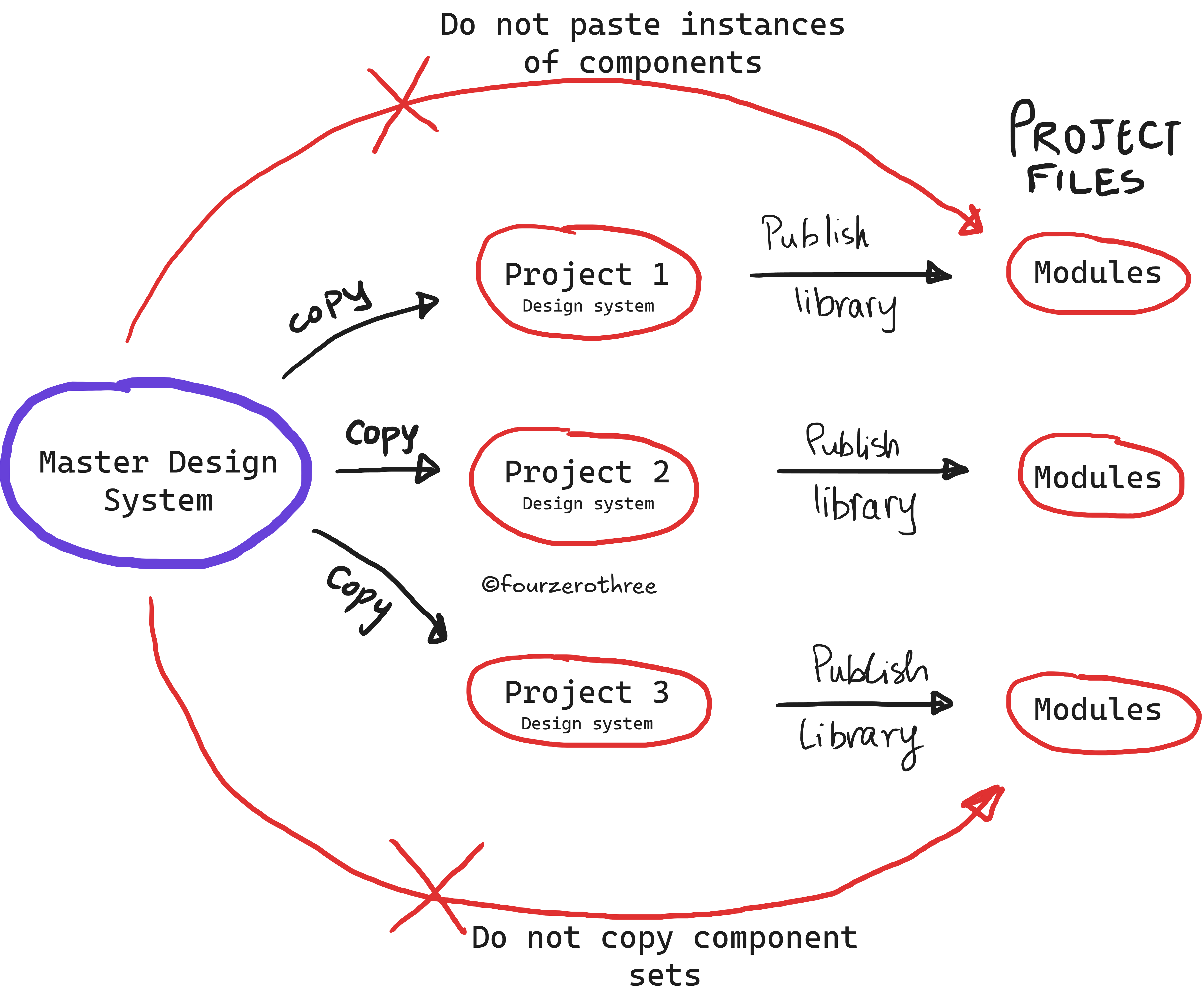
Once we publish the Design System library for a client project, do we continue to build (any new) components in library itself?
Building/modifying components in the main Design system file (library), publishing/updating it, then updating the main Module file to keep up with library updates was painful.
To keep the system usable, governance became just as important as design.
I ran an onboarding workshop for designers, helped them understand how it could be used effectively, helped them troubleshoot issues, and collected feedback regularly.
Over time, I shipped a leaner, more optimized version of the system:
made variables more leaner (cut back of variables that were rarely/not used),
variables were made more organized,
components were updated to be leaner and less complex so it was easier to use.
This balance between power and usability was key. A design system only works if people actually use it.
Act VIII - Reflection
In a consultancy, design systems aren’t just about scaling a single product. They’re about creating a foundation that can flex across multiple clients, timelines, and teams.
The biggest wins came from structured tokens and reusable components. They gave us speed, consistency, and clarity at scale. But I also learned that too much flexibility can overwhelm, and governance is what keeps a system alive.
Designing the system is only half the job. Sustaining it is where the real impact lies.