RedStack: Building a multi-role execution platform using a AI-augmented design workflow - case study
1) Introduction
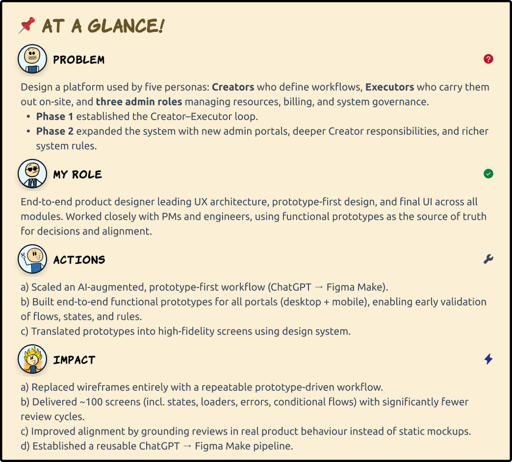
RedStack is a remote execution platform where one user (Creator) defines structured procedures (workflows) and another user (Executor) carries them out on-site, step by step. The platform ensures that a workflow designed remotely can be executed safely, consistently, and with a clear audit trail even when the creator isn’t physically present.
Note: This is a redacted case study. Designs, terminology and data have been intentionally modified to respect confidentiality.
a) User archetypes
At its core, the platform supports five personas:
Creators, who design structured workflows.
Executors, who execute these workflows on-site.
Three admin roles, who manage resources, billing, and system-wide governance.
b) Product evolution
The initial version focused on validating the core loop: a Creator uploads a workflow, an Executor performs it, and the system captures the results.
Once the loop proved meaningful, the platform expanded into a multi-role ecosystem. Phase 2 introduced new admin portals, extended Creator responsibilities, and added modules for materials, billing, and system governance - areas that didn’t exist in the first version.
2) Design Challenge
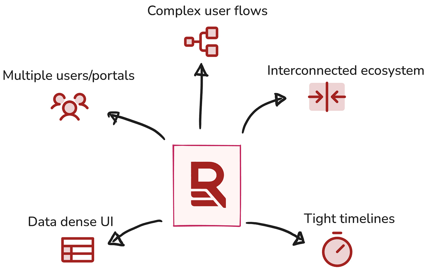
RedStack wasn’t a typical “one-user, one-flow” product. It was a multi-role ecosystem with many moving parts, each with its own portal, rules, responsibilities and each one influencing the others.
Main challenges:
a) A dedicated portal for each role needing needed tailored UI, navigation, workflows, and error states. Keeping these portals distinct yet coherent was a core challenge.
b) Complex, branching user flows.
c) Dense, data-heavy UI with complex components.
d) A deeply interconnected product ecosystem. decision in one portal directly shaped what another user could or couldn’t do.
e) Tight timelines.
🎥 Prototype preview
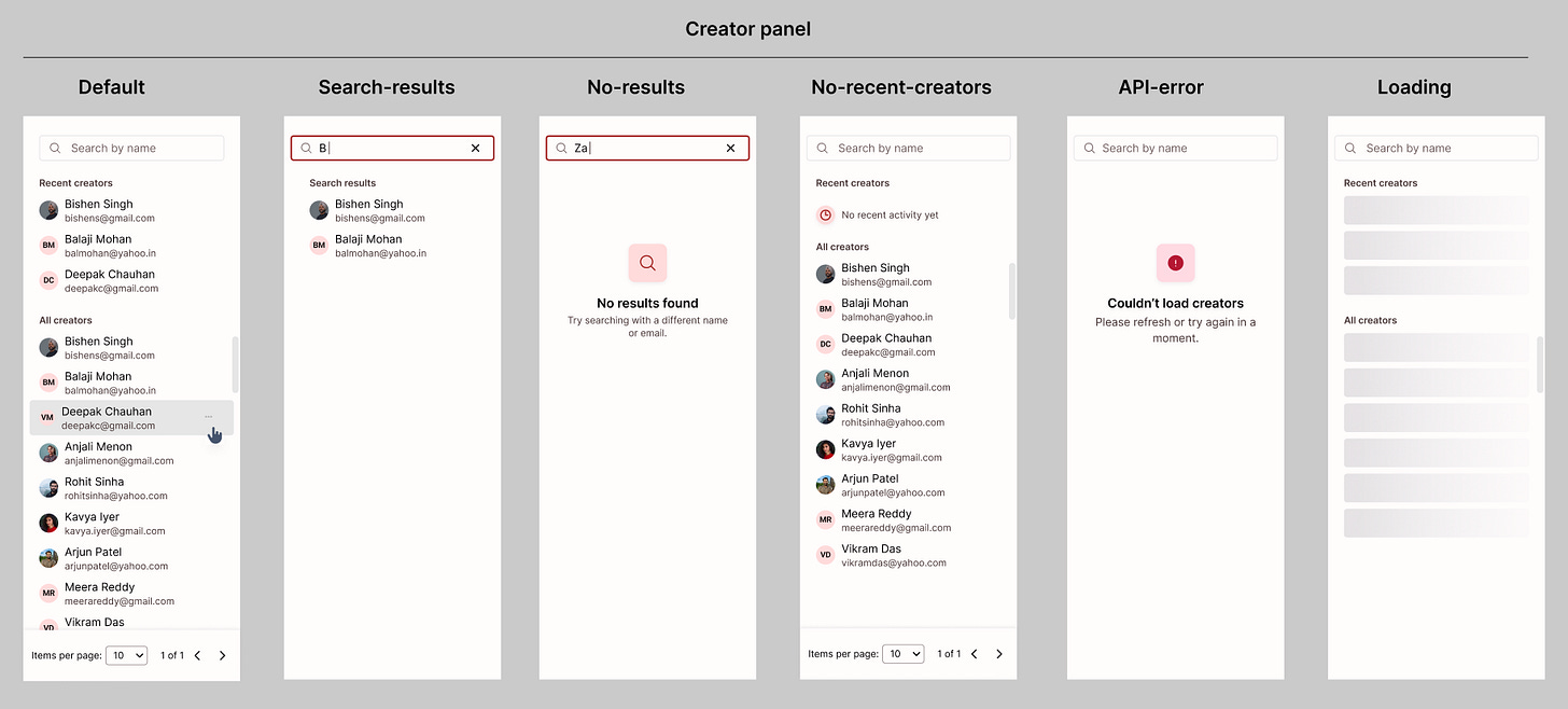
Before getting into the workflow itself, here’s a quick look at the functional prototype I built. The video demonstrates interactions in 2 screens including different states (Empty, loader, error).
This prototype became the source of truth across product, engineering, and design discussions. It grounded every conversation in real behaviour instead of abstract wireframes, and helped us reason about functionality with much more clarity.
Due to NDA constraints, this demo includes only two representative screens. All UI, data, and branding have been intentionally modified for this case study.
3) Choosing an AI-Augmented approach
Given the scale and pace of RedStack, I needed a workflow that let me move fast without losing accuracy. With the design challenges I had traditional UX workflows wouldn’t keep up.
An AI-augmented workflow became the most practical way to work through this complexity. I had already experimented with it during Phase 1, but Phase 2 is where it evolved into a foundation for the entire design process.
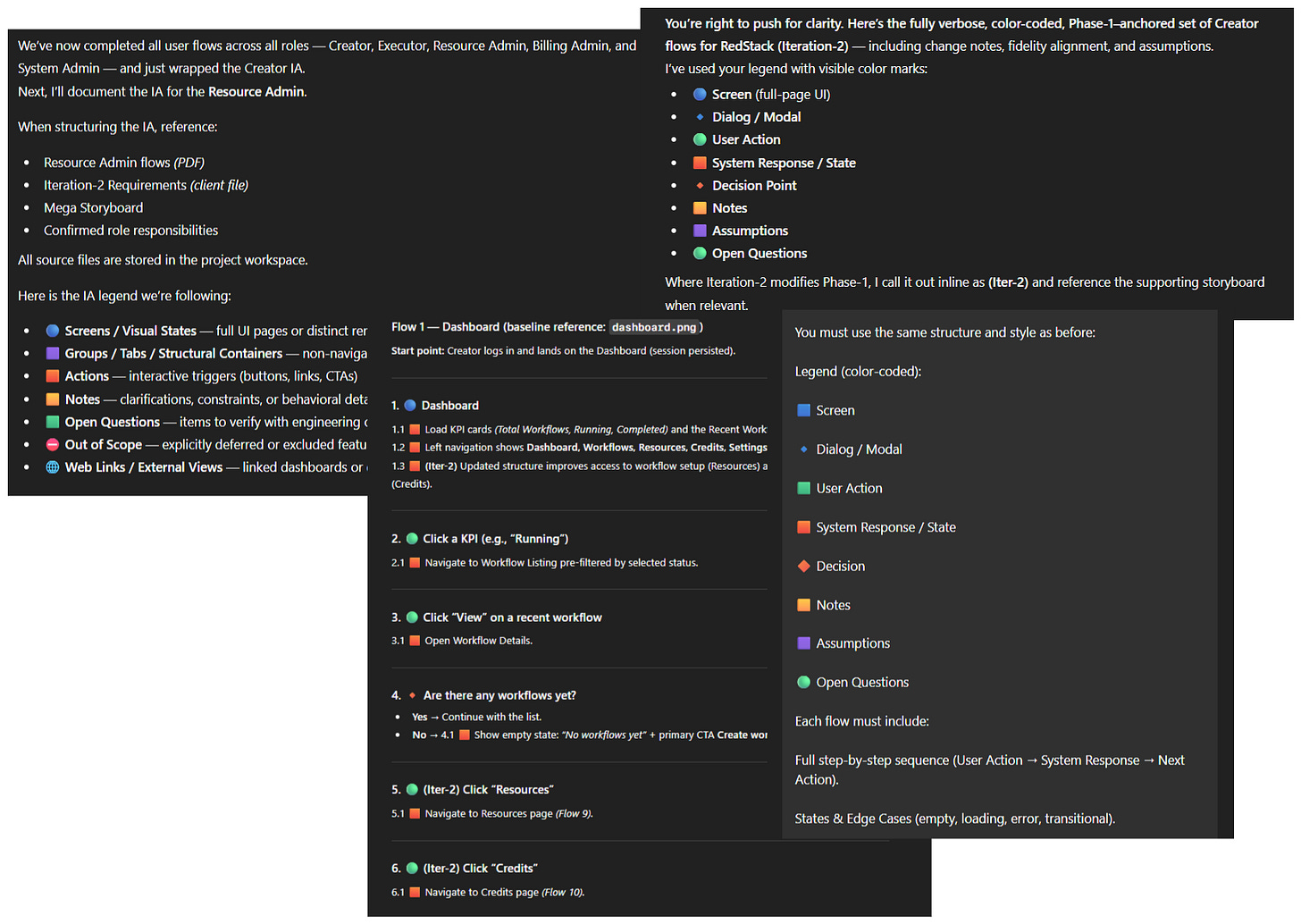
Using ChatGPT as a UX co-pilot
I used ChatGPT as a structured UX co-designer for research and UX. This allowed me to:
work faster across large modules with many states
connect dots across roles, rules, and flows
digest dense product logic and turn it into clear UX behaviour
maintain accuracy at scale
turn UX decisions into working prototypes quickly
Working prototypes
For a product of this magnitude, static wireframes would fall behind. With 5 user portals (including a mobile app for the Executor), dozens of states and numerous screens, the design process needed something more dynamic.
⚠️Early workflow where things broke!
My initial approach was to generate layouts using ChatGPT and then build the full prototype inside v0. It looked promising but quickly ran into practical issues:
v0 hallucinated layouts during regeneration.
components broke unless prompts were extremely precise.
stateful UI (tables, logs, conditional screens) sometimes got flattened or lost.
small changes frequently caused flows to break or disconnect.
I made progress, but maintaining stability required multiple forks and constant patching. This wasn’t scalable.
The root issue for me, was my prompts in v0. I truly believe this makes or breaks your prototype.
✅ The Fix
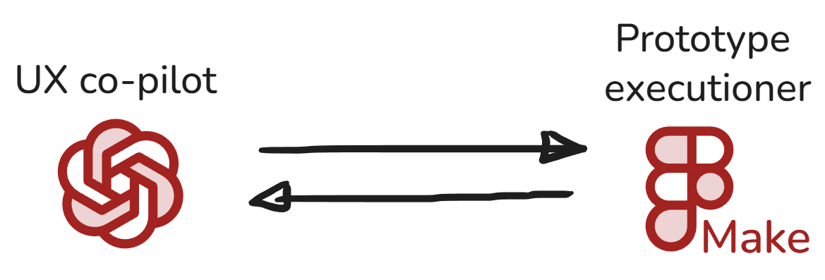
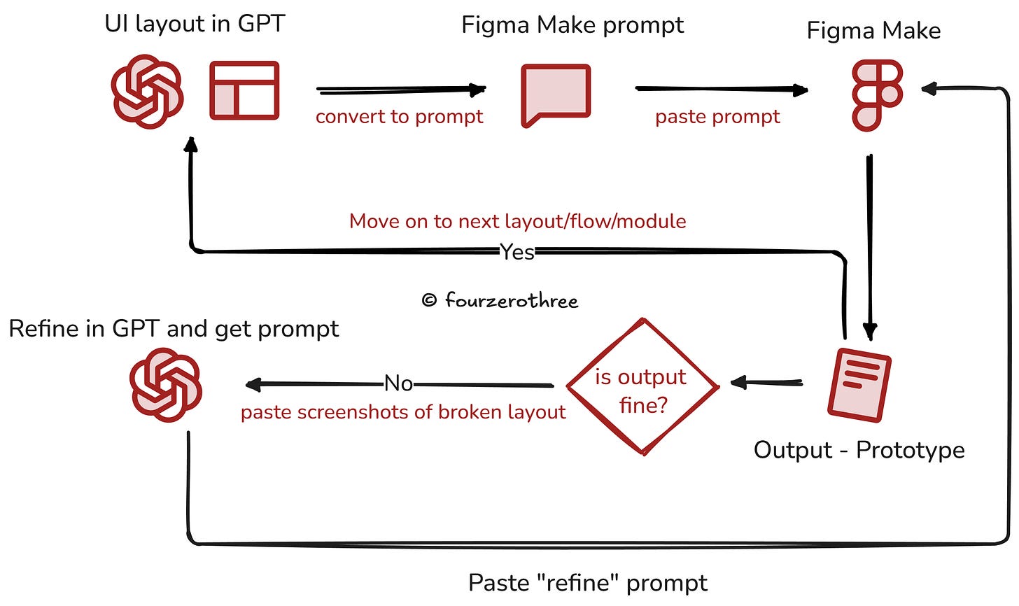
I switched to Figma Make and adopted a new pattern: a two-tool workflow where each tool had one clear responsibility.
Instead of designing inside Figma Make (with me doing the prompting and iterating inside Figma Make), the prototype is created through a controlled two-step pipeline:
ChatGPT handles all prompt authoring
I designed layouts in ChatGPT - spacing, structure, component rules, interaction logic. Once the layout was approved, ChatGPT generated a deterministic Figma Make prompt.
Figma Make handles execution
I pasted the prompt into Figma Make and reviewed the output.
If something broke, I returned to ChatGPT with a screenshot and asked for a rectification prompt.This loop removed ambiguity and kept the prototype stable.
This way I ensured Figma Make received instructions exactly the way it wanted it to. Hallucinations dropped dramatically and prototypes remained stable across screens and iterations.
4) From Prototype to High-Fidelity UI
Once the prototype behaviour was stable, moving into high-fidelity design became much more deliberate.
Instead of starting from a blank canvas, I could trace over correct behaviour and focus purely on visual quality, coherence, and system-level consistency.
How the prototype shaped the UI work
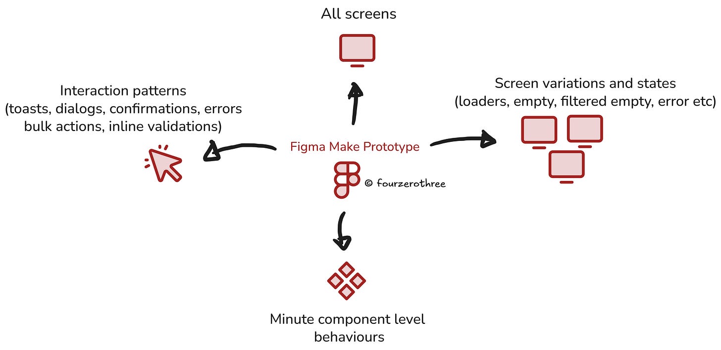
The prototype gave me a predictable map of every screen, interaction, and edge case I needed to design. It clarified the following:
So the high-fidelity work became a matter of polishing, not guessing.
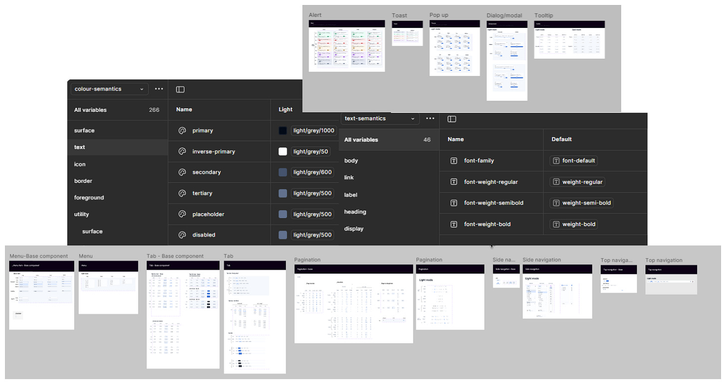
Design system application
From here, I translated each prototype screen into production-ready UI using the design system:
Applied DS tokens for colours, spacing and typography
Created complex reusable components – tables, editable tables, multi-step modals, filters, side nav, cards
Ensured cross-portal coherence - five personas, but one unified product feel
The scale of the UI work
Across four portals, I designed around 100 screens, including state variations and supporting dialogs.
Because the behaviour was locked in early, the UI stage was fast, predictable, and required far fewer revisions.
5) What this workflow achieved
Faster delivery across a massive surface area
I designed ~100 screens across four portals (including all state variations, dialogs, loaders, filtered empties, confirmations, errors) with far fewer iterations than a traditional wireframe-first approach.Clearer product conversations
Every discussion across product, engineering, and design was grounded in real behaviour. The prototype removed ambiguity early, especially around edge cases, rules, and logic.
Better alignment across a multi-portal ecosystem
Dependencies between roles (different user archetypes) became easier to map, validate, and design for.
A reusable internal workflow
The “ChatGPT (UX and UI layout) → Figma Make (execution)” loop evolved into a repeatable method I can now apply to complex systems work going forward.
6)Reflection
This project fundamentally reshaped how I work.
A five-persona, rule-heavy ecosystem with tight timelines would have been extremely difficult to tackle with a traditional wireframe-first design workflow. By treating AI as a structured co-designer, I was able to move fast without sacrificing depth.
The biggest shift for me was realising that behaviour-first design unlocks clarity. Once behaviour is correct and testable inside a prototype, everything downstream - UI, components, states, edge cases become predictable.
This experience has changed how I approach large systems going forward -
anchor behaviour early, ground discussions in real interactions, and use AI tools intentionally to scale clarity, not replace craft.


